for this part of the course we were asked to draw a still life composition using just monochrome to imply texture and tone without excessive shading.
To start with I decided to draw a bag of apples.
line drawing apples in carrier bag, white ink on black paper
I decided to draw a bag of apples on a small table. I used white ink on black paper. Even though this is a pretty good representation of what I was looking at, I am not really that enamoured with the outcome. It could be a cabbage or a pile of rags, there is nothing that determinable about it that makes it shout apples! So I decided to add in the bunch of bananas again to give it some context which then made the apples make sense.
white pencil on black paper line drawing fruit and bag
I drew it again on black paper with a white pencil crayon. It was difficult to avoid blending and shading as this is something that I do a lot of when I am drawing.
I decided to try doing this same image, either as a whole or small sections of it using different colours and different materials.
I was finding it more challenging to do this exercise than I thought I would. I have enjoyed it though.
line drawing fruit in carrier bag with white ink on black paper
I did the same colours and the same composition but using white ink again and using a stiff paint brush.
I think that this worked better than the white pencil drawing of the same style and type.
I like the flow of the ink and the way that it sits in some lines much more thickly and with greater saturation and in others more thinly and more delicately. I have not drawn much with ink in the past but I really liked using it.
I decided to try doing something a bit more different later on with various pens and also a couple of drawings that were more abstract and then a picture with different subject matter.
The next couple were felt tip pens in different colours on differently coloured papers. I also had a go at pointillism.
I added a paper bag and moved the composition around slightly and drew on white paper with a fountain pen with purple ink:
purple fountain pen on white paper, fruit and paper bag, preliminary sketch for playing with colour final piece
This one I did as a preliminary sketch for the final piece for the playing with colours part of the module.
mackerel heads pointillism
I decided to draw a few different monochrome pictures with different subject matter. This one is of three mackerel heads.
Although I really do like the effect of pointillism it is very time consuming and a bit tedious. I have to remind myself whilst I am doing it that the outcome will be very pleasing and striking so that I don’t get fed up and give up. This is a small drawing (A bit bigger than A5) stuck in my sketch book and it took around an hour or so to draw! All those tiny dots instead of shading takes absolutely ages!
Having said that is IS very striking and effective and a good way to use monochrome to achieve a totally different effect.
monochrome sheeps skull black and white pencil on black paper
This one, above, was a change of subject again, black and white pencil on black paper of a sheep’s skull.
monochrome skull still life, black and white pencil on black paper
Above is a still life composition of sheep’s skull and various other shells, bottles and paint brushes which I drew using the black and white pencils on black paper. I really liked this one. I like the composition and think it looks very effective. I didn’t pursue this one any further. I wish that I had all the time in the world to pursue loads of the things in this module, there is so much scope for developing nearly everything that I have done!
abstract pepper
This one on the right is an abstract line drawing of a capsicum pepper.
I decided to use lots of colours for this one just as an experiment. It was just a bit of fun, but it was so effective and fun that I decided to stick it in my sketch book after all! I also did a row of a few colourful garlic bulbs in a similar style.
I used loads of different ink pens, biros, felt tips, gel pens and fine liners and a fountain pen for the pepper and a mixture of coloured felt tip pens for the garlic.
Although I deviated from the initial brief for these ones, I think that they are really effective and they were great fun to draw too!
abstract garlic
Again this was a most enjoyable part of the course and something that I really could take further. It will be really difficult to decide which parts to develop when I am finally ready to prepare to get things wrapped up and ready for assessment. Although it has taken me a long time to get things sorted out, this has been a hugely important and exciting journey for me, where I have come up against a lot of my own demons, barriers and walls but also been enormously inspired and excited by what I have done so far!
Leading on from the artists that I chose to look at earlier regarding their use of negative space, the course literature suggested that I look at the work of Gary Hume.
These are the images that I have chosen to look at:
Gary Hume ‘Love Loves Unlovable’ 1994
the image that I chose first, ‘Love Loves Unlovable’ I thought was relevant to the work I have been doing as it involves the use of large areas of black and the use of foliage. I really like the way that the colours pop out so much in contrast to the large areas of black.
Gary Hume ‘Pinks’ 2000
The second Image that I chose was ‘Pinks’ which again I decided to look at because of the use of organic matter.
I have been working on my own pieces using apples and bananas and foliage against a dramatic black background, using the foliage in relief rather than adding detail, much like the work of Gary Hume, I have done a number of sketches and have a rough idea of what direction I would like the drawings to take.
FIrst off I have done a number of sketches of the fruit in detail using various different media. These are in my sketchbook and I have included some here.
I decided to carry on and work with the apples and bananas and foliage and had a lot of thoughts about the composition of the drawing. I want the eye to be drawn in to the middle of the drawing and have explored the best way to do this in my sketchbook.
practicing the foliage for the background
I first practised the foliage in the background once I had decided on the composition of the final drawing. I wanted to have a range of different sizes of leaves but also not to complicate the foliage aspect of the drawing too much as I want to have the focus of the final piece to be the fruit and the foreground and for the foliage to enhance that aspect not drown it out.
I decided to keep the colour completely flat and blocked so that the detail of the fruit and the colour really stands out. Much like the work of Gary Hume. I decided to do a mock up of the final piece in rough so that I could see what the outcome might look like.
mock up for a final piece idea.
I have decided after much deliberation that I want the size and shape of the drawing to be tall and narrow rather than a typical ratio. I think that this will be more interesting and quirky, almost as if it is a view through a door that is not properly open…
After all the sketches and preparation for the final piece this was what I ended up with. I am not entirely happy with it, as I think it would be better much bigger, additionally I think it would work well in paint rather than pencil. I did draw some of the preliminary sketches using oil pastels and soft pastels and mixed media as well as exploring other vegetables and fruits but this was what I decided on and I think it is something that would benefit from working on the idea more and exploring more ways of presenting it.
intended final piece for this part of the module, however I think I Would like to work on this idea further.
I do really like the composition of the piece and loved drawing apples and bananas and have decided to concentrate on these as a subject for further parts of this module, though I have explored lots of other subjects too.
I love how warm the colours are on the fruit, and think that it works really well. having said that it definitely needs work.
FOr this part of the module we were asked to design a still life composition and to play around with colour to achieve texture, tone and depth, using colours that were not what we would expect to use, rather than ‘just’ drawing in the regular colour scheme.
I was really looking forward to this part of the module and was developing something of a real respect for the humble apple and banana. I had also become aware of the importance and significance of texture in drawings and therefore decided to stick with my theme of apples, bananas and carrier bags.
I have done extensive drawings in my sketchbook of these things using various different materials and achieving varying levels of success.
I decided to go all out and use bright and garish colours to depict these subjects and dove right in with my first attempt.
playing with colour attempt #1
I was getting along nicely with this one and thoroughly enjoying it, then massively overworked the carrier bag in the middle of the drawing. I was disappointed because until then it was working rather well. I was having fun playing with alternative colours and thought that it was going to plan, but got a bit obsessed with the carrier bag handle and over did it!
playing with colour attempt #2
So I started again…. same subject but honestly, lost all interest in it because I think that the colours went from being quirky and fun and a bit different to just looking rank and offensive …. time to try again…..
playing with colour attempt #3
number three started, I was a bit happier with the colours but then realised that as I had shifted my position without realising it whilst drawing the initial sketch for the shapes, I had inadvertently and unknowingly caused the apples at the back of the carrier bag to appear as if they were floating and not sat on the table top properly. Completely unsatisfied with that outcome, I decided to stop again and start a new one…..
Also reflecting back over this exercise, I had not done a very good job up until this point in terms of making the apples look shiny and round, the way that i have drawn them, the very shiny, round parts of the apples look like they are actually flat and shiny.
playing with colour attempt #4
drawing the outlines again, I managed to sort out the floating apple issue and get that part of the drawing right, but then managed to pick colours for the bananas which were in danger of triggering a migraine. I am all for creating challenging pieces but added to the frustration at having started the same drawing 4 times was the fact that the colours that I had chosen were making me feel nauseated…. I decided to sling it to one side and start again…..
playing with colour attempt #5
Studying the still life composition carefully for the 5th time, I managed to draw what I thought was an accurate depiction of what was in front of me, I accidentally ended up with a floating apple. Not deterred, I persevered and finished the outline then plucked possibly the most disgusting colour out of the 200 or so colours that I have to choose from and coloured in the wall behind the fruit all in that colour.
By now I was tearing my hair out somewhat as this previously pleasurable and enjoyable task was now becoming a migraine-inducing, nausea promoting pain in the backside!
I decided at this point to take a hiatus from the carrier bag of fruit and leave it well alone for a couple of weeks and get on with something else.
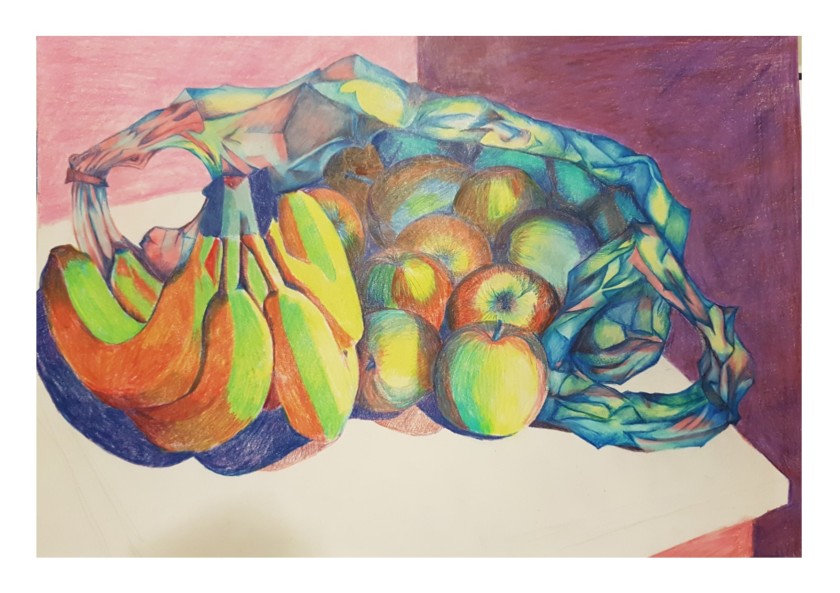
WHen I came back to it some time later I decided to do things a bit differently. I swapped the plastic bag for a paper one and put a bunch of bananas (obviously not the same ones) on the opposite side of the composition instead.
This actually was way more pleasing on the eye!
The I set about taking into consideration everything that I had learned from my first five attempts at drawing this picture and set to.
This time…. IT WORKED!!!
playing with colour final piece
I think that this works really well. I much, MUCH prefer the colours that I have chosen to use. The only part of the drawing that I am not happy with is the dark shadow on the left side of the apple at the front of the drawing looks like a hole and not like a shadow…
I like the use of light and dark and how I have managed to achieve some quite striking differences in tone with out using obviously contrasting shades of black and white. I am having something of a love affair with brown paper, I LOVE drawing on it and think it gives a really great effect.
Over all this was a really interesting if a little frustrating exercise at times. I think that I have met the required outcomes and I am happy with the result.
Beginning part 2 of my degree course, with lots of sketches of organic subject matter, really exciting to be moving forward with this and getting ready to release the might of my passionate self! Hear me ROAR!!!
Starting part 2 of the first part of my degree has been somewhat easier than the first part. I seem to be finding my pace a little bit and enjoying the process a LOT more.
I am really happy with the comments from my first assignment, lots of positive feedback and comments that I can work on (such as adding a separate menu to my blog for the assignments and learning log relevant to the degree course and several artists who I will go and research who might inspire me and be relevant to my studies!). I was amazed most of all about the fact that my tutor said that I had submitted a lot of work, when I thought for sure I hadn’t done nearly enough!
One thing that I was really thrilled by was the suggestion that I might do more of the personal art that relates to my feelings and enjoy doing so, connecting more with whats going on and being more passionate. I feel that I have managed to do that more in this second part and also stay more relevant to the degree course in the process. Athough still life is not something that I have really felt that I could throw myself into in the past, I have REALLY enjoyed the process so far and have heaps of ideas that I would like to explore moving forwards.
First I just put a load of natural objects that I found in the house in a still life arrangement to do some preliminary sketches. I photographed the still life from several different angles to see what they looked like at a glance, some of which I have included in my sketch book, then I did a sketch of the whole thing from above and front and then a few more sketches of the angle that I most liked the look at and refined the idea of using negative space. I have researched several artists using negative space and still life subjects online and really enjoyed looking at other artists work.
“Guernica” Picasso
I chose this hugely famous and enormous piece of work by Picasso as an example of work to look at and explore because of his use of lots of contrast, though it is not a still life piece, I love how he has managed to create such an imposing piece of work that feels oppressive with so few colours. I have not seen the originals to any of these pieces of work that I have chosen, sadly, though can only imagine how completely overwhelming this piece of work that he created must feel in person. It is absolutely huge for one thing and the subject matter, though disjointed and in the cubist style is disturbing and feels almost aggressive. I am not fully “au fait” with the actual meaning of the piece of work as I refrained from looking at the intention of the piece until I want to look at it in more depth wanting more to explore my reaction to it and understand how it makes me feel just by looking at it and absorbing the feeling that it evokes. Honestly it reminds me of the feeling that is in the world around me at this point in time, in a political sense. I can feel a real sense of despair when I look at this painting and feel exhausted and despondent, there is a really impactful aura of loathing that I can’t tell if maybe I am feeling because of what is happening in the world in real time and I am looking for in this painting, or if it was actually the artist’s intention to evoke that kind of real visceral response?! It reminds me of people being forced to do things against their will and being hurt in the process. This is the first time that I have really allowed myself to look deeply into a cubist painting, (which is probably shocking for an artist!) and I must say that I am surprised at the level of the feeling that it has triggered in me. I feel almost breathless with the heaviness of the feeling of being almost crushed.
Giovanni Ambrogio Figino- “Metal Plate with Peaches and Vine Leaves” 1591-1594
I love this painting, the peaches are so soft and real looking. One thing that I thought looking at this picture was that when I am drawing a still life picture, something that I would like to do is marry up the detail and realism of the subject matter- fruit, vegetables, fish, seafood maybe? with the stark and plain negative space. I love how the focus is all on the fruit and the foreground- in this case the fruit and the leaves and the plate, but if the background was detailed or a lighter colour, the fruit and plate and the leaves would lose all context and vibrancy. There would be a real sense of things being lost if there was a paler or detailed background in this picture and the heaviness of the negative space lends a real warmth to the peaches that I think would be lacking if there was any more detail in the background. This is something that I would really love to use for my own work. I will explore more about negative space and incorporate this into my own work. I adore drawing organic objects and would love to tun out something with this much warmth and gentleness.
Enter a Georgie Morandi “Grande Natura Con Lampada A Destra” 1928
This is the only drawing (as opposed to painting) that I have included in this selection of other artists and I included it partly because of this fact and partly because I liked the effect of the use of negative space (again) and the mixture of shapes in the subject matter. It is somehow a combination in some ways of the Picasso piece and the still life above, in as much as it is very geometric (such as the cubist Guernica) and it includes really good use of negative space. I have never heard of this artist before and though this is not a piece that I particularly enjoy looking at, it is useful in terms of how I can use it to influence my own work. This really makes me interested in using negative space and actually at the point at which I saw this drawing I started to sketch my still life with more negative space in the background which was an effect that I really like. Again I find this piece rather bleak and depressing and heavy, which I am surprised at because I wouldn’t expect to have an emotional response towards a collection of jars and containers drawn in blacks, whites and greys… I have decided for sure that I am way more interested in drawing and depicting images of much more organic subject matter. I love the twists and turns and curves and dips and divots and beauty of natural objects and the human form (though I will have to wait my turn to get into the drawing of bodies jsut yet!)
Jan Bruegel “Bouquet” 1599
I’m a huge fan of Bruegel, I studied some of his work for my A-Level, and wasn’t so much aware of his still life work as I have really only looked at his more sinister scenes of death and destruction with skeletons and mounted warriors and their wholesale murdering of crowds of people in bleak and depressing landscapes. This was a surprise and I saw the picture and selected it before I even knew who had painted it. Again, flowers are not something that I would necessarily choose to draw myself, I love them and have painted hundreds of them but they are not something that I have drawn many of, the reason I chose this painting was because here Bruegel has chosen a very organic subject matter and as I said, this is what I like the best. I also was really keen to seek out more work from artists who place emphasis on both the detail and tone and feel of the subject matter using colour and realism to depict the flowers in this case- the peaches in the painting above- and the heaviness of the background and the monotone of it which in relation to the detail of the fruit I would have imagined would have almost ‘drowned out’ the colour and the tone of the natural object but in actual fact I am amazed that rather than the background jumping forward and obscuring the beauty of the natural objects, actually helps to bring them forward and define them, making the softness even more so by way of being such a stark contrast. Almost as if in juxtaposing the softness of the detailed fruit with the blank and stark darkness of the background, both are emphasised and compliment each other. This is a surprise to me and something that I hope I can do justice.
So this is the still life that I put together on a board on a Lazy Susan so that I could move and turn the still life to get an angle and frame it in a way that I liked best. I took a good number of photographs and sketched a couple of different angles until I found the one that I liked best.
This was the first sketch I did of the whole still life. I hadn’t really given much thought to the idea of using just a section of a still life composition before, pretty much always just assuming that if I put together a still life set up, then I had to draw the whole thing in one go! when I started looking at the photos that I had taken I realised that the reason that this sketch is not very successful, for the most part is because there is no sense of a focal point in this sketch, there is too much going on, the eye is not drawn to any particular part of the drawing, there is just too much going on. I realised that there doesn’t even have to be an object in the focal point of the picture for it to work either as I moved forwards drawing different sections of the composition, there simply has to be a flow and a place to which the eye is drawn. In later sketches I used the lines of the bananas and the framing of the apples and the negative space to being a sense of completion to the pictures.
This was the second sketch I did, drastically decreasing the number of objects in the drawing and wiping out the background, giving the drawing a bit more negative space. Removing a majority of the objects in the picture immediately improves it, though i was still not happy with the overall look and framing of the objects nor the angle that I was happy with, I think that this drawing is much more successful than the first.
I decided to experiment with different materials at this point whilst I made my mind up about which angle I liked best. This drawing was done on a coarse graned paper using black biro and graphite pencil. This is in more extreme close up than the first and second as I was more interested in the look of the materials that I was using. I like the detail in the drawing but I think that it really loses something by not having any colour in it, I also really think that it needs more negative space in the background and a better sense of flow and direction to make it work.
This was the first picture that I drew with colour for this composition. I used a coarse grained paper again and used soft pastels. I was not happy with the result of using jsut soft pastels, though I liked the colours, I was unhappy with the level of detail that I was able to achieve using just the pastels because they don’t lend themselves to the kind of realistic fine detail that I like to portray in my drawings. I was really getting into the process of finding the materials and composition that I wanted to settle on at this point and really finding pleasure in the work. I decided to use the colouring pencils that I so love to use and try a different angle with more negative space in the background too.
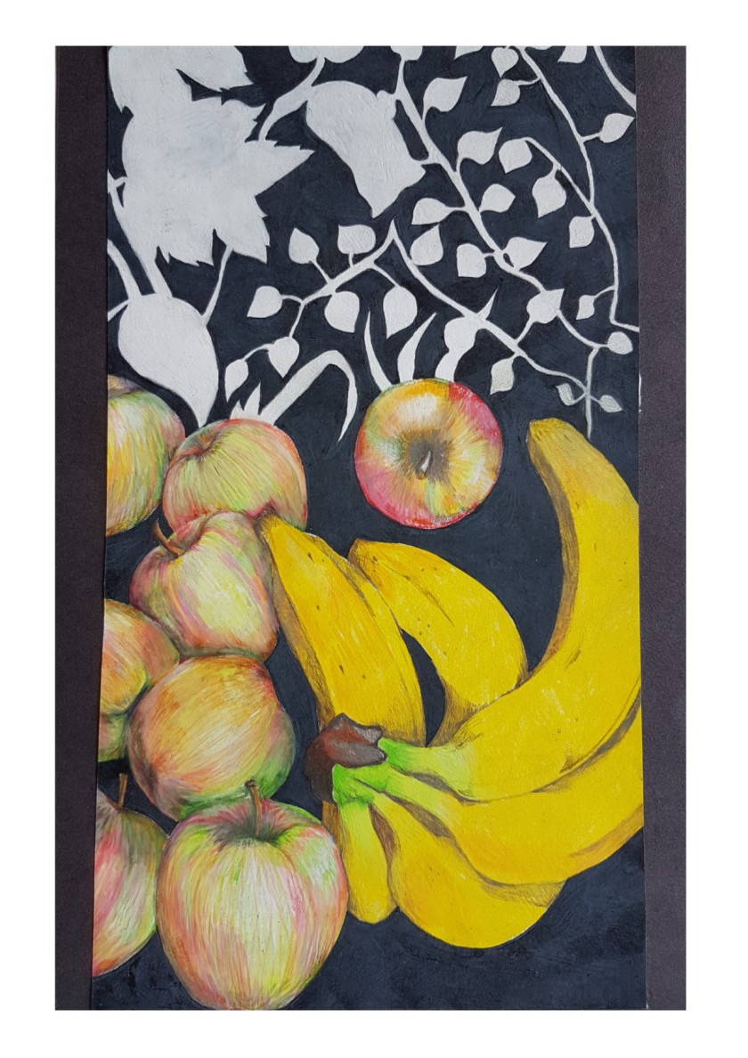
For this first sketch using a different angle of the still life I just used pencil and did a quick sketch, for speed more than anything just to see if this change in angle was what I wanted to achieve. I was really pleased with the look and the feel of the picture and felt really excited about drawing the picture with colour. I love the use of negative space, mixing up detail in the foreground and then just drawing the outlines and using monochrome in the background leaves. As it turned out I really really like the composition of this drawing. It really works. So I decided that this was the composition that I would like to use if I take this drawing further. I went on to draw this using the colouring pencils and being a lot more heavy handed with the background negative space.
I love this drawing. I love these pencils so much! I think that the detail on the fruit works really well with the plain black background. I love the different colours in the apples and the cheerful bright boldness of the bananas. I love the way that the leaves and twigs pop out in the background juxtaposed against the heavy black of the negative space and really emphasise that space, without the colours and the warmth in the foreground fruits would be lost. I think this works really well, however I drew some tiny sketches in my sketch book, increasing the height of the background and making the overall feel and direction to the drawing much more pleasing. I don’t have a photo to share of those pictures. I plan to draw the picture larger and in those dimensions as a sort of ‘final piece’ as I think it works so well in a small sketch.
I then moved onto my next subject matter and drew a bunch of detailed veggies and some mackerel.
First up was this cross section of a red cabbage. I drew it using prismacolor premier pencils on brown heavy brown paper. I really loved drawing this cabbage, it was a really wonderful thing to draw. I was amazed at just how many colours were in the cabbage. It looks at first glance to be “just” purple and white, but on closer inspection there are all layers of purple, burgundy, mauve, red, white, grey, creamy yellowy colours, brown, it was absolutely fascinating to draw. I love how the lines are so swooping and curvy and the layers remind me of the cross section of a tree trunk. I love the way that the purple started to bleed more and more into the white with different tones of red and purple. I decided to draw more vegetables and other food with the same materials in order to study them more closely. I really love the effect of the lovely vibrant colouring pencils on the brown paper, though I will be exploring other drawing surfaces too.
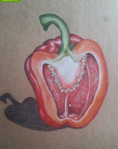
After I had finished the cabbage, I decided to look at a red pepper in detail. I chose the same materials to draw with as the cabbage had been so successful. I realised that I have drawn multiple peppers over the years but never truly looked at one in great detail and just on a whim I decided that I would like to take photos at regular intervals whilst drawing this picture. I wanted to learn a bit about my own process, how I put together a sketch and the different stages of it. To my amazement, when I looked back over the photographs I realised that I am actually incredibly organised and methodical when approaching this type of drawing. In my life outside of drawing I am so messy, disorganised and somewhat chaotic at times. so it was a real surprise to see that there are also times when i am able to be very neat and considered. I think that this is something that I need to harness in other areas of my life, such as meeting deadlines for important events, both in and out of my degree course, and being more organised in general, I have the ability I just need to grab hold of it! I also thought a bit about how much I struggle to create when my home is in a mess. This has been something that has held me back enormously in the past. I have literally held the art of creating as being something sacred and had a distinct need to be organised and ‘proper’ about it. This really makes me sad because it contradicts what I know about my need to be creative… Yes it is a sacred and wonderful part of me, the ability to create, however, I think my need for perfection, that is unattainable for one thing, is so intense that I actually think that I hold myself back in so many ways. I think that particularly after the rape when I was 19, the fact that it revolved around my artwork has really thrown me off kilter. I have, since then, had a need, a genuine desperation to almost keep my art sterile, to stop it from bleeding out from its neatly contained edges. This has meant that the actual work that I have allowed myself to do is most often involving me really holding back and not putting all of that raw passion that I know I feel into the art work.
Being bipolar particularly has a huge impact on the way that I feel about my artwork, not just art in the classic, visual sense either, other disciplines such as music, drama, dance… All of these things move me deeply and I feel such a huge visceral reaction to hearing/seeing/experiencing beauty and pain and fear and sadness and love in a creative sense and I know that this is something that lies bubbling under he surface just waiting for an outlet to really get going with it. I have so many ideas and thoughts that I literally yearn to produce and make into a real tangible work of art, yet for the reasons I have said, the need for sterility is so pervasive. I can’t adequately describe using words the feeling of absolute euphoria that I get when I am manic nor can I find the ‘right’ words to describe the despair that I feel when my mood plummets. The contrast I guess like the fruit and the negative space, only more so. Maybe this is what draws me to the concept of the beautiful, natural raw warmth of the organic matter and the juxtaposition against the cold, hard, black negative space. It literally somehow describes me, albeit in a watered down kind of way.
What I really want to achieve is the reality of those feelings-NOT the watered down version! If I can’t say them, I can’t sing them, dance them, describe them…. The obvious solution is to create them using art as my medium….
I feel like I am on the cusp of something wonderful, though maybe that is just my mood?!
Reigning in those thoughts for a moment and coming back to the methodical and purposeful creation of the pepper sketch, this was the final outcome of all those stages of creation:
I was happy with the pepper, I still am, but I really, really want to let loose, not be so controlled and contrived, let rip with all of that raw passion and joy and aching pain that I feel so much of the time.
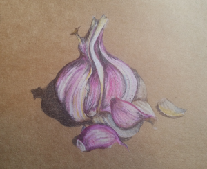
I think that the next sketch, a small sketch of a garlic bulb with a couple of loose cloves that I pulled out of the bulb is rather sweet, but again lacks the passion and feeling:
I do like this sketch but I think it lacks definition, though again I was amazed by the number of colours that I had to pick out of my pencil tin in order to capture the true likeness of the vegetable. I think that I have also managed to achieve a good sense of the papery skin of the bulb, and I really like the natural sweeping curves and lines of the drawing. It is pleasing to look at and it is something that I would consider using in a final piece.
After I had drawn some vegetables and really examined them, I read onto the next part of the folder and discovered that I had wandered unwittingly into a wonderful part of the course, where I get a whole chunk of time to devote to drawing natural objects. It was suggested to me that I might look up the ‘Memento Mori’ arena of artwork. A short definition here: “Memento mori is a Latin phrase meaning ‘remember you must die’. A basic memento mori painting would be a portrait with a skull but other symbols commonly found are hour glasses or clocks, extinguished or guttering candles, fruit, and flowers.” (taken from this website here). All of these suggested objects are things that I am interested in and the idea of the memento mori style of working really appeals to me, especially in my darker moods, but not restricted to those times. I love skulls, animal and human and am desperate to procure more of them to add to my collection (currently consisting of a single sheep skull! So not quite a ‘collection’ yet, per say….) I remember drawing a skull several times when I was a teenager as we were lucky enough to have a real human skull in the art department at school, since then I have been on the look out to get hold of a real one myself. Though I guess a really good replica would suffice.
Anyway, I somewhat deviated from the subject matter of a typical memento mori piece of work, but feel that with the next couple of sketches (again using prismacolor premier pencils and and heavy brown paper. I bought and drew three whole mackerel. These fish are astonishing to look at. The colours that they are made of are absolutely beautiful and the beautiful gloss and shimmer of their skin is just a joy to behold.
This was the first drawing I did of the recently deceased trio of fishies, I was again amazed at the colours, this has been a theme so far in this part of the course, ans I was also amazed at how much the facial expressions varied from one fish to the next. Interestingly though several totally independent bits of feedback have been given to me that the fish look really sad and despairing. I didn’t draw them deliberately with this in mind, but with the political climate the way that it is at the moment with the calamitous outcome of the Brexit vote and terrorism being rife in all corners of our spherical home, then most recently the rise and rise of Donald Trump dominating the world media, I have really been feeling the anxiety and confusion that so many of us are feeling during these uncertain times. It is no surprise then that the objects that I chose to draw that were once alive and have faces show some of that anguish that is malingering in our communal headspace right now.
I was really engaged in drawing these fish, I truly loved the whole process. It was a joy, a real genuine exciting joy to draw them and to work at figuring out ways to do the beautiful animals justice.
This was the second mackerel drawing, again the same challenges, colours, the shine, the expression on it’s face, the last remaining vestiges of a short life, forever captured in my sketchbook!
They are a true rainbow of colour and a blaze of shimmering and fiery gloss. Simply beautiful, sometimes silver, sometimes golden, sometimes blue, sometimes green, Even their eye colour varies from fish to fish. I had no idea. I thought they all pretty much looked identical!
After drawing these fish I feel moved to draw other seafood, crabs, prawns, a lobster if i can afford one! Other fish, different types. And a HUGE urge to pursue my need for at the very least a convincing replica of a human skull….!
I have also decided to experiment with not only other drawing media but other types of drawing surface, fabric, different types of paper, card, plastic, metal, tin foil. After drawing the last mackerel I actually created my own drawing surface out of a piece of screwed up grease proof paper, onto which I painted a block of white acrylic which I planned to draw directly onto. This was not actually possible as the acrylic was wet and made the grease proof paper very flimsy and thin. So I used my imagination and tore up a piece of white cartridge paper into small pieces and stuck it in layers onto the acrylic paint with layers of paint in between the paper and finally a thick layer of white acrylic over the top of it. I was planning to draw on to the dried rough surface with graphite pencil, but when I tried to make a mark on the ‘paper’ that I had created with a graphite pencil it barely left an impression on the shiny surface, I decided to have a go at drawing a rough sketch of the mackerel directly onto the paint with blue and black ball point pen. This was somewhat successful, however I plan to experiment with making more of these alternative drawing surfaces and trying out other forms of drawing materials on them, ink, pastels, oil pastels, charcoal if it will work. I will include samples in my sketchbook and upload photos when I have them.
Over all I am thoroughly enjoying this part of the degree course and my art studio is nearing completion at long last, so in the near future I will be able to move in there with all of my materials and a huge dose of enthusiasm to get things moving….
But that’s another blog post entirely.
For anyone who has stayed with me to read til the end of this enormous blog post and stream of consciousness, I thank you and I am grateful for your time.