

I started to share in my previous post some of the detailed observations of natural objects that I have chosen to work with. This has been a riot of mess, colour, fun and ideas. Manly I have chosen to work with seafood, fruit and vegetables and this will continue through the next project -I have already made a start to this, and there is a lot of continuation from one project to the next as I read forwards to the next on and find that I have been doing some of it anyway! I like to keep the next project as a surprise. I don’t read forwards at the beginning because I want to be able to approach each topic with my own ideas and not just be led by what is in the folder so that I can see how things develop organically for me. It is interesting how much of what I have been doing already then shows itself in the next project!
I have been doing lots of sketches of natural objects paying attention to the object individually and as a group if there is more than one- as you can see form my perevious post, looking at background as well as subject (something which I have now discovered comes up in project 2!)
I used different materials, papers, drawing implements and styles.

I re-drew the apples from the first part of my sketches using oil pastels to see if there was any improvement on the soft pastels. I actually think that this works really well.

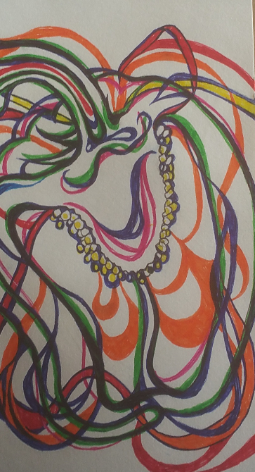
I included this doodle in my sketchbook after reading about ‘Memento Mori’ and being inspired somewhat by the subject matter that these artists paint and draw. I decided to keep it in my sketchbook as it was interesting. What amused me greatly though was that when I photographed it and looked at it as a whole picture and not just the individual aspects of it, I realised that the silhouette in the middle bottom of the doodle looks remarkable like a female bottom wearing slinky knickers. This was quite by accident, though I wonder what my unconscious mind was trying to tell me!!?

This is a bit of a study on just the negative space aspect of the drawings that I was doing initially after researching artists who use negative space in still life. I used a piece of plain cartridge paper and a black felt tip pen for speed. I wanted to have an experiment with negative space in more fine detail as I think it would work better with the style of drawing that I prefer.

These were some really simple doodles on the back of the cabbage study that I included in my first blog post of this part of the course. I used different colours of felt tip pen and a white pencil just to get some idea of colour choices.
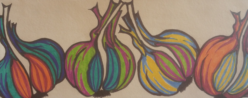
This is a group of garlic based on the study that I did of the garlic. I used garish colours of felt tip pen just to try something new. I actually really like this drawing even though it is nothing like I have ever drawn before and is not anything like the kind of thing I would normally have in my house, I would actually really love to have this on my kitchen wall, it’s great fun and quirky and quite a joyous little sketch!
Another experiment that I did with the drawing of the pepper that I drew (example in the previous post) I decided to experiment with lines to imply the shape and form of the pepper. I actually really like this one too. It is fun and colourful and I like the way that it gives a sense of looseness but in actual fact is really carefully drawn. I used fine liners an biro and just layered up lines and colours to make this effect.

This is a sample sheet of some paper that I made. I used pieces of crumples greaseproof paper which I painted a square of white acrylic pain. I had planned to just do that and draw directly onto it but the paint made the greaseproof paper really flimsy and thin and it would have been impossible to make any kind of marks on it that were pressed harder than a very delicate touch. I decided to persevere with the idea of making this paper and tore up a piece of plain cartridge paper into small pieces and layered them up onto the greaseproof paper with the acrylic paint then finished it with a thick layer of white acrylic paint to make the drawing surface. This made a really robust drawing surface once it had dried, albeit a little bit shiny. I experiemented with a dozen or so different drawing implements (from top to bottom):
- Graphite Pencil
- Broad black felt tip pen
- Colourful artists ink pens
- Biro
- Soft pastel (I had to put a layer of stick tape over this to stop it smudging as I couldn’t use fixative)
- Oil Pastel (again added sellotape)
- Colouring Pencil
- Regular HB pencil
- Ink Fine Liner
- Rollerball Pen
- Gold Permanent Ink Paint Pen
- Sharpie
- Gel Pen
The most successful of these with this drawing surface were the HB pencil, the biro, the colourful artists ink pens, the fine liner and the roller ball pen.
With this in mind I did a few sketches on the handmade paper:

This was the first, a whole mackerel which is not that successful. I was really getting to grips with the surface ass I was drawing on it. It was really lumpy and shiny and hard to use but I thought if used in the right way could produce some interesting results.

Mackerel head based on the larger drawing of the mackerel that I did in soft pastels (further down) I think that this is much more successful. I used biro and artists ink pens, smudging and blending the colours for different effects. I used the white background to pick out shiny parts of the fish… And finally:

A brown crab. I think that this one works really well! Again I used biro and ink pens. It looks like watercolours and I think works really well. This drawing is based on the sketch that I did of a crab that I bought from the fish market. I really like this one and think that it is the most successful of the three that I did.

This is a detailed sketch of one of the whole mackerel that I did then cut out and mounted onto a crumpled piece of greaseproof paper which I mounted onto a piece of heavy brown paper. This was not without difficulty as the greaseproof paper did exactly what it was designed to do and wouldn’t stick! In the end I had to use gorilla glue which kind of leaked from behind the sketch and left some weird discoloured patches. I need to look at different types of glue rather than just relying on pritt stick!

This is an A3 sketch of a brown crab bought from the market. I don’t normally have an issue with dead animals, I love skulls and such like, but this felt rather macabre drawing something that actually still looks alive once it is posed. I did this by just drawing in the dark patches and the shadows using cross hatching.

I decided to do a more detailed drawing of just the crab’s leg which I had to pull off. I think this is rather successful though it looks better in the photo than it does in the original drawing- as is the same with the whole crab sketch. I included more detail of the tezture and tone in the crab’s shell.

And finally…. This is an A2 sketch/drawing of the mackerel head done in soft pastel. Though I had sworn off soft pastels I decided to give them another go on a much bigger piece of paper. Gosh, I love this drawing! It is beautiful to look at, really love the detail, which I have struggled to achieve before. What I did differently was to draw it and blending the colours then putting a bucket load of fixative on it to stop it from smudging but also to give the drawing a rough texture again. I have always found that after a while the grain of the paper becomes saturated with the soft pastel and it becomes impossible to get detail onto the paper. From experience I know that fixative makes the surface rough again in the right quantities and I was able to draw onto the fixative with a small amount of biro and then another layer of soft pastel and then more fixative. I think the colours look sublime and I am really pleased with it. My partner really loves this one. It is big and bold and colourful and rich.

You have really “got” the fish. Is A2 big? Roughly what measurements? I really like the fish head. An unusual statement from me!
LikeLiked by 1 person
A2 is 4 times the size of A4, and it started off that bug but got trimmed down today to A3 (twice the size of A4) today cos the edges were all tatty. I really like that drawing too, I don’t normally use soft pastels much, but that was great fun! thanks ever so much 🙂 xxxx
LikeLike