More Sketches For Drawing 1 Part 2- Intimacy, Exercise 1. Further Studies and Experimental Drawings.
I started to share in my previous post some of the detailed observations of natural objects that I have chosen to work with. This has been a riot of mess, colour, fun and ideas. Manly I have chosen to work with seafood, fruit and vegetables and this will continue through the next project -I have already made a start to this, and there is a lot of continuation from one project to the next as I read forwards to the next on and find that I have been doing some of it anyway! I like to keep the next project as a surprise. I don’t read forwards at the beginning because I want to be able to approach each topic with my own ideas and not just be led by what is in the folder so that I can see how things develop organically for me. It is interesting how much of what I have been doing already then shows itself in the next project!
I have been doing lots of sketches of natural objects paying attention to the object individually and as a group if there is more than one- as you can see form my perevious post, looking at background as well as subject (something which I have now discovered comes up in project 2!)
I used different materials, papers, drawing implements and styles.
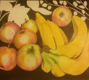
I re-drew the apples from the first part of my sketches using oil pastels to see if there was any improvement on the soft pastels. I actually think that this works really well.
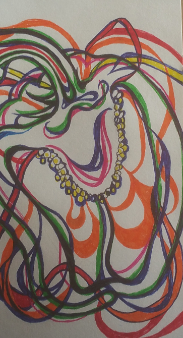
I included this doodle in my sketchbook after reading about ‘Memento Mori’ and being inspired somewhat by the subject matter that these artists paint and draw. I decided to keep it in my sketchbook as it was interesting. What amused me greatly though was that when I photographed it and looked at it as a whole picture and not just the individual aspects of it, I realised that the silhouette in the middle bottom of the doodle looks remarkable like a female bottom wearing slinky knickers. This was quite by accident, though I wonder what my unconscious mind was trying to tell me!!?
This is a bit of a study on just the negative space aspect of the drawings that I was doing initially after researching artists who use negative space in still life. I used a piece of plain cartridge paper and a black felt tip pen for speed. I wanted to have an experiment with negative space in more fine detail as I think it would work better with the style of drawing that I prefer.
These were some really simple doodles on the back of the cabbage study that I included in my first blog post of this part of the course. I used different colours of felt tip pen and a white pencil just to get some idea of colour choices.
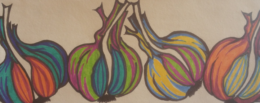
This is a group of garlic based on the study that I did of the garlic. I used garish colours of felt tip pen just to try something new. I actually really like this drawing even though it is nothing like I have ever drawn before and is not anything like the kind of thing I would normally have in my house, I would actually really love to have this on my kitchen wall, it’s great fun and quirky and quite a joyous little sketch!
Another experiment that I did with the drawing of the pepper that I drew (example in the previous post) I decided to experiment with lines to imply the shape and form of the pepper. I actually really like this one too. It is fun and colourful and I like the way that it gives a sense of looseness but in actual fact is really carefully drawn. I used fine liners an biro and just layered up lines and colours to make this effect.
This is a sample sheet of some paper that I made. I used pieces of crumples greaseproof paper which I painted a square of white acrylic pain. I had planned to just do that and draw directly onto it but the paint made the greaseproof paper really flimsy and thin and it would have been impossible to make any kind of marks on it that were pressed harder than a very delicate touch. I decided to persevere with the idea of making this paper and tore up a piece of plain cartridge paper into small pieces and layered them up onto the greaseproof paper with the acrylic paint then finished it with a thick layer of white acrylic paint to make the drawing surface. This made a really robust drawing surface once it had dried, albeit a little bit shiny. I experiemented with a dozen or so different drawing implements (from top to bottom):
Graphite Pencil
Broad black felt tip pen
Colourful artists ink pens
Biro
Soft pastel (I had to put a layer of stick tape over this to stop it smudging as I couldn’t use fixative)
Oil Pastel (again added sellotape)
Colouring Pencil
Regular HB pencil
Ink Fine Liner
Rollerball Pen
Gold Permanent Ink Paint Pen
Sharpie
Gel Pen
The most successful of these with this drawing surface were the HB pencil, the biro, the colourful artists ink pens, the fine liner and the roller ball pen.
With this in mind I did a few sketches on the handmade paper:
This was the first, a whole mackerel which is not that successful. I was really getting to grips with the surface ass I was drawing on it. It was really lumpy and shiny and hard to use but I thought if used in the right way could produce some interesting results.
Mackerel head based on the larger drawing of the mackerel that I did in soft pastels (further down) I think that this is much more successful. I used biro and artists ink pens, smudging and blending the colours for different effects. I used the white background to pick out shiny parts of the fish… And finally:
A brown crab. I think that this one works really well! Again I used biro and ink pens. It looks like watercolours and I think works really well. This drawing is based on the sketch that I did of a crab that I bought from the fish market. I really like this one and think that it is the most successful of the three that I did.
This is a detailed sketch of one of the whole mackerel that I did then cut out and mounted onto a crumpled piece of greaseproof paper which I mounted onto a piece of heavy brown paper. This was not without difficulty as the greaseproof paper did exactly what it was designed to do and wouldn’t stick! In the end I had to use gorilla glue which kind of leaked from behind the sketch and left some weird discoloured patches. I need to look at different types of glue rather than just relying on pritt stick!
This is an A3 sketch of a brown crab bought from the market. I don’t normally have an issue with dead animals, I love skulls and such like, but this felt rather macabre drawing something that actually still looks alive once it is posed. I did this by just drawing in the dark patches and the shadows using cross hatching.
I decided to do a more detailed drawing of just the crab’s leg which I had to pull off. I think this is rather successful though it looks better in the photo than it does in the original drawing- as is the same with the whole crab sketch. I included more detail of the tezture and tone in the crab’s shell.
And finally…. This is an A2 sketch/drawing of the mackerel head done in soft pastel. Though I had sworn off soft pastels I decided to give them another go on a much bigger piece of paper. Gosh, I love this drawing! It is beautiful to look at, really love the detail, which I have struggled to achieve before. What I did differently was to draw it and blending the colours then putting a bucket load of fixative on it to stop it from smudging but also to give the drawing a rough texture again. I have always found that after a while the grain of the paper becomes saturated with the soft pastel and it becomes impossible to get detail onto the paper. From experience I know that fixative makes the surface rough again in the right quantities and I was able to draw onto the fixative with a small amount of biro and then another layer of soft pastel and then more fixative. I think the colours look sublime and I am really pleased with it. My partner really loves this one. It is big and bold and colourful and rich.
Beginning part 2 of my degree course, with lots of sketches of organic subject matter, really exciting to be moving forward with this and getting ready to release the might of my passionate self! Hear me ROAR!!!
Starting part 2 of the first part of my degree has been somewhat easier than the first part. I seem to be finding my pace a little bit and enjoying the process a LOT more.
I am really happy with the comments from my first assignment, lots of positive feedback and comments that I can work on (such as adding a separate menu to my blog for the assignments and learning log relevant to the degree course and several artists who I will go and research who might inspire me and be relevant to my studies!). I was amazed most of all about the fact that my tutor said that I had submitted a lot of work, when I thought for sure I hadn’t done nearly enough!
One thing that I was really thrilled by was the suggestion that I might do more of the personal art that relates to my feelings and enjoy doing so, connecting more with whats going on and being more passionate. I feel that I have managed to do that more in this second part and also stay more relevant to the degree course in the process. Athough still life is not something that I have really felt that I could throw myself into in the past, I have REALLY enjoyed the process so far and have heaps of ideas that I would like to explore moving forwards.
First I just put a load of natural objects that I found in the house in a still life arrangement to do some preliminary sketches. I photographed the still life from several different angles to see what they looked like at a glance, some of which I have included in my sketch book, then I did a sketch of the whole thing from above and front and then a few more sketches of the angle that I most liked the look at and refined the idea of using negative space. I have researched several artists using negative space and still life subjects online and really enjoyed looking at other artists work.
“Guernica” Picasso
I chose this hugely famous and enormous piece of work by Picasso as an example of work to look at and explore because of his use of lots of contrast, though it is not a still life piece, I love how he has managed to create such an imposing piece of work that feels oppressive with so few colours. I have not seen the originals to any of these pieces of work that I have chosen, sadly, though can only imagine how completely overwhelming this piece of work that he created must feel in person. It is absolutely huge for one thing and the subject matter, though disjointed and in the cubist style is disturbing and feels almost aggressive. I am not fully “au fait” with the actual meaning of the piece of work as I refrained from looking at the intention of the piece until I want to look at it in more depth wanting more to explore my reaction to it and understand how it makes me feel just by looking at it and absorbing the feeling that it evokes. Honestly it reminds me of the feeling that is in the world around me at this point in time, in a political sense. I can feel a real sense of despair when I look at this painting and feel exhausted and despondent, there is a really impactful aura of loathing that I can’t tell if maybe I am feeling because of what is happening in the world in real time and I am looking for in this painting, or if it was actually the artist’s intention to evoke that kind of real visceral response?! It reminds me of people being forced to do things against their will and being hurt in the process. This is the first time that I have really allowed myself to look deeply into a cubist painting, (which is probably shocking for an artist!) and I must say that I am surprised at the level of the feeling that it has triggered in me. I feel almost breathless with the heaviness of the feeling of being almost crushed.
Giovanni Ambrogio Figino- “Metal Plate with Peaches and Vine Leaves” 1591-1594
I love this painting, the peaches are so soft and real looking. One thing that I thought looking at this picture was that when I am drawing a still life picture, something that I would like to do is marry up the detail and realism of the subject matter- fruit, vegetables, fish, seafood maybe? with the stark and plain negative space. I love how the focus is all on the fruit and the foreground- in this case the fruit and the leaves and the plate, but if the background was detailed or a lighter colour, the fruit and plate and the leaves would lose all context and vibrancy. There would be a real sense of things being lost if there was a paler or detailed background in this picture and the heaviness of the negative space lends a real warmth to the peaches that I think would be lacking if there was any more detail in the background. This is something that I would really love to use for my own work. I will explore more about negative space and incorporate this into my own work. I adore drawing organic objects and would love to tun out something with this much warmth and gentleness.
Enter a Georgie Morandi “Grande Natura Con Lampada A Destra” 1928
This is the only drawing (as opposed to painting) that I have included in this selection of other artists and I included it partly because of this fact and partly because I liked the effect of the use of negative space (again) and the mixture of shapes in the subject matter. It is somehow a combination in some ways of the Picasso piece and the still life above, in as much as it is very geometric (such as the cubist Guernica) and it includes really good use of negative space. I have never heard of this artist before and though this is not a piece that I particularly enjoy looking at, it is useful in terms of how I can use it to influence my own work. This really makes me interested in using negative space and actually at the point at which I saw this drawing I started to sketch my still life with more negative space in the background which was an effect that I really like. Again I find this piece rather bleak and depressing and heavy, which I am surprised at because I wouldn’t expect to have an emotional response towards a collection of jars and containers drawn in blacks, whites and greys… I have decided for sure that I am way more interested in drawing and depicting images of much more organic subject matter. I love the twists and turns and curves and dips and divots and beauty of natural objects and the human form (though I will have to wait my turn to get into the drawing of bodies jsut yet!)
Jan Bruegel “Bouquet” 1599
I’m a huge fan of Bruegel, I studied some of his work for my A-Level, and wasn’t so much aware of his still life work as I have really only looked at his more sinister scenes of death and destruction with skeletons and mounted warriors and their wholesale murdering of crowds of people in bleak and depressing landscapes. This was a surprise and I saw the picture and selected it before I even knew who had painted it. Again, flowers are not something that I would necessarily choose to draw myself, I love them and have painted hundreds of them but they are not something that I have drawn many of, the reason I chose this painting was because here Bruegel has chosen a very organic subject matter and as I said, this is what I like the best. I also was really keen to seek out more work from artists who place emphasis on both the detail and tone and feel of the subject matter using colour and realism to depict the flowers in this case- the peaches in the painting above- and the heaviness of the background and the monotone of it which in relation to the detail of the fruit I would have imagined would have almost ‘drowned out’ the colour and the tone of the natural object but in actual fact I am amazed that rather than the background jumping forward and obscuring the beauty of the natural objects, actually helps to bring them forward and define them, making the softness even more so by way of being such a stark contrast. Almost as if in juxtaposing the softness of the detailed fruit with the blank and stark darkness of the background, both are emphasised and compliment each other. This is a surprise to me and something that I hope I can do justice.
So this is the still life that I put together on a board on a Lazy Susan so that I could move and turn the still life to get an angle and frame it in a way that I liked best. I took a good number of photographs and sketched a couple of different angles until I found the one that I liked best.
This was the first sketch I did of the whole still life. I hadn’t really given much thought to the idea of using just a section of a still life composition before, pretty much always just assuming that if I put together a still life set up, then I had to draw the whole thing in one go! when I started looking at the photos that I had taken I realised that the reason that this sketch is not very successful, for the most part is because there is no sense of a focal point in this sketch, there is too much going on, the eye is not drawn to any particular part of the drawing, there is just too much going on. I realised that there doesn’t even have to be an object in the focal point of the picture for it to work either as I moved forwards drawing different sections of the composition, there simply has to be a flow and a place to which the eye is drawn. In later sketches I used the lines of the bananas and the framing of the apples and the negative space to being a sense of completion to the pictures.
This was the second sketch I did, drastically decreasing the number of objects in the drawing and wiping out the background, giving the drawing a bit more negative space. Removing a majority of the objects in the picture immediately improves it, though i was still not happy with the overall look and framing of the objects nor the angle that I was happy with, I think that this drawing is much more successful than the first.
I decided to experiment with different materials at this point whilst I made my mind up about which angle I liked best. This drawing was done on a coarse graned paper using black biro and graphite pencil. This is in more extreme close up than the first and second as I was more interested in the look of the materials that I was using. I like the detail in the drawing but I think that it really loses something by not having any colour in it, I also really think that it needs more negative space in the background and a better sense of flow and direction to make it work.
This was the first picture that I drew with colour for this composition. I used a coarse grained paper again and used soft pastels. I was not happy with the result of using jsut soft pastels, though I liked the colours, I was unhappy with the level of detail that I was able to achieve using just the pastels because they don’t lend themselves to the kind of realistic fine detail that I like to portray in my drawings. I was really getting into the process of finding the materials and composition that I wanted to settle on at this point and really finding pleasure in the work. I decided to use the colouring pencils that I so love to use and try a different angle with more negative space in the background too.
For this first sketch using a different angle of the still life I just used pencil and did a quick sketch, for speed more than anything just to see if this change in angle was what I wanted to achieve. I was really pleased with the look and the feel of the picture and felt really excited about drawing the picture with colour. I love the use of negative space, mixing up detail in the foreground and then just drawing the outlines and using monochrome in the background leaves. As it turned out I really really like the composition of this drawing. It really works. So I decided that this was the composition that I would like to use if I take this drawing further. I went on to draw this using the colouring pencils and being a lot more heavy handed with the background negative space.
I love this drawing. I love these pencils so much! I think that the detail on the fruit works really well with the plain black background. I love the different colours in the apples and the cheerful bright boldness of the bananas. I love the way that the leaves and twigs pop out in the background juxtaposed against the heavy black of the negative space and really emphasise that space, without the colours and the warmth in the foreground fruits would be lost. I think this works really well, however I drew some tiny sketches in my sketch book, increasing the height of the background and making the overall feel and direction to the drawing much more pleasing. I don’t have a photo to share of those pictures. I plan to draw the picture larger and in those dimensions as a sort of ‘final piece’ as I think it works so well in a small sketch.
I then moved onto my next subject matter and drew a bunch of detailed veggies and some mackerel.
First up was this cross section of a red cabbage. I drew it using prismacolor premier pencils on brown heavy brown paper. I really loved drawing this cabbage, it was a really wonderful thing to draw. I was amazed at just how many colours were in the cabbage. It looks at first glance to be “just” purple and white, but on closer inspection there are all layers of purple, burgundy, mauve, red, white, grey, creamy yellowy colours, brown, it was absolutely fascinating to draw. I love how the lines are so swooping and curvy and the layers remind me of the cross section of a tree trunk. I love the way that the purple started to bleed more and more into the white with different tones of red and purple. I decided to draw more vegetables and other food with the same materials in order to study them more closely. I really love the effect of the lovely vibrant colouring pencils on the brown paper, though I will be exploring other drawing surfaces too.
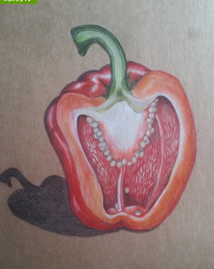
After I had finished the cabbage, I decided to look at a red pepper in detail. I chose the same materials to draw with as the cabbage had been so successful. I realised that I have drawn multiple peppers over the years but never truly looked at one in great detail and just on a whim I decided that I would like to take photos at regular intervals whilst drawing this picture. I wanted to learn a bit about my own process, how I put together a sketch and the different stages of it. To my amazement, when I looked back over the photographs I realised that I am actually incredibly organised and methodical when approaching this type of drawing. In my life outside of drawing I am so messy, disorganised and somewhat chaotic at times. so it was a real surprise to see that there are also times when i am able to be very neat and considered. I think that this is something that I need to harness in other areas of my life, such as meeting deadlines for important events, both in and out of my degree course, and being more organised in general, I have the ability I just need to grab hold of it! I also thought a bit about how much I struggle to create when my home is in a mess. This has been something that has held me back enormously in the past. I have literally held the art of creating as being something sacred and had a distinct need to be organised and ‘proper’ about it. This really makes me sad because it contradicts what I know about my need to be creative… Yes it is a sacred and wonderful part of me, the ability to create, however, I think my need for perfection, that is unattainable for one thing, is so intense that I actually think that I hold myself back in so many ways. I think that particularly after the rape when I was 19, the fact that it revolved around my artwork has really thrown me off kilter. I have, since then, had a need, a genuine desperation to almost keep my art sterile, to stop it from bleeding out from its neatly contained edges. This has meant that the actual work that I have allowed myself to do is most often involving me really holding back and not putting all of that raw passion that I know I feel into the art work.
Being bipolar particularly has a huge impact on the way that I feel about my artwork, not just art in the classic, visual sense either, other disciplines such as music, drama, dance… All of these things move me deeply and I feel such a huge visceral reaction to hearing/seeing/experiencing beauty and pain and fear and sadness and love in a creative sense and I know that this is something that lies bubbling under he surface just waiting for an outlet to really get going with it. I have so many ideas and thoughts that I literally yearn to produce and make into a real tangible work of art, yet for the reasons I have said, the need for sterility is so pervasive. I can’t adequately describe using words the feeling of absolute euphoria that I get when I am manic nor can I find the ‘right’ words to describe the despair that I feel when my mood plummets. The contrast I guess like the fruit and the negative space, only more so. Maybe this is what draws me to the concept of the beautiful, natural raw warmth of the organic matter and the juxtaposition against the cold, hard, black negative space. It literally somehow describes me, albeit in a watered down kind of way.
What I really want to achieve is the reality of those feelings-NOT the watered down version! If I can’t say them, I can’t sing them, dance them, describe them…. The obvious solution is to create them using art as my medium….
I feel like I am on the cusp of something wonderful, though maybe that is just my mood?!
Reigning in those thoughts for a moment and coming back to the methodical and purposeful creation of the pepper sketch, this was the final outcome of all those stages of creation:
I was happy with the pepper, I still am, but I really, really want to let loose, not be so controlled and contrived, let rip with all of that raw passion and joy and aching pain that I feel so much of the time.
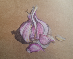
I think that the next sketch, a small sketch of a garlic bulb with a couple of loose cloves that I pulled out of the bulb is rather sweet, but again lacks the passion and feeling:
I do like this sketch but I think it lacks definition, though again I was amazed by the number of colours that I had to pick out of my pencil tin in order to capture the true likeness of the vegetable. I think that I have also managed to achieve a good sense of the papery skin of the bulb, and I really like the natural sweeping curves and lines of the drawing. It is pleasing to look at and it is something that I would consider using in a final piece.
After I had drawn some vegetables and really examined them, I read onto the next part of the folder and discovered that I had wandered unwittingly into a wonderful part of the course, where I get a whole chunk of time to devote to drawing natural objects. It was suggested to me that I might look up the ‘Memento Mori’ arena of artwork. A short definition here: “Memento mori is a Latin phrase meaning ‘remember you must die’. A basic memento mori painting would be a portrait with a skull but other symbols commonly found are hour glasses or clocks, extinguished or guttering candles, fruit, and flowers.” (taken from this website here). All of these suggested objects are things that I am interested in and the idea of the memento mori style of working really appeals to me, especially in my darker moods, but not restricted to those times. I love skulls, animal and human and am desperate to procure more of them to add to my collection (currently consisting of a single sheep skull! So not quite a ‘collection’ yet, per say….) I remember drawing a skull several times when I was a teenager as we were lucky enough to have a real human skull in the art department at school, since then I have been on the look out to get hold of a real one myself. Though I guess a really good replica would suffice.
Anyway, I somewhat deviated from the subject matter of a typical memento mori piece of work, but feel that with the next couple of sketches (again using prismacolor premier pencils and and heavy brown paper. I bought and drew three whole mackerel. These fish are astonishing to look at. The colours that they are made of are absolutely beautiful and the beautiful gloss and shimmer of their skin is just a joy to behold.
This was the first drawing I did of the recently deceased trio of fishies, I was again amazed at the colours, this has been a theme so far in this part of the course, ans I was also amazed at how much the facial expressions varied from one fish to the next. Interestingly though several totally independent bits of feedback have been given to me that the fish look really sad and despairing. I didn’t draw them deliberately with this in mind, but with the political climate the way that it is at the moment with the calamitous outcome of the Brexit vote and terrorism being rife in all corners of our spherical home, then most recently the rise and rise of Donald Trump dominating the world media, I have really been feeling the anxiety and confusion that so many of us are feeling during these uncertain times. It is no surprise then that the objects that I chose to draw that were once alive and have faces show some of that anguish that is malingering in our communal headspace right now.
I was really engaged in drawing these fish, I truly loved the whole process. It was a joy, a real genuine exciting joy to draw them and to work at figuring out ways to do the beautiful animals justice.
This was the second mackerel drawing, again the same challenges, colours, the shine, the expression on it’s face, the last remaining vestiges of a short life, forever captured in my sketchbook!
They are a true rainbow of colour and a blaze of shimmering and fiery gloss. Simply beautiful, sometimes silver, sometimes golden, sometimes blue, sometimes green, Even their eye colour varies from fish to fish. I had no idea. I thought they all pretty much looked identical!
After drawing these fish I feel moved to draw other seafood, crabs, prawns, a lobster if i can afford one! Other fish, different types. And a HUGE urge to pursue my need for at the very least a convincing replica of a human skull….!
I have also decided to experiment with not only other drawing media but other types of drawing surface, fabric, different types of paper, card, plastic, metal, tin foil. After drawing the last mackerel I actually created my own drawing surface out of a piece of screwed up grease proof paper, onto which I painted a block of white acrylic which I planned to draw directly onto. This was not actually possible as the acrylic was wet and made the grease proof paper very flimsy and thin. So I used my imagination and tore up a piece of white cartridge paper into small pieces and stuck it in layers onto the acrylic paint with layers of paint in between the paper and finally a thick layer of white acrylic over the top of it. I was planning to draw on to the dried rough surface with graphite pencil, but when I tried to make a mark on the ‘paper’ that I had created with a graphite pencil it barely left an impression on the shiny surface, I decided to have a go at drawing a rough sketch of the mackerel directly onto the paint with blue and black ball point pen. This was somewhat successful, however I plan to experiment with making more of these alternative drawing surfaces and trying out other forms of drawing materials on them, ink, pastels, oil pastels, charcoal if it will work. I will include samples in my sketchbook and upload photos when I have them.
Over all I am thoroughly enjoying this part of the degree course and my art studio is nearing completion at long last, so in the near future I will be able to move in there with all of my materials and a huge dose of enthusiasm to get things moving….
But that’s another blog post entirely.
For anyone who has stayed with me to read til the end of this enormous blog post and stream of consciousness, I thank you and I am grateful for your time.
As I have already shared, this has been a difficult time with my mental health and physical health too. (Actually I think I only shared that my mental health has been poor, I didn’t mention my physical health…) Well my mental health has started to stabilise now, I am feeling a lot more ‘together’ and ‘with it’. Physically though, there is a very different story to tell.
I have been suffering with a huge flare up of whatever is wrong with me. My GP is sure that all that ails me is fibromyalgia, but I can’t help feeling like this is a somewhat ‘dustbin diagnosis’; basically I feel like I have had the label of fibromyalgia slapped on me because nobody can be bothered/will make the effort to run necessary tests and diagnose me with the actual thing that I am ill with! .
Starting from the bottom up, feet first, there is literally not a part of my body which does not cause me pain, though for the majority of the time it is in my joints, not just soft tissue. I also have very hypermobile joints, meaning that the flexibility in my joints is over extended, even though they are sore and tender. My ankles particularly are very weak and I fall a lot, though this is not just the joint pain causing me to fall, but the fact that in addition to the pain I am in, I also suffer with chronic debilitating dizziness. I have had this investigated and the only things that they were able to say with certainty are that a) I have a rather low blood pressure, which stays low even when I have been standing for a while, and b) I have something called psychogenic syncope which roughly translates as “falls over because of psychological reasons”.
I cannot argue the low blood pressure, there is evidence to back that up, but the psychogenic syncope, which is rather vague, basically means that because of my mental health I have fainting fits. It seems to tie in with the dissociative symptoms a lot. I have had several really nasty falls which have occurred at times when I have been blissfully unaware of the fact that I am even awake, let alone not maintaining my balance.
Twice I have broken bones in my altered state, the first time I cracked my cheekbone, not badly but badly enough that 18 months later it still gives me pain. Then last time I did some serious damage whilst unaware I broke my top thumb knuckle into three pieces crushing it under a chair. I don’t actually remember the breaking of the bone, but when I woke up, some part inside me had had a field day wrecking my living room in bizarre ways…
I woke up in the morning with an extremely sore thumb. I was, at that time, being assessed to see if I had Lupus- still a possibility but they have not taken that ‘evidence’ seriously or to the next round of testing because I think that they think I am making a fuss about nothing. Anyway I woke up with a sore thumb and assumed that it was joint pain, so I put a heat patch on the whole of my thumb and held it in place with a wrist splint. I then set to cleaning my flat because I had had a huge flood in here, unbeknown to me I was cleaning vigorously with a shattered thumb knuckle. I cannot even describe how painful it was. Anyway, I took the heat pad off and saw that my thumb had gone several shades of purple and was nearly three times it’s normal size, so my friend brought me to A & E and we discovered that not only was it broken, but badly broken. Six weeks minimum in a splint after 2 weeks in a full arm cast. NIGHTMARE. It was also my right thumb I am right handed- which made everything difficult and lots of things impossible.
What upset me the most though was the fact that I had and still have no recollection of the fall. When I woke up the scene in the living room was really disturbing. I had spread several packs of gardening seeds all over the coffee table, I had placed plushy dog toys under all the legs of all the dining chairs. All my photos were upside down. All of the blankets and cushions out of the living room were in a pile by the front door. One of the dining chairs was lying down- which the doctors and so on thought was how I broke my thumb by falling on the chair and crushing my thumb underneath it. scary stuff. I had also emptied two pencil cases FULL of pens and pencils into my bin. It was so weird. Like I said though, I still have zero recollection of what happened that night and it was traumatic piecing it all together.
Anyway, the reason for my bringing this up, and getting side tracked (hahaha, nothing new there!) is because my physical health is really dreadful at the moment. I have had five falls in the last two and a half weeks. smashing my phone, getting gravel all embedded in my hand and knees, covering myself with mud, denting my ego rather spectacularly, and mostly really hurting myself. Part of the problem is lack of awareness and the fact that I have done myself real damage.
So yeah the physical side of things is really not good. I am having to use my crutches more and more to enable me to leave the house, and I HATE it!
Having said that, the lack of mobility means that I have ample time to sit and draw. And once I had gotten over my hump of not being able to draw, I was drained and depressed and mentally not in a good place.
I began to draw things out of the garden, flowers, leaves etc, and from photos that I took on holiday (Pete the Duck for example!) and using different media to emphasise tone and texture.
Pepper from the garden (graphite pencil)Chillies from the garden (Graphite pencil)Collection of Peas from the garden (pencil and colouring pencil and biro)Banana (colouring pencil and biro on brown paper)
I did a couple of drawings of flowers after I had enjoyed doing my Iris pictures so much, but found that they lacked the depth and detail of the irises, I think that I just prefer the colours and the shape and the unusual markings of the irises more than I do on these flowers… they would make good greetings cards but not much else…
Asiatic lilies from the garden (pastel and biro and pencil on blue pastel paper)“The welcoming committee” pansies from the garden
And then I did a few other different pictures, the “Pete the Duck” pic being one of my favourites!
“Pete The Duck” Otter Falls Cottages, Devon, drawn with felt tip pens, colouring pencils and minimal biro on sugar paper.Sea shell, drawn with colouring pencils on brown paper, experimenting with using different colours for shading rather than just black/grey/brownMy left hand- soft pastels and biro on sugar paper.
Not so happy with the hand one although I like the colours, it came out somewhat chunkier and more manly than my actual hands! Still an interesting and fun picture to draw, it was difficult to achieve the fine detail with soft pastels on a paper with a bit more tooth.
Finally I drew some pictures of non famous people, one was a commission piece of work for a birthday present for the person who was the subject of the portrait- and she loved it! wow! the other ones are my cousins, Maisie and Reddvers.
“Tia” Commission piece for the lady in the pictures’ birthday“Reddvers” my young cousin, very sweet photo of him taken by his sister, Maisie“Maisie” My cousin, given to her as a gift, graphite pencil and biro on white cartridge paper.
Maisie loved her portrait. She is still very young (13? 14?) but an incredible artist herself, so busy drawing everyone else that she doesn’t do any of herself and nobody else does either, so it was a nice surprise for her to get it!
Re-engaging with the drawing of objects form the garden, animals from photographs and other organic items was so much fun. I enjoyed it and managed to include some of the items from previous work
Still Life, charcoal on cartridge paper, A1Portion of the same still life, charcoal on cartridge paper.
As you can see I included the skull that I eventually had in my final piece in these two still life studies. Actually I had never drawn a picture exclusively in charcoal before and though I was at a disadvantage, my paper was flat on the table as I did not have an easel or a drawing board that would allow me to elevate the paper, thus I ended up with a wonky picture with poor perspective as It was being drawn flat on the table. It actually looks worse in the photo than in real life because I had to angle the camera in such a way that it actually took the picture, let alone managing to get the perspective corrected. I will be investing on a tilting A1 drawing board just as soon as I can afford one as it is absolutely essential unless you keeps stopping and standing over the picture and preparing to draw the lines in using a ruler for accuracy, it would really make my work a lot easier to have a board on a stand so that I am facing my work rather than having it stretched out in front of me looking all wonky when I am done with it! still, I had a go and having never drawn a picture exclusively in charcoal before I was actually pleasantly surprised with the results!
Odilon Redon was born in Bordeaux on April 20, 1840 and died on July 6, 1916. The young Bertrand-Jean Redon acquired the nickname “Odilon” from his mother, Odile. He started drawing as a ten year old and even won a prize for his drawing but upon his father’s insistence switched to architecture as a teen. He failed to get into the architecture school at Paris’ École des Beaux-Arts which ended that career before it started however continued to study painting there in 1864 under Jean-Léon Gérôme before returning to Bordeaux, where he took up sculpting. He studied with the draughtsman and engraver Rodolphe Bresdin who introduced him to etching and lithography.
He continued with his artistic career until 1870 when he was called to fight in the Franco-Prussian War.
After the war he returned to Paris and worked almost exclusively in charcoal and lithography and entered his “Noirs” period, making what he called his visionary works, almost entirely in shades of black. This picture above and the one below are very similar in their composition and feel, though done almost 20 years apart:
“The Trees” C1090’s
I have picked out a number of his works spanning the era of his use of charcoal and which reflect a wide variety of his works during the period of 1875 up to 1900, all of which show great depth, tone and shading which Redon portrayed so well.
In the first two pictures I am instantly drawn to the centre of the picture by the lines of the trees, the depth and shading give the picture a feeling of mystery and gloominess. I feel a heaviness in these two pictures which is alleviated when I inspect the pictures more closely and see that he has picked out spots of light and dappled greys on the bottoms of the trees, implying a more fantastical quality to his work, almost like he is illustrating a fairy tale about a deep dark woods.
At first the pictures look heavy, verging on clumsy, but when I study them more closely, there is fine detail in the twigs and fronds of leaves in the undergrowth. In the first picture I feel almost as though the relationship between the two trees is almost conspiratorial, secretive and as though one tree is whispering to the other, the trees seem to take on a more human form. In the second picture the trees are leaning away from each other, like they have fallen out, it is almost as if the second picture is the conclusion to the first picture when viewed as a pair.
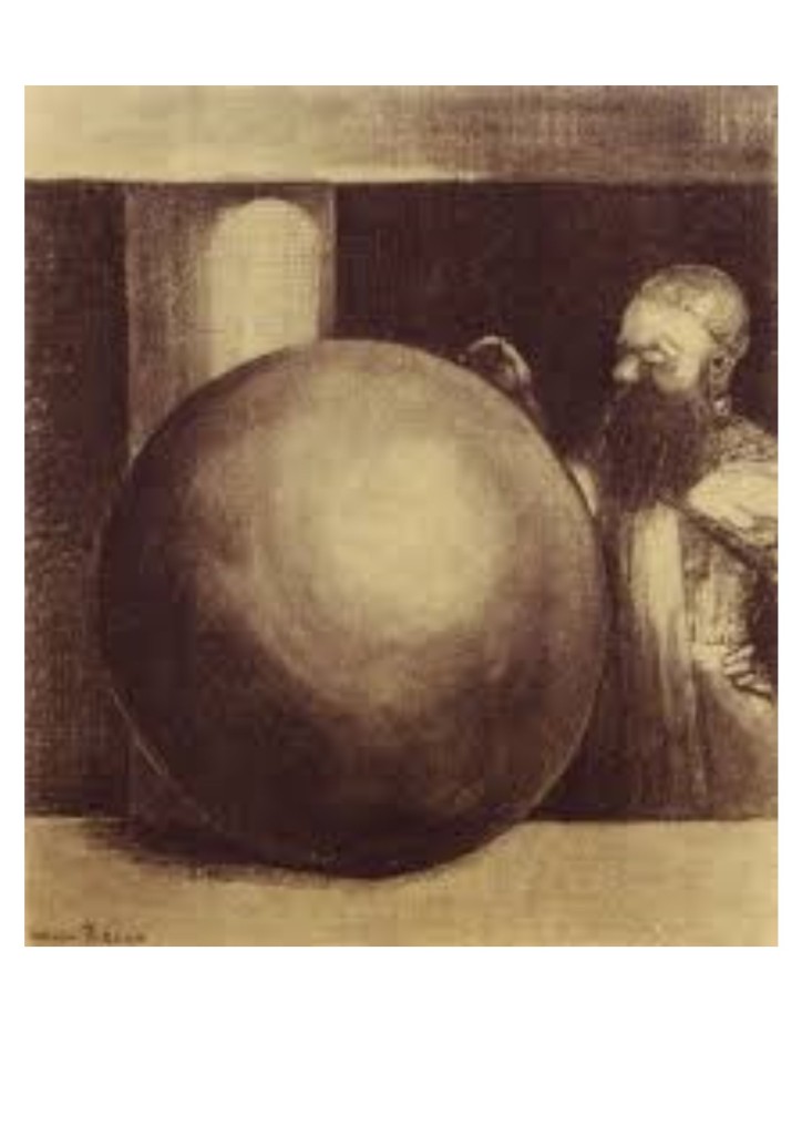
I decided to look at the way that Redon has used shading on more spherical objects, using the patches of light and dark to give weight and imply lightness also:
Unknown. (could not find a title or year for this but it fits in with his other ‘noirs’)“Sphere” C1890’s
What I think is amazing about these two pictures is that the subject is the same, the sphere, yet with a difference in shading makes the top one have such a hugely heavy weight like a giant cannonball and the other looks light as a feather, like it is floating. It shows that with the right kind of shading any ‘weight’ of object can be achieved and the shading that he has used in these pictures gives the objects a very 3D appearance. I also really like the delicate use of shading on the lighter areas of the object and the lighter areas on the pictures as a whole. There is no solid ‘line’ around the whole sphere in either picture, all of the shape is implied using shading.
“Smiling Spider” 1881
Odilon Redon was greatly inspired by the author/poet Edgar Allen Poe, though he had been dead for 33 years at the time that Redon was involved in making lithographs. Although his picture seem somewhat surreal, they are not classed as such, instead being described as realistic yet macabre and ethereal, Redon described his work in the following way: “I approached the unlikely by means of the unlikely and could give visual logic to the imaginary elements which I perceived.” [more about this can be found here]. Above and below are a couple of his Edgar Allen Poe inspired pieces:
“The Crying Spider” 1881
I really like how Redon has implied menace and the macabre through his use of heavy black and minimal light areas picked out of the blackness. Again on first viewing these pictures they have an air of naivete but on looking, and really seeing the mages, there is a certain maturity, a conveying of real emotion which is achieved purely through the sensitive use of one colour.
sometimes life just shudders to a despondent halt…..
Alan Rickman ‘Life is difficult sometimes’
I realise that it has been some weeks since i last posted a blog update. Two of those weeks have been spent on holiday in Devon- a perfect excuse to bring out the pencils and paper and draw to my heart’s content… the other weeks I cannot account for other than a feeling of bewilderment and discontent. I have struggled to manage my time, I have struggled to manage my moods and I have struggled to manage my motivation In short I have drawn and written very little and done very little else of consequence with my time- other than waste it!
The date is drawing ever closer and I am drawing ever decreasingly towards the installation of my art studio. I should be excited, I should be climbing the walls with joy and gratitude, and instead I feel as flat as a pancake.
I have nearly finished my research point, the first one in the first part of Drawing 1, discussing some of the works of Odilon Redon. I anticipate that this will be complete some time this afternoon and I will publish it before the afternoon/evening is over then I can dedicate the rest of the week to finishing and handing in the first part of my degree!
I can’t help feeling that this is something of self sabotaging behaviour. I have enviably got exactly what I want, the course, the support of my partner, friends and family, the promise of an art studio…. plus all the basics, a roof over my head, more than enough food in my belly, people around me who I love. This should be easy.
But it isn’t. Life with some mental health difficulties is not easy, there is much that I don’t understand about myself and much that I do. I understand, for example, that I am given to sabotaging myself when things are going well, I do not, however, understand why I do that. Maybe it is fear of succeeding, of actually getting something right. I am managing to sell portrait commissions both of animals and people and these are very warmly received and appreciated, this is good, so what do I do on the back of this? I retreat further into myself, find that space of safety inside and put on that brave face for the world to see when inside is just chaos.
Let me give you an example, for want of a better way of explaining it, imagine that you are made up of lots of different parts. It isn’t difficult. Imagine the language you use when you are talking about an inner conflict about making a decision about something, for example. You might say ‘On the one hand I feel like <example>BUT another part of me feels like <example>….’ or ‘part of me KNOWS that isn’t the best way of doing things but a bigger part of me just thinks ‘fuck it!”. Now you have in mind those conflicting parts of yourself, we all have them, nobody is just a straight down the middle, always in one mind about everything kind of person, we all experience internal dilemma. So imagine then that those inner parts of you are actually very defined and have their own personae, they don’t just represent a differing point of view that you have to yourself, but actually take on characteristics that are completely different to your main character. Like me, I am, in my core self, the part of me who does the most me-ing, pretty flighty, given to swings of mood and temperament, sometimes, sometimes often,anxious about a lot of things. I am driven, I am creative, I am a lover of life, an optimist, despite the anxious streak. Now imagine that there are other parts of me who are well developed and conflicting with the core me, there might be, for example, part of me who is oblivious to any of the trauma that I have been through…. There might be younger child parts who are, in turn, skittish, playful, funny, childish, traumatised, curious, Yes I contain all of those qualities as core me, but those child parts might embody a certain quality in particular, so one child part might be particularly curious, another one particularly playful, one very traumatised, one pre-verbal, one very noisy and bull headed. Maybe there is an adult part who is able to deal with the bill paying, the refund getting when something isn’t right, the phone answering the taxi calling, the doctor appointment attending. There might be an adult part who is very, very critical and mean, a masculine part or maybe two, maybe a self abusive part who likes to sabotage things for the other parts when they are going well, because if we sabotage it for ourselves then nobody can wreck it for us…. Just imagine, for a second, ALL of that happening. AT ONCE.
It gets VERY noisy in here.
I feel weird even posting this as it is so personal, but I promised myself that I would share uncensored the process of this journey and this is something that plays a very big part for me. I am not on my journey alone with this degree, with anything, even when I am by myself. Of course there are times when none of this matters, when I am able to just ENJOY something…. like Game of Thrones, for example. Its not suitable for the younger bits of me, but they can take themselves off to a corner of my mind and amuse themselves whilst adult, coping, managing, grown up me gets to do something for myself. And it’s not all bad, when there is something that I, core me, finds too difficult to cope with, there is always some other version of me who can pick up the pieces and carry on. But it is not without complications. There are very stubborn combatant parts of me who like to cause arguments and trouble for core me, I’m not always aware of time passing or when someone else is doing something, I am not always aware of it. Like the part of me who is writing this, I am very aware of what I am writing, some other part might get a nasty shock when they read it later though!
The upshot of all this is that I have to take things easy and be gentle with myself. I have to be kind to myself and patient because not all the me’s are up to date with the other ones, and most of all I have to remind people around me that I am not always firing on all cylinders. Something that to part of me might seem very straight forward and simple, might suddenly become completely impossible and difficult. I am lucky.. I have a family who are willing to make sense of this with me, I have a partner who is supportive of my pursuits though doesn’t always understand my reasoning, is for the most part willing to join me for the ride. I have good friends and a support network who are helping me to figure things out as I go along.
All these things impact on my ability to function on this degree course.
Alan Rickman ‘…But it’s not all bad’
So on that note, now that I have got that off my chest I will resume with my work, my writing and my drawing work, I will continue to plug away at the degree course and do my utmost to get a good result.
Thanks for trying to make sense of something that doesn’t really make sense to me. I appreciate the concentration span of anyone who got through all that in one piece! off to work I go!
Having enjoyed the texture studies so much I decided to carry on doing some drawings of items from nature to explore texture using other drawing media than just pencil. I particularly enjoy drawing with biro, colouring pencil and graphite pencil together for a really dark and detailed effect. I started out drawing this shell from two different angles, the top and the underneath:
Spiny shell from above, biro, graphite pencil and colouring pencilSpiny shell from underneath with graphite pencil, biro and colouring pencil
Having enjoyed drawing this object from nature I decided to collect a group of objects from a dog walk and my garden, an iris, a stick, a stone, some fuchsias, holly and a pine cone. I decided to draw directly into my sketch book onto the brown paper rather than on white paper and sticking it in. This was the result:
Brown paper study, Stick, Iris, Holly, Stone, Pine Cone, Fuchsias; Biro, graphite pencil and colouring pencil.
I’m more or less happy with this, although it is a study I still like the composition of this the way the items are stacked together, though there are no real shadows cast between the objects as the light was really bright in the room and not from any particular direction, I will be using a spot light in future as I will need to light still life set ups from at least one side and my table is in a dark corner f the room.
In the future when my studio is built (it’s being built on September 8th, I’ve been keeping a countdown calendar!!!)I will have a huge table to draw on (80cm deep by 180cm wide) which will be height adjustable and a MUCH better chair that has been made for me to suit my needs. I went to get assessed or these a few days ago and they should be manufactured by the time my studio is finished being built. The table will be side on to the window in the studio so there will always be a side on light naturally but I will also be investing in a lamp with a daylight bulb and spot lights for lighting up still life and objects to be built. I really cannot wait for this to be built as it will help me enormously in the pursuit of the right working environment…..
Anyway, after the mixed natural objects texture study with mixed media on brown paper, I realised that the combination of drawing media and the brown paper was beautiful, so I decided to do a more detailed study of just irises, which in my opinion were the better of the flowers that I had drawn in the previous study and chose a photograph of last years irises and long grass like leaves.I really really enjoyed drawing the picture that I ended up with:
Irises and buds on brown paper, Biro, Graphite Pencil, Coloured Pencil
Like I said, I am really happy with the outcome, I love the detail and the many, many shades of blues and purples in the flowers. Again, drawing these irises has increased my respect for nature, the exquisite detail on the petals, all the different shades of burnt orange, blues, purples and greens, as well as burgundy, red…. the veins in the petals….Here are a couple of drawings of my progress whilst I was doing the picture, different stages and although I think that the detail is lovely without the finer detail being added by biro, I still think I prefer the more detailed version.
Irises Progress 1- first basic iris drawn with graphite pencil and colouring pencil, not yet completeIrises Progress 2- Getting the second flower down, looks a little fuzzy round the edges until I added the finer detail in with biro
I love the brown paper as a backdrop and can’ believe I have never used brown paper to draw directly onto before and I am thrilled with the results so will be investing in some large sheets of it for future work.
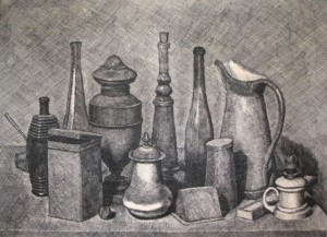
I have also constructed and drawn my first collection of objects for still life work. I chose a sheep’s skull, two class vases, a glass bottle full of water, an empty glass jar, a leather bound book, a glass paperweight and a large piece of calico fabric. I set up the still life on my table and because of the lack of natural light I decided to play with ways of lighting up the piece with different forms of light to cast interesting shadows and to play with reflections and shade In the end I decided on two sets of 4 tea light candles in two spaces in front and to the side of the still life set up, this made some beautiful twinkly light reflecting off the glass and shiny objects as well as some really interesting shadows on the non shiny objects.
I chose to work on off white cartridge paper, A2 in size and use charcoal, just plain willow charcoal sticks in various widths and a putty rubber. I have only ever used willow charcoal once and that as for lie drawing multiple five minute rapid pose sketches and am not familiar with it’s imitations or benefits, so I thought would give it a shot.
I decided to do the whole still life arrangement first on one sheet of A2 paper and found charcoal really difficult to work with I would like to redraw it on black sugar paper with chalk and charcoal together. It was a difficult medium to use as it smudges really easily and makes a huge mess! However as this was my first ever attempt at drawing seriously with charcoal I am pretty happy with the results. I think I got enough detail to make each aspect of the arrangement identifiable. The actual picture is not on the tilt like the photograph depicts it to be, the lines are pretty much straight, though this was difficult to achieve because I don’t have a tilted drawing board at the moment so I was working flat which messed somewhat with my ability to get the perspective correct. When I get my art studio I will be investing in a table top drawing board which tilts to avoid this difficulty occurring in the future.
This is a photograph of the first drawing:
Still Life- Charcoal on Cartridge paper, first attempt at using charcoal to draw such intricate detail.
Although the photograph makes t look wonky, the actual still life looks better, it is still clear that ll the objects are recognisable and that the picture mostly works. The only part that really sticks out to me as being wrong is the small jar in the bottom right of the picture, it looks like it is floating because I wasn’t heavy handed enough with the charcoal. I also realised how hard it is to achieve minute detail with a drawing implement that blunts so rapidly. I am pretty much happy with the over all look except the fact that the photograph angle that I took it at makes it all look like the tall items are drastically leaning inwards, I know that they do to some extent on the actual picture but not to this extent.
I decided to pick out a corner of the still life and draw it bigger with more detail. Again the photograph makes it look wonky and again the actual picture is not as only, but this again really highlights the need to invest in a proper tilted drawing board.
Still Life close up Study
I think that this works better in terms of the weight of the objects is far better conveyed, also felt like I was finding better ways of using the charcoal and the putty rubber to better effect, especially on the skull and vases behind it. I ill be doing a couple more smaller A3 drawings of the same still life using other drawing media, maybe mixed media on A3 cartridge paper and maybe an A1 black sugar paper piece using charcoal and chalk, just to see what works well and what materials I am comfortable working with and which ones I need to revisit and practice using more.
I might even do a smaller one directly into my sketch book so that I can check out the effect of working with graphite and biro with this kind of still life on brown paper…
I picked these objects because I LOVE my sheep’s skull, it is old and perished and so full of history,. I chose several reflective objects so that I could pay with the reflections of reflections of reflections, also I wanted completely transparent objects because I wanted to be able to see the calico behind it. I chose the book and jars as they are typically rectangular boy shapes as well as the jars having circles and ellipses, and I chose the flower because I wanted something living in the picture full of inert objects. I don’t actually like the way the flower turned out as a drawing though I do like the way it adds eight to the collection of objects which would otherwise have ended up being all the same height and have no kinds of interesting levels to it.
I did really love the way that the candle light lit up the picture. I would love to try adding just a couple of colours to add warmth to the drawing. I may take a couple of photos of the set up still life so that I can revisit it later when I have time to really get stuck into it as I really do believe that it is worth revisiting…
I wrote an email to my Course Tutor last weekend about the updates to my blog and the work I had started for my degree and she got back to me stating that my story brought to mind three artists who she recommended that I look up; Tracey Emin, Richard Billingham and Artemisia Gentileschi. All of these artists have experienced either rape or abuse in their childhood. I have both rape as adult and sexual abuse as a child,so there were a number of pieces which really resonated with me. I have picked out one of each of these which had the most profound effect. By Tracey Emin I have picked the drawing “I want you so much” drawn in 1995; Richard Billingham’s picture from his book of candid family photographs, ‘Ray’s A Laugh’, taken between 1990 and 1996. Finally I have looked a the Baroque period female artist Artemisia Gentileschi, in particular her painting ‘Judith slaying Holofernes” painted between 1616 and 1620.
The first picture “I want you so much” by Tracey Emin, to me spoke of the rape I experienced. She has drawn prolifically around this period of over-sexualised women and raw pictures depicting female genitalia using words as well to express some disturbing almost childlike writings, in a very childlike script. This picture though, really reminded me of my own rape. Being face down and feeling the pressure of a dark, menacing presence on my back, crushing the life and freedom out of me:
Tracey Emin- “I Want You So Much” 2015
The way she has blacked out the face of the woman to me felt like the dehumanising effect of being treated like a piece of meat and the fact that the figure on top of her has taken the form of some kind of monster with a beak. I would not necessarily have chosen a bird type depiction of the perpetrator of my rape, though I guess it could also be a horned beast, indeed there is no explanation that I can find about this picture to suggest that it was directly about her rape aged 13, but I strongly believe that we are informed in our artwork that is most emotive by our experiences throughout our lives and can’t help but feel that the blacking out of the face, the fact that she has used lots of heavy dark ink add weight and menace to this picture that gave me a stab in the chest when I saw it.
I love how she has portrayed so much with so few lines and so little detail, it really speaks of the power of such a critical event on the victim, the blackness to me indicates shame and dehumanisation as I previously mentioned and the need to not be identified by something that so very much identifies us.
The second picture I have chosen by Richard Billingham taken between 1990 and 1996, from his autobiographical photo book/album named “Ray’s a Laugh” depicting his abusive parents, his grossly overweight and abusive mother and his classically alcoholic and abusive father. I picked this one:
Richard Billingham from his book “Ray’s a Laugh” taken between 1990 and 1996, of his Father, Ray.
I chose this picture because after my own experiences of childhood sexual abuse and adulthood rape turned to alcohol and drugs to cope. This picture to me speaks of the despair and hopelessness that I felt during my late teens and early twenties whilst experiencing full blown addiction. He looks so pathetic and lost which reminded me of the pursuit of escapism through substances only to find oneself hopelessly lost. I don’t know Ray’s own history, whether he too was abused which informed his own behaviour towards his children, without talking to him it would be impossible to know. Interestingly, I could relate this despair and hopelessness to being a victim as well as an addict as in effect with either of these situations one is consumed an controlled by something outside of oneself.
The seediness and vileness of the surroundings, the vomit on the outside of the toilet bowl, captivate me, as something that the individual would swear blind was under his or her control, but clearly it isn’t the case, for Ray or for me.
I think that Billingham has cleverly reduced his abuser to become something pathetic and harmless, something that I am guessing was somewhat cathartic for him along with all of the other pictures, proving beyond doubt that his family failed in so many ways.
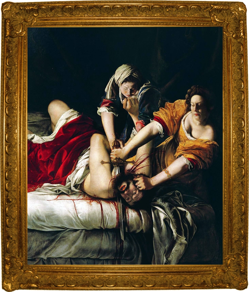
The third picture that I chose by Artemisia Gentileschi, “Judith Slaying Holofernes” is a depiction of an old testament biblical story of Judith overcoming her more powerful superior, who had raped her, with the help of her maid, beheading him in bed. It has been depicted many times throughout history but to be drawn and painted by Gentileschi, somehow seems more significant:
Artemisia Gentileschi- “Judith slaying Holofernes” panted between 1616 and 1620 during the Baroque period.
For one this painting seems almost photographic in its delivery. I read whilst researching this painting that she had been raped by her father’s painting pupil, though what happened to me was not the same, it still revolved around my art and I am certain that there must have been some catharsis in her painting this picture in that she got to inflict the rage and pain that she felt towards her father’s friend and pupil in painting two women overcoming a man who had raped one of them. Maybe the young, fresh faced girl, the maid who is holding the man down yet being strangled by him represents the innocence that/who was stolen from Artemisia?
According to the Encyclopædia Britannica Artemisia was forced under torture to give evidence at the rapist’s trial before her father’s death, and I’m sure that this would have left her with some serious unexpressed rage. Though maybe I am projecting my own feelings, how else do we view the work of others but with our own eyes and experiences? Maybe this painting was a way of expressing some of the rage she felt towards her own perpetrator in safe way and is in some way an intuitive and repressed ‘autobiographical’ piece based on what she would have liked to have done rather than the actual outcome?
It also begs the question, is all art made by survivors then intrinsically ‘survivor art’ by the very nature of the artist being a survivor? Or can we shake off that title and make something NOT influenced by those experiences? My thoughts are that we cannot as we are more than a sum of our parts but also equal to a sum of our parts, we cannot remove that survivor self any more that we can deny the female or male, young or old self. We cannot not be something that we are.
As I said all of these pieces really resonated me and I would love to think that I would some day have the courage to express my feelings about what happened to me as a child and as a adult in such a way, using art as a way to play out my feelings and use it as a catharsis of my own, resolving some of the years of madness that plagued me after such events. Time will tell I guess.
Part two of the course, drawing texture…. this was an interesting one. Once I had de-bugged a few demons I have been raring to go. The brief was to draw a few examples of texture. I did a few but had so much fun I decided to keep going. Obviously there are some that are better than others. I have found that the more I enjoy working on something the better it turns out…. simple reasoning there I reckon. Anyway here are the texture sketches that I did with some self reviewing comments underneath….
daffs
So this is one that I am not so happy with, it’s a picture of those ‘Tête á Tête‘ daffodils the double headed ones, They were virtually transparent with the light behind them and though I think I have achieved a level of transparency it is rather clumsy, but then I didn’t really enjoy drawing them…..
white feathers
I was more pleased with these very fast sketches, as I think that i have managed to capture something of a lightness that feathers have. I have quite a collection of white feathers that I find around the place, I like to think of them as angel feathers (waits patiently for all thee non-believers to finish shaking your heads….). These sketches literally took about 6 minutes to finish and I think that even though they were fast they weren’t rushed, and they have a kind of ethereal floaty texture….
Nailbrush
I picked this one because of the texture of the bristles, I think the handle looks rushed, because it was and because I was more bothered about the bristles than I was about the plastic handle. I did my best to stay true to the original object even though it makes me look like I need a new nail brush as all the bristles are wonky and dishevelled looking… Over all I am pleased with how the texture of the bristles came out.
Section of a knitted cushion cover
Though I am pleased with the over all ‘feel’ of the drawing, it is far too uniform and regular to look real. It looks comfortable ad warm, but it is not as imperfect as the original item, it doesn’t show any of the pilling that has occurred on the cushion cover. I think this proves that I am not a fan of regular pattern reproduction, I found it petty boring to draw, possibly made worse by the fact that the night before I had tried to draw it in failing light and cocked it up completely, even though the original picture was cocked up, it somehow had more ‘life’ to it, but in my annoyance with the failing light I screwed it up and threw it away.
Dog-chewed stick
Molly had a good go at this all over the living room carpet….. joy! But I rescued it and was fascinated by all of the little shreds of fibres, however, even though it is a pretty good representation of the original item, out of context it doesn’t seem to mean as much as the item does in my hand. Maybe with some other natural objects it might have more presence and seem less like a collection of lines floating in space. though I do like the texture over all.
dandelion clock paper weight
I liked the *idea* of this one, I liked that it is dual textured, the fluffiness of the dandelion captured in acrylic that is hard, reflective and shiny. The photo doesn’t do the drawing justice because I couldn’t angle the camera without getting a ruddy great shadow in the picture, so I have ended up taking a picture that makes the drawing look squiffy and out of shape. In real life the dome is not on the tilt. I am happy with how the shine and the reflectiveness of the surface came out in the drawing but the dandelion clock is kind of sparse and not very detailed and I kind of lost interest in it half way through doing all those dandelion spikes….. My dad says that it looks like Darth Vader’s helmet if Darth Vader had been a hippie. He also recognised the picture as being of the paper weight he had bought for his parents in law many years ago. I guess tat is a ringing endorsement that it does indeed represent the item it is meant to be….
Broken Sea shell
I actually really enjoyed drawing this and yet am slightly disappointed with the results. it has nice texture, which is good, hits the brief, but again looks kinda clumsy, I know I could do better, but this bucks the trend because it is one which I really enjoyed but which came out not so good.
Sprig of leaves
Pretty standard, I’m nether here not there about this one. I went into the garden, picked the top chunk of a weed and came back and drew it. I enjoyed drawing it and was fairly in my stride by this point and the texture of the leaves is pretty evident, but I can’t help feeling that I would have felt more in my element drawing something ridiculously bubbly like a savoy cabbage leaf instead. I did enjoy this and will definitely be drawing more leaves as I LOVE nature and growing, I have a fertile garden FULL of things growing so there will be plenty of opportunities to draw natural things…..
Ocean Battered Stone
I LOVED drawing this one. I thoroughly love this stone anyway, I love the pitted parts and the holes which go all the way through. I am so happy with the pitted areas and the depth of the picture, it looks almost real to me. I also like the way it looks smooth but still rough which it absolutely is.
Rotting Tree Trunk
I really engaged in drawing this one. Like I said I love nature and organic material to draw, I love and adore nature and faces and features and life drawing too, anything with organic lines and shapes and forms. I love the twists and turns in this log, and the different textures, from the algae mouldy bits to the wood and the bark, I love the fact that I just did a section, though also understand that without the rest of the tree or other objects the drawing again is a little bit out of context, though also understand that this is a matter of a study, not a complete ‘picture’. I am really looking forward to putting objects together and exploring more natural shapes, especially outdoor nature and the human form. This one really made me want to do more pictures of natural objects, but also reay made me want to keep drawing in general!
Starfish
This one was a LOT harder to draw than I thought it would be! When I picked up the dried starfish out of the bathroom (Actually I don’t agree with the drying of starfish for bathroom decorations, but I do love starfish and was also given this one a a gift so didn’t want to waste a life by not keeping it!) I picked it because of its knobbly bits and bobbly bits. It was only when I had started to draw it that I realised just HOW knobbly and bobbly it actually is! I have a whole lot more respect for this starfish having drawn it than I did before hand. Nature is a fantastic thing! Although I am pleased with the outcome of this one, and the people who I have shown the pictures to unanimously vote this one as their favourite long with the pineapple one next, so there must be something of a unique and interesting quality to the drawing as well a some skill. I’m still not entirely happy with it, but I am a relentless perfectionist. I do, however, LOVE the texture and the way that despite it’s complicated texture the end result is pleasing.
and finally…..
Section of a Pineapple
I think that this picture was my favourite one to draw out of all of them, and I think it shows. I love the fact that the texture looks like a repeating pattern at first glance and in actual fact is anything but. I think this is one reason that I loved drawing it so much, because it was so subtly different in every part of it. Each spiky leaf is totally different, each segment of the fruit differs completely from the others. I do happen to love pineapples a lot, though I hate prawns and crab and yet drawing those excites me too.
This exercise has really piqued my interest in texture, particularly textures found in nature as opposed to man made ones, and I am so looking forward to drawing faces, bodies and more organic items and doing individual studies has made me really keen to more onto drawing collections of items as it has made me far more aware of the importance of context.
I’m so excited to announce this upcoming event in my life (it will probably be much more exciting for me than it is for anyone else….) I had been planning to get a huge shed for the back garden in order that I have got my own art studio to work in, somewhere to keep my art materials in their ever growing collective state, somewhere to sit on a comfy chair in front of an electric fire and crochet and listen to music, somewhere to sit and write and enjoy solitude and creativity…. All this planning has been in the pipelines for the last couple of months since I thought about it and made plans to start saving up for the beloved, proposed shed, then out of the blue after a conversation with my mum this morning about how I was going to afford it and go about making it a reality, my lovely parents called me up and told me that they were going to buy me the perfect shed!!!
The Beautiful Shed Of Creative Dreams!!
This is the fine specimen, with a few alterations, the bottom windows on the double doors will be bocked up to make the doors into double stable doors and the height will be increased to be 6’6″ at the lowest point and 8′ at the highest. It is 8 feet deep and 12 feet wide and plenty big enough for a good sized art, writing and studying studio! I have a man supposedly coming this evening to give me a quote for clearing and flattening the ground where the shed will go and putting in three rows of 2 foot squared two inch thick slabs for the shed to rest on, and then I need to sort out the materials to insulate and clad the inside of the walls and roof to keep it warm and dry,, then I need to get the shed put in and built (can you believe it, they will deliver it for free, then put it up for me as well!?!)
My going to be beautiful in the summer garden….
When the shed is in place I will be filling in the gaps between the joists with 50mm Celotex insulation sheets cut to size both on the walls and roof, putting down a piece of decent lino, and cladding the whole inside of the shed with reasonably thick MDF/Plywood or similar, filling in the joins with silicone sealant and then painting the whole inside white for maximum light reflecting effect.
When all this is done I will be sourcing a big work table and I already have a swivel chair that I can reupholster and then I can move in my huge book shelf and a couple of chests of drawers and all of my art materials! I am going to get an electrician to run an outside socket from the house so that I can power the shed and heat it in the winter and I will be getting a leather type reclining arm chair with a foot stool or similar in order that I can sit and write and do crochet in there, and jot own ideas in comfort a well as receive visitors to my little workshop!
Molly-Moo chewing a ball
I have so many ideas and plans for this and cannot wait! (Though I have to sadly!) They will be delivering and erecting the studio-shed at the beginning of September, and I am SO excited! I know that it will be a few weeks of working with the place to get it just so before I move in officially, but I am so excited to get all my things in there and start working in there! The company supplying the shed are really popular and booked up all the way until August, so I will just have to be patient!
I can’t wait to put pot plants outside the widows and hang hanging baskets off the corners, then I would REALLY like to get some jasmine or wisteria or clematis to grow up trellising all around the end side of the building, something really beautiful and butterfly and bee attracting so that I can enjoy the local flora and fauna whilst I work. Our garden is already a haven for beautiful things, we are avid growers of fruit and veg and herbs and flowers and the garden is looking set to be beautiful this year with nearly 60 varieties of edible plants, strawberries, apples, pears, cherries, peach, plums, so many veg I couldn’t name them all and loads of fragrant herbs and spices too. We do all our growing in pots and raised beds so it’s all very manageable and this year we put up a screen fence to stop the neighbours cats from coming in and crapping in all of our plants and also to stop Molly the hooligan pooch from buggering off next door to chase said cats (and being unceremoniously swiped across the face with a set of razor sharp claws in the process!) and all the veg we have sown is starting to come through in their plug pots. We even have Kohlrabi and butternut squash this year!
getting there in the garden- the shed will be on the far right hand side of this picture….
I know this has been a bit of a deviation from the usual art related posts but I am so excited about this development because it will enable me to completely immerse myself in the creative process and really turn out the work that I feel I am capable of. Rather than sitting in front of the television with a drawing board on my lap and getting distracted by whats happening in the house like the need to wash up or do laundry or clean or cook or…… all things that are procrastination and deflecting techniques that my brain throws out at me because I think that there is still a little part of me that is frightened of making art because of what happened all those years ago. Well, guess what. It’s time to take my art back. It’s time to reclaim my creativity and flourish in my own creative space.
EDIT: news just in…… my folks have offered to pay for the ground to be cleared and prepared and the slabs laid!! I can’t believe it! I’m so excited!!!
Portraits and dogs…. they go together like birds of a feather….
Once I had drawn the logo for Pangothica I was so fired up to draw something else that I jumped on it straight away! I started doing some portraits. Actually, this started with drawing a friend’s dogs for her birthday. Two miniature schnauzers taken from separate photographs and made into one picture. this was the finished result, and a gift that was happily received:
First Dog Portrait Ever! Two Mini Schnauzers
Steve Hogarth, Marillion
This spurred me on to find other things that I could turn my hand to. Gem, in fact, asked me if I could draw her favourite musician (Mr Steve Hogarth from Marillion) and handed me a photo which was quite difficult to draw. Major facial expression going on and lots of passion in the photo. I gave it a go and despite some issues with the technicalities I came up with this which I was very pleased with I think it captured the emotion of his singing very well, personally so I shared it on the fan page to a positive audience for the most part…
I moved onto another picture of him which was not so successful and looks a it like him and a bit like Alice Cooper, though still not bad considering it was only my second ever portrait. I shared it again, this time to a more lukewarm reception, but hey, I’m still learning!
Steve Hogarth Second Portrait
Basically I think this one is overworked and I was using pencil and biro together to draw and the overall effect is a little bit dark. I decided to do another one in biro and pencil, still only my third ever portrait! This time of Mr Steve Rothery, the guitarist from Marillion and all round brilliant Rock God (And a thoroughly nice chap, I met him in a church in Oxford at the Christmas gig of the aforementioned Steve Hogarth!). This one came out MUCH softer and a much better likeness of the man himself. Again shared to the fan site and this time to a better reception.
I did a lot more work in pencil which worked better for tone and shading and then added in accents of biro for depth and to pick out the darker elements. This had an overall better effect than over-using the biro and I was much more pleased with the result. I was finding my feet at last with the drawing malarky and was loving every minute of it!
Mr Rothery, Marillion.
I was sussing out how to do this portrait thing at last and discovering something about the way I work that I had not thought much about before. I actually much prefer to draw using subjects that are actually doing something. Incidental poses rather than contrived ones. Action shots, if you will. I really prefer my subjects to be caught in a moment in time rather than posing for the camera, unless of course they have an unusual expression or are pulling a face.
My training in hypnotherapy and NLP comes in here I think. One of the subjects that I have studied at some length is “micro facial expressions”. Have you ever seen the TV series ‘Lie to Me’? with Tim Roth? Well… That. How the face betrays a feeling in a fleeting moment in time, how we express our innermost feelings in that millisecond that sometimes people are lucky enough to catch on camera. So to me a face with expression is FAR more interesting and also difficult to draw. I do like some posed photos but they ave to be interesting not just gazing at the camera… In this last of the set of drawings, I actually sold the final piece… here:
Steve Hogarth, Marillion, Live
I am waiting for the framing to be done and then I will post a picture of the finished product!
I will leave you with a poem about a lethal addiction….
“A Cautionary Tale…”
It’s a terrible tale I’m going to tell ‘bout an aspiring young writer Who started to swell… It started on Thursday, At just about noon, Her face went all round Like a full, silver moon By lunch time on Friday, Her cranium inflated Her chin couldn’t take it Her jaw dislocated Into the weekend The swelling continued Puffing up ligaments Tendons and sinews. The spherical authoress Was more than bemused (once pretty and slender, Her ego was bruised) The doctors were baffled, Experts confused; Test after test… “What’s behind this?” They mused.
Several days later Our tale takes a twist, Our beach-ball –like heroine Rolled over her wrist She punctured her forearm And out shot some ink The cause of the swelling Was her favourite drink! What had started off as An innocent nibble Idle chewing of pens whilst She thought what to scribble… Developed and grew into Quite an affliction As she succumbed to A full blown addiction
Nightly in private She’d been sneaking around Supping on biros and Pens that she found. The result was: Disaster! A sticky ink river Her kidneys were inkwells Pools of gloop in her liver. Her tummy was bloated with chewed fibre tips Remains of a fountain pen Staining her lips
Sadly for our comrade There’s never a return Once you’ve swallowed a pen, Your insides will burn… the addiction takes over, Like a wild forest fire; Only the inkiest tidal waves Will quench your desire! Your resolve will soon waver, You’ll be swallowed whole, Soon guzzling ink Becomes your only goal… Of course, the outcome Of this tale is tragic, No happily ever after Nor fairy tale magic… She lay on the floor And gasped her last breath And in full technicolour She waited for death.