hEDS – A Journey Through Pain And All That Jazz

Many years ago, in 2004, I was diagnosed with Fibromyalgia by a GP. I was 23. I was in near constant pain, I weighed thirty five and a half stones in weight (497lbs, 225KGs) so my body was under enormous stress, but even the non weight bearing parts of my body were in pain. All the time.

Fibromyalgia is characterised by widespread pain (myalgia) in the soft tissue (fibro) in the entire body. It has a number of other symptoms as well, however. Extreme sensitivity to light, sound, smells, textures, issues with ones’ bowels, problematic sleep, stiffness, fatigue and the curious “fibro fog“. I definitely had all the symptoms, along with the sensitive “trigger points“- tender points around my body that were very sore when pressed by my GP so the diagnosis did seem to fit, but it didn’t explain everything.

By 2020, I had lost eighteen stone in weight and I was constantly going back to my GP complaining about excruciating pain in my joints. “It’s probably your Fibromyalgia!” he would say. with increasing amounts of impatience. But I knew that it wasn’t. Pain in the soft tissue, muscles especially, that is fibromyalgia, but this was different. I would feel my ankles slide in and out of position and my hips as well. My wrists would crunch and click, my jaw would pop and crack and my mouth would lock open and my fingers would often bend so far then pop out of their alignment and get stuck until I manually popped them back. Not all the way out so they had dislocated, so I couldn’t use that word with the doctor, but partially. I have a word for that now. Subluxation.

I was experiencing other problems too. Recurring cramps in my legs and feet that would wake me up at night, so frequently, several times a week. I was feeling sick constantly, having pain whenever I ate food, I was losing weight as a result of this. I had had a gastric bypass in 2013, and had lost weight due to the surgery, but this felt very different. I would eat food and immediately my stomach would feel full and hard, like it had cramped up. “It’s probably anxiety because of your fibromyalgia” said my GP.

I had developed Raynaud’s Phenomenon in my hands and feet due to exceptionally poor circulation, so my hands and feet were going blue and purple and white when I went from hot to cold and had started burning from temperature changes. All this along with the fact that I have always bruised very easily, have been extremely “double jointed” (hypermobile) in more or less every joint in my body, my entire life, having done “tricks” with my hands when I was a child, and done the splits up the wall, back flips and back bends from standing without any gymnastic training growing up, twisting my arms around and popping my shoulders, bending my wrists and thumbs back on themselves and having knees and elbows that went “the wrong way” and a Jaw that would get stuck open at the dentists and during the night! And that embarrassing fact of my poor bladder control, that I had mentioned to the doctor a number of times, but again, “its probably to do with your fibro! You’re just anxious, try doing some pelvic floor exercises!”

I couldn’t help thinking that this was all a bit convenient, like the fibro was just a dustbin that all my symptoms were being thrown into at will. I was visiting the doctor at an alarming rate with my aches and pains and various other symptoms and being fobbed off every time I went. He had referred me to a couple of rheumatologists at my request, I think more to shut me up than for any other reason, but they had been equally as dismissive. I was coming out in regular hives and other mystery rashes on my face. in the absence of any other support I Googled the face rash and found LUPUS. a connective tissue disorder.

I took my potential diagnosis to the rheumatologist and walked with my walking stick into his office and hadn’t even sat down. “how can I help you” he asked, not even asking me to take a seat. “umm well I was wondering if I might have Lupus” I replied “I can tell you now you haven’t got Lupus!” he said not even asking me what my symptoms were. I was there long enough for him to ask me my name and date of birth and that was that.

Still searching for answers – obviously not very good at finding them, I was talking to a good friend who mentioned hypermobile Ehlers Danlos Syndrome to me, in connection to her son. I listened to her and everything she said clicked into place. it fit me perfectly! I read up on it and took it to my GP. He listened and shook his head “I still think its the fibro” he said. I was despairing by now. I knew I was being fobbed off. I knew that I had to go privately and that there were so many associated health conditions connected to it.

I researched private Consultant Rheumatologist Specialists in Hypermobility/Ehlers Danlos and found Dr Philip Bull in the One Hospital in Ashford Kent. He was a very experienced Consultant having worked and taught with the NHS for twenty years prior to working in private medicine and still doing some work for the NHS, and was now the Lead Medical Advisor for The Hypermobility Syndromes Association and an active member. I looked him up and even though Kent was quite a drive from Birmingham, I knew that this was my man!

I made an appointment with him and a friend and I made the three hour drive down to see him a few weeks later, it was November 2020 during a gap between Lockdowns.

I was very nervous, but I had no need to be. It was the polar opposite of any negative experience that I have ever had with any doctor on the NHS. He was warm, friendly, receptive, knowledgeable and best of all he listened. I could have wept. I had corresponded with him prior to the appointment and told him what I was concerned about, I had explained that I was concerned that I had hypermobile Ehlers Danlos Syndrome and had been fobbed off by my GP and several rheumies within the NHS leading up to the appointment with him.

He examined me extremely thoroughly, using the checklist for the diagnostic criteria for hypermobile type EDS, and the Beighton Score (my Beighton score was 9). He took my history around allergies, pain, dislocations, mood, anxiety, behavioural traits, family background, family members who had similar symptoms (I didn’t know this at the time, but my aunt and cousin also have hEDS). He did a thorough, but not diagnostic, test to check for the likelihood of autonomic dysfunction such as POTS and checked my feet and legs.

Eventually he told me that I was right, that I did have hypermobile Ehlers Danlos Syndrome. and that I also had fibromyalgia along side it. That he was also making a clinical diagnosis of Mast Cell Activation Disorder, based on my symptoms that I had described. That he was going to write to my GP to ask him to refer me to a Cardiologist about autonomic dysfunction because I had a significantly lowered blood pressure and raised heartrate on standing which would account for breathlessness and feeling/actually fainting when I stood up, which I hadn’t connected to my pain related symptoms at all. He wanted him to refer me to a Gastroenterologist to discuss the eating issues as after so many years out of gastric bypass surgery I should not have developed pain when eating or nausea. That that required investigation also. And that he wanted to recommend that I was assessed for Autism and/or ADHD as well. He explained that Neurodivergence was very much related to the hypermobile spectrum disorders and that I presented very much as neurodiverse. He wanted me to have Hydrotherapy if possible as well.

on the way back to Birmingham I got a ticket for going through a toll tunnel without paying for it and didn’t realise, but I honestly didn’t care. I was floating, I had just received the best worst news of my life!

Back in Birmingham Dr Bull was as good as his word, my GP and I received the same letter. and within a few weeks I received letters from the Queen Elizabeth Hospital in Selly Oak offering me appointments with the Cardiology consultant and with the Gastroenterology consultant. I also was offered ten sessions of Hydrotherapy at the Woodlands Royal Orthopaedic Hospital. And my medical notes were updated to reflect the new diagnoses.

Getting my formal diagnoses of hypermobile Ehlers Danlos Syndrome and Mast Cell Activation Disorder, has been absolutely invaluable. I have had appointments with the cardiology department ever since my diagnosis, every few months. They continue to take me seriously. after multiple tests, the Gastroenterology team Found a large hiatus hernia lurking at the top of my stomach- hernias are common with EDS- so it wasn’t anxiety , or part of Fibro, but a fairly serious issue all by itself. The hiatus hernia is causing significant reflux which if not sorted is one of the main causes of oesophageal cancers. I had my Autism assessment and have been diagnosed with Autistic Spectrum Disorder as well. But that’s another story….

So was it worth the money to go private? Absolutely. but I still love our NHS and hate what is happening to it…

The End

Long time no see, old blog of mine, maybe its time to take you in a new direction, see I was doing so well on that degree until the shit well and truly hit the metaphorical fan. y’see like all the things that I start with rapid and unwavering enthusiasm, something always seems to happen that sticks a massive spoke in the wheels to throw me off course and cause an enormous existential crisis creating a rift greater than the big bang itself, internally, and throwing me completely off the tracks of whatever I am doing.

This time, like so many others, it was entirely me. I got fully caught up in the thing, I researched the thing, I enthused about the thing, I researched the thing some more, I bought all the things to do with the thing, I worked on the thing tirelessly, I did the thing to the best of my ability and got really very good at the thing, then the thing suddenly became not very interesting to me any more and I got really sad and depressed and anxious and burnt out and couldn’t even pick up a pencil and couldn’t manage the thing and couldn’t look at the thing and couldn’t even think about the thing without having severe anxiety and panic attacks. the thing started making drawing miserable which flew in the face of all the reasons why I was doing the thing in the first place and in the end I decided that doing the thing was a complete waste of time and energy and money and could no longer cope with the thing anywhere near me.

Then shortly after making the decision to pull out of my degree, and get back to drawing off my own back, which was a process in and of itself, on 30th December 2017, my dad suddenly, Very Suddenly, without warning, dropped down dead. he didn’t have a heart attack. his death was very avoidable. You see, my dad and I had the same genetic predisposition to blood clots. A protein S and Protein C deficiency. A DOUBLE WHAMMY OF THROMBOPHILIA. I take rivaroxoban, a relatively new anticoagulant which keeps my blood pretty well manageably runny and clot proof. Not 100% but near enough. My dad should have been on it, or similar, but thought he knew best.

He went into his garden at the house he lived in in Devon with my mum to fill up the bird feeders on 29th December 2017 and slipped on some ice on the patio, landing on his leg. He had had two Pulmonary Emboli (blood clots on the lungs) and multiple DVTs in his legs (I’ve had two of each as well). he said soon after, to my mum that he felt as if he had a blood clot in his leg and my mum suggested going to the hospital. He refused. Then I chatted on the phone to him for about two hours on Saturday morning, about this and that and nothing much. He told me that he felt as rough as rats. I said, as I often did, that I loved him and I also said as we parted on the phone, “don’t die!” “I have no intention of dying!” Said he…. at 11am.

At 1pm I was out and about and received a phone call from my mother telling me that she had called an ambulance. my dad had collapsed and lost full consciousness and voided his bladder. The ambulance were “taking their time”.

At 2pm the ambulance still hadn’t made it to the property and my dad was grey but in fairly good spirits. his heart was racing and he was finding it difficult to breathe properly.

At three pm the ambulance turned up. They decided that despite his fall and despite his predisposition to clotting and despite the fact that he wasn’t on an anticoagulant, and despite the fact that he was showing all the hallmarks of a pulmonary embolism, the symptoms that he was having were most likely to be an infection caused by a spot on his back. so instead of blue lighting him to hospital they took it slowly and drove him in in no hurry.

When they got to hospital, having been told my dads history by my mum, the doctor decided that my dad wasn’t an urgent case either, even though his pulse was racing and slowing, racing and slowing, just like it does when you have a PE, even though his O2 sats were jumping up and down, just like they do when you have a PE, even though his history was that he had a protein S and C deficiency which made him predisposed to DVTs and PEs, and even though he wasnt on an anticoagulant, even though he was breathless and passing out repeatedly, and then voiding his bladder, to NOT start him on clot busting medication.

At6pm I received a phone call from my mum, “Im in Accident and Emergency still with your dad. It doesn’t look good.” so me and my partner started packing our bags to drive down the two and a half hours to Devon.

At 7pm my dad looked at my mum and he said “This is it Ruth! I think I’m going!” and then died.

My mum said the doctors swarmed around him, pulled him into the resuscitation bay, and worked on him for an hour in the most magnificent and brutal way. she begged and pleaded with him to survive, she rubbed his feet and reminded him that he had promised her that he’d look after her, but after an hour of relentless chest pumping from a machine that broke or at least bruised every rib in his body it was clear even to her that nothing was working.

She asked the consultant if he had any chance of a meaningful recovery if he did pull through. “No” he said. He would be tube fed, unlikely to speak or understand anything, completely dependent, poor quality of life. “Then stop, if you can save any of his organs or tissue please do, but stop, he wouldn’t want that.”

The next few weeks and months are a blur, a whirlwind and a muddle. New year, his funeral, my birthday. its been nearly 5 years now and I still cant believe he’s gone.

We tried to claim compensation from the NHS for the negligent way that he was treated by the ambulance and hospital. the fact that they disregarded his history and didn’t administer clot busting medication in spite of overwhelming evidence to suggest that it was required. we failed.

Even though my mums story has NEVER changed, she remembers times and details and she never varies her story, the ambulance drivers denied being told that my dad was predisposed to DVTs and suffered from previous clots, the hospital said the same, negligence was avoided by the skin of their teeth. the post mortem ruled that my dad died from a massive heart attack caused by a pulmonary embolism caused by a deep vein thrombosis caused by a protein S/C deficiency, triggered by falling over the previous day.

I didn’t pick up a pencil for years after my dad died. I was far too sad. I didn’t garden, I didn’t do much of anything. It just about broke me.

Assignment 2 part 2-March of the Mackerel, 2000 Leagues Under The Sea

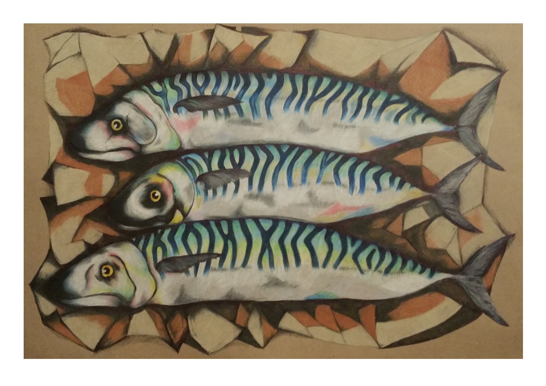
As part of my detailed observations of natural objects, I was really taken with the humble mackerel. It was my initial thought when I read the first part of part 2, and I immediately went out and bought mackerel and started drawing them only to turn the page and find that the image in the course guide was actually three mackerel on a plate.

undeterred, I have gone on to really fall in love with this most humble, yet most beautiful fish and do many, many drawings of them. Using mixed media, using monochrome, using actual colours, using pointillism, hand made paper. Items such as shells, crabs and buoys  and other seaside items to use in lots of different aspects of marine life. I will include those preparatory studies and ideas in this post too. I have shared some of the images in an earlier post, but I will be reposting some in the interest of bringing more context to this part of the course.

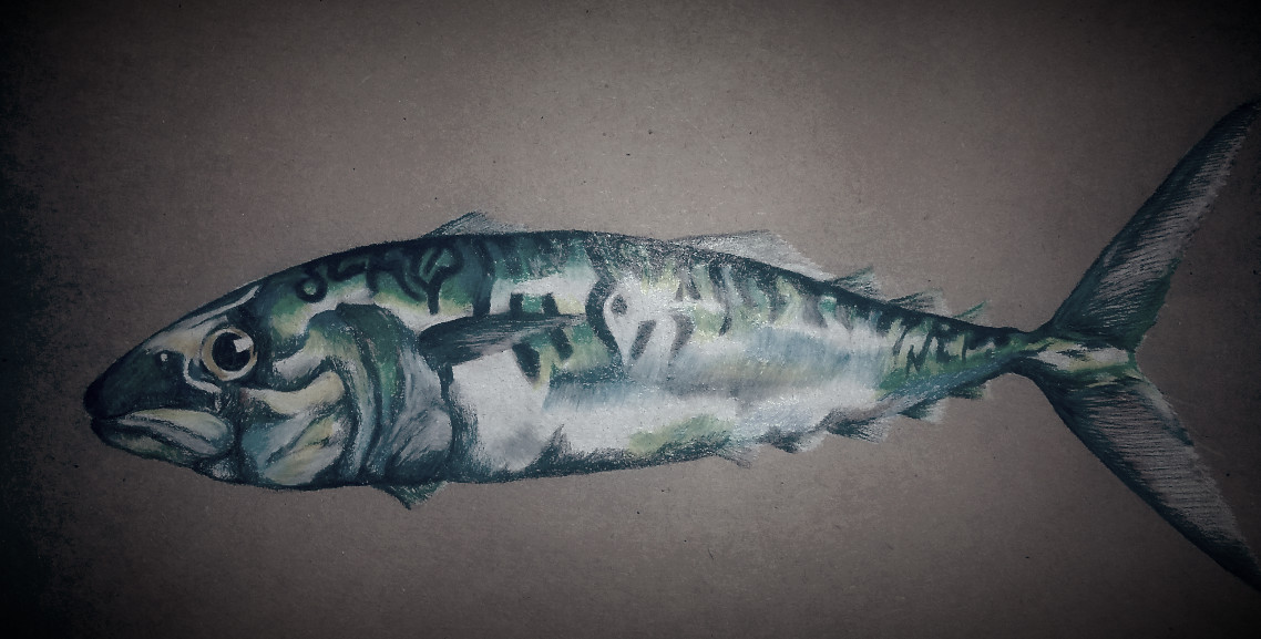
So I had some preliminary sketches of the mackerel

2016-11-08-22-33-45
single mackerel study mixed media

2016-11-08-17-19-51
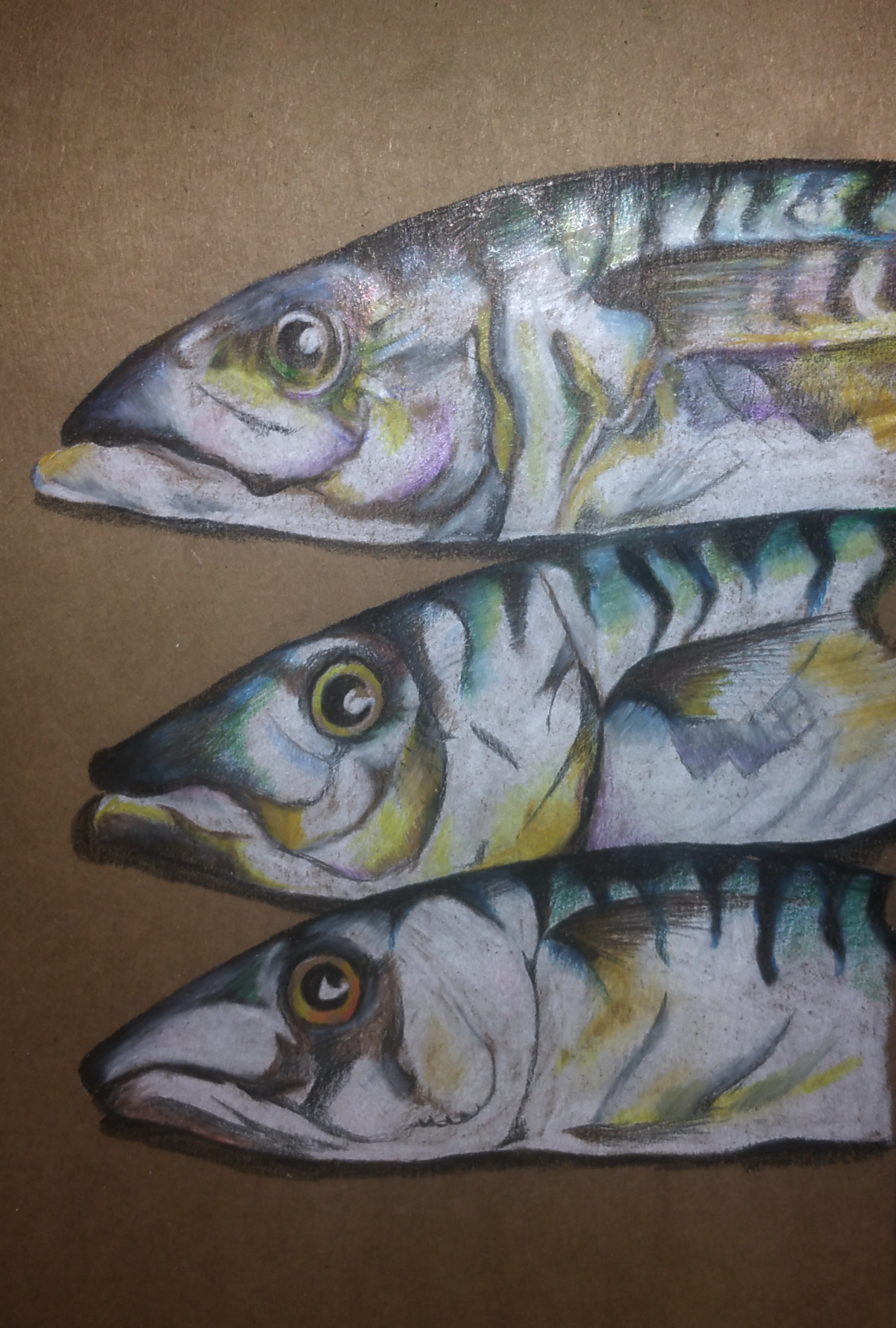
Three mackerel heads on brown paper

smartselectimage_2016-11-16-10-15-37
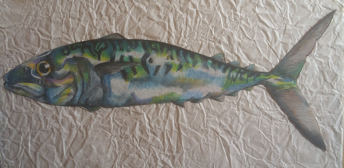
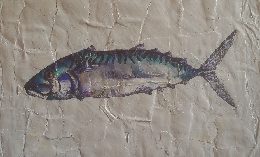
single mackerel on brown paper mounted on crumpled greaseproof paper

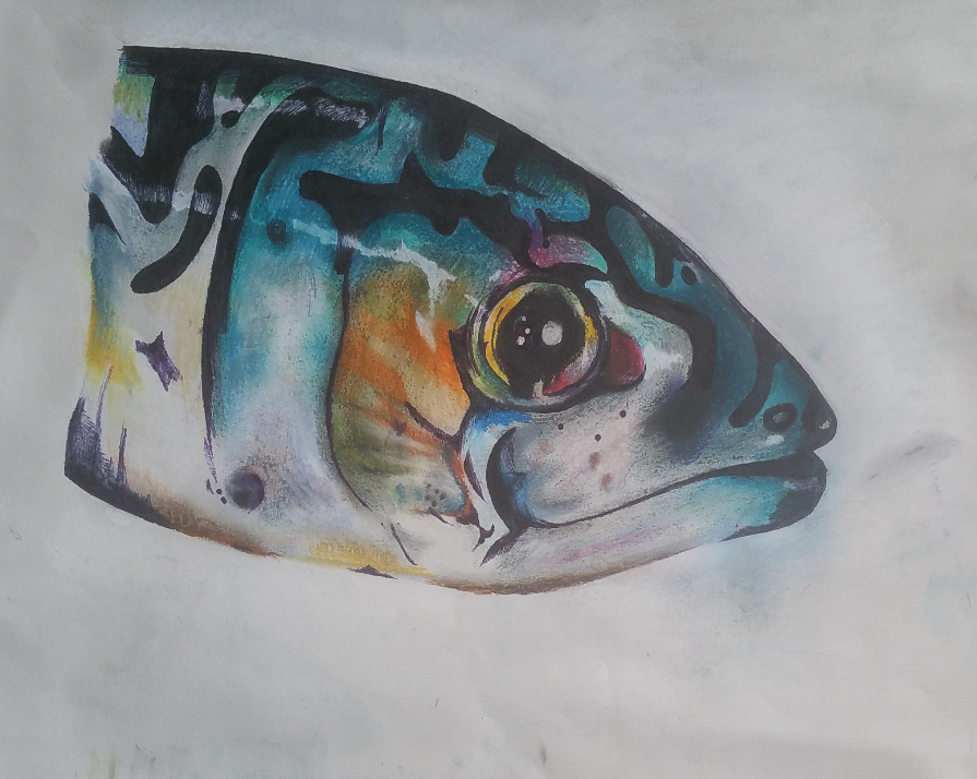
After experimenting with different mackerel drawings, I branched out and did a much bigger and bolder mixed media piece, using mainly soft pastels, of a mackerel head. It is bold and beautiful and colourful and several people have wanted to purchase it off me, which I have declined the opportunity to do….

smartselectimage_2016-11-15-09-34-49
mixed media, soft pastel mackerel head

I then went on to work with very mixed media. I made my own paper which I have talked about before, I will briefly explain here now. I took regular greaseproof paper and tore up small pieces of the cartridge paper and used white acrylic paint to stick the small pieces on the large piece of greaseproof paper then painted more acrylic paint over the top, then dried it and used it to draw on with various different drawing media. I made a table to find out the best drawing methods to use onto the paper and found that there were several things that worked best.

I drew on this home made paper a few drawings with varying levels of success, a crab and more mackerel.

mixed media mackerel 2
mixed media mackerel


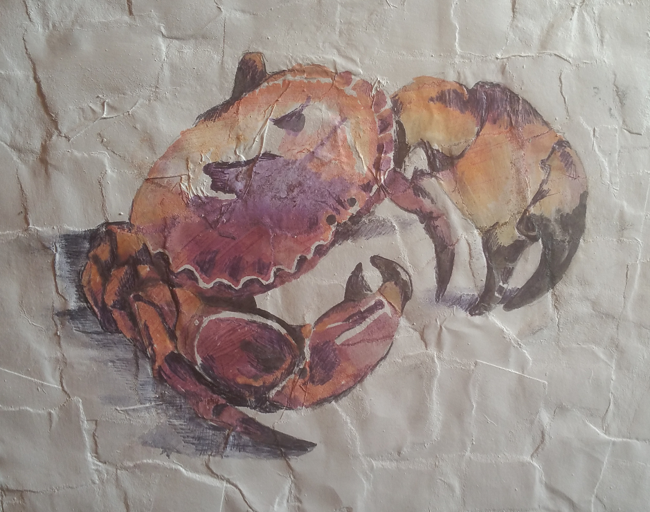
mixed media crab
mixed media crad

smartselectimage_2016-11-16-10-15-48
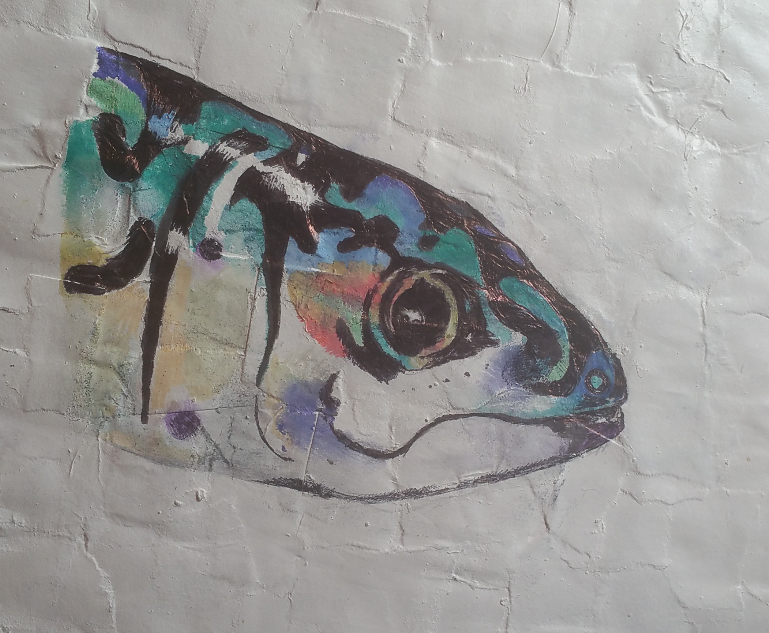
Mixed Media Mackerel Head

It was actually extraordinarily difficult to draw on the hand made paper. I would like to do more of it though, explore different colours and techniques.

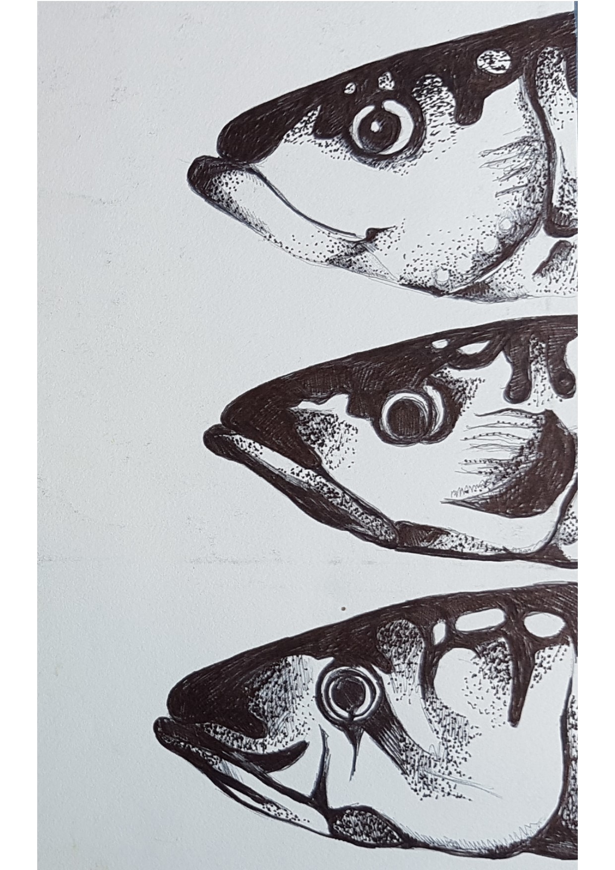
mackerel heads pointillism

After focussing on just mackerel (and one crab!) I decided to draw some other marine related objects , buoys and shells, to see if I wanted to include any of those in as a final piece.

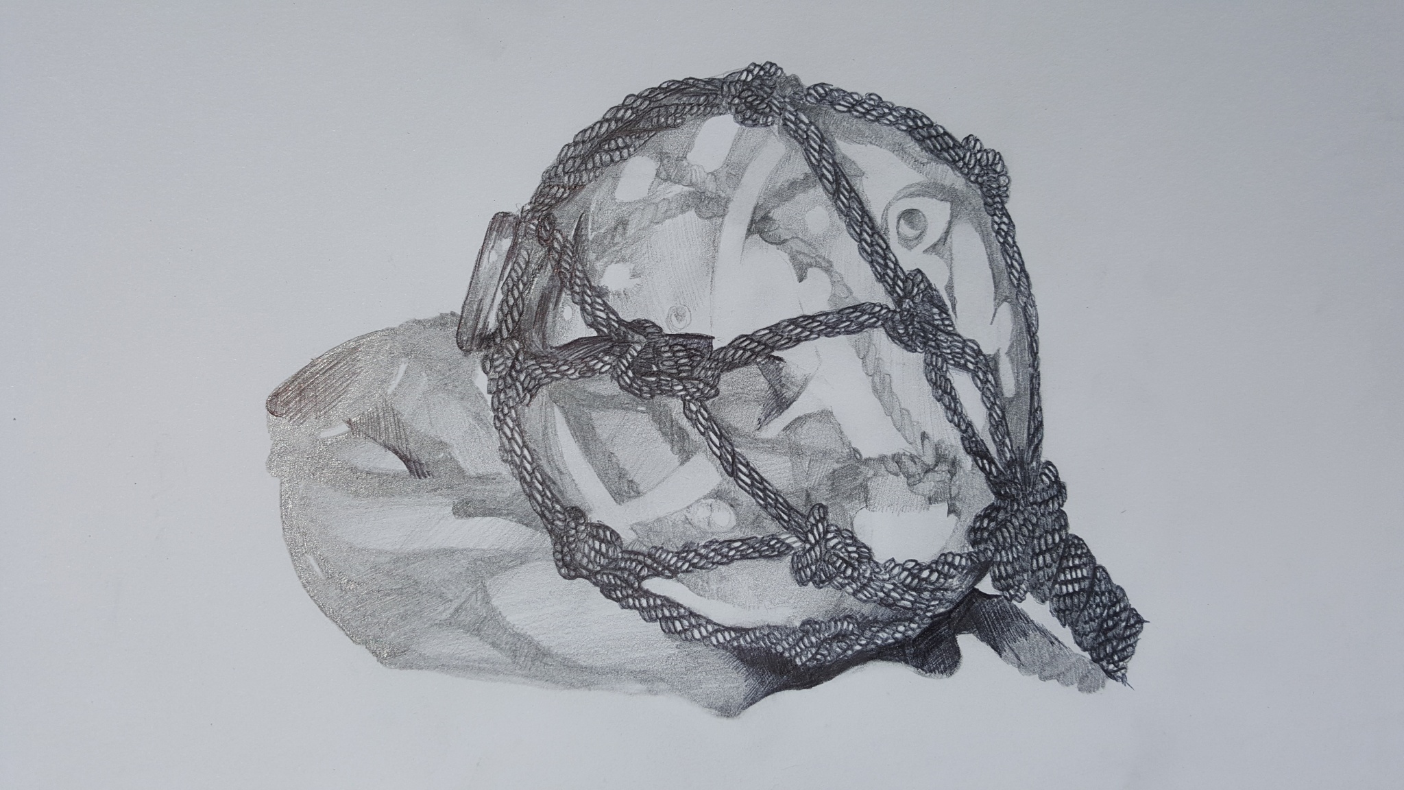
The buoys I found particularly interesting to draw as they are both reflective and transparent and it very much held my attention and interest finding ways to portray both of these qualities in the drawings. I also had the main buoy wrapped in rope which added another contrasting texture to the study which I thought made it very pleasing both to draw and then to look at afterwards.

buoy study
Glass buoy study in pencil

I was really pleased with how this came out, and though I did not include the buoys in a final piece in the end, I would love to take these drawings further and look at other compositions for still life drawings including more of the marine related objects.

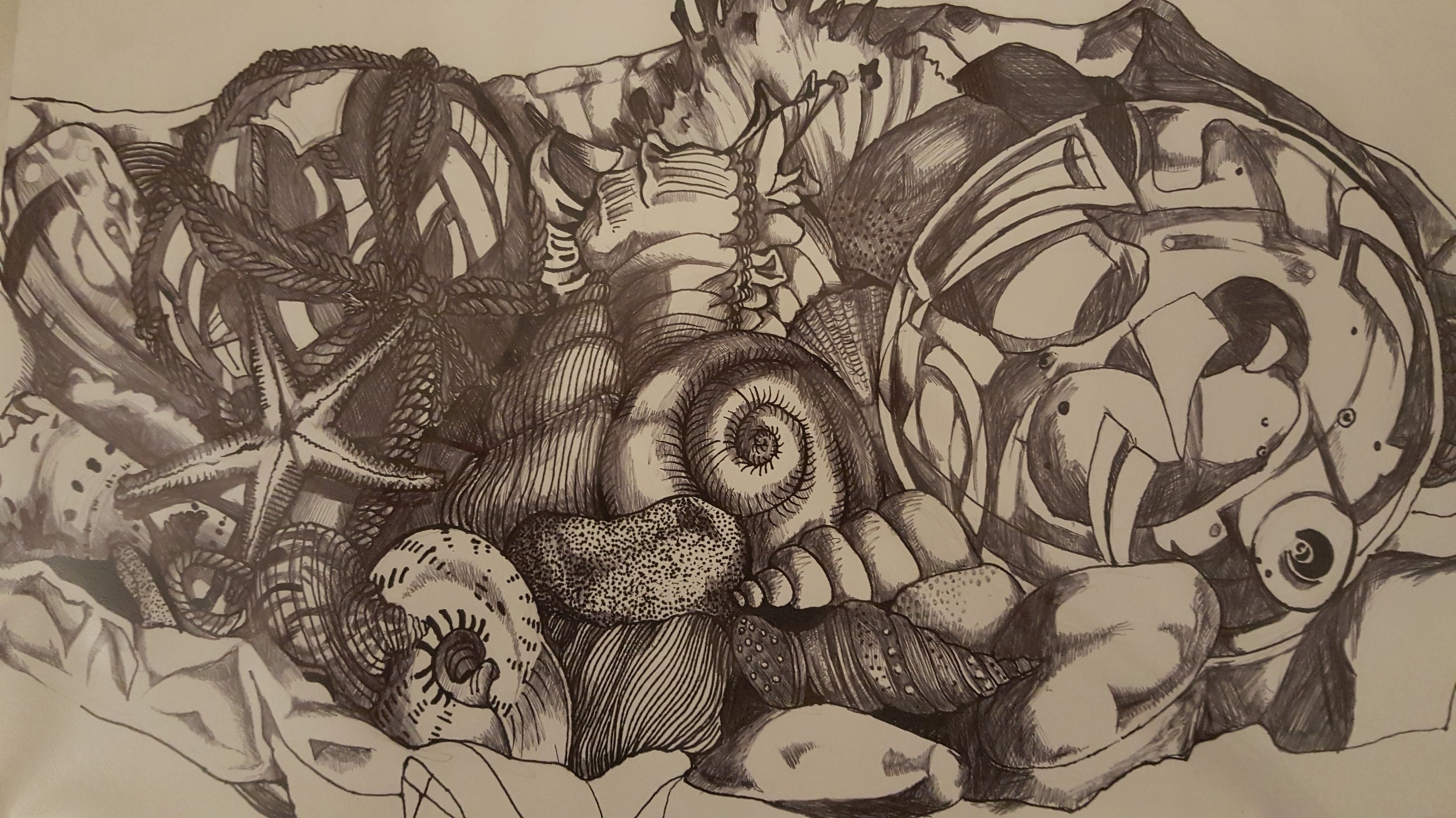
I also did a drawing which included lots of shells and ocean-worn stones which was drawn in fine liner, pencil and biro, using  hard lines and contrast as much as possible.

flotsam and jetsam
flotsam and jetsam. Hard lines and mixed media on cartridge paper

This was not my usual way of drawing, though I think as an experiment it turned out quite well. I wanted to explore a bit more of this subject matter in mixed media, as I planned to use at least a couple of different media for the final piece. This study included two of the buoys, one with rope and one without, and although the monochrome and line heavy effect was what I was planning to achieve, I think that the buoys deserve to be star of the show as they are such an interesting object to draw. It was altogether fun to draw this composition because it was SO busy and full and I had to concentrate and plan the drawing carefully to fit everything in!

I would like to redo the final piece at a later date to include a lot more of these items or even do a set of three pictures on this theme maybe including one or two of the items in each drawing, but a different combination, or composition for each one. I don’t know exactly how I would approach this, but as a collection of drawings I think that the marine based sketches were very successful, and had I not already dragged out this project for far longer than I had wanted to initially, it is something that I would love to spend a great deal longer exploring.

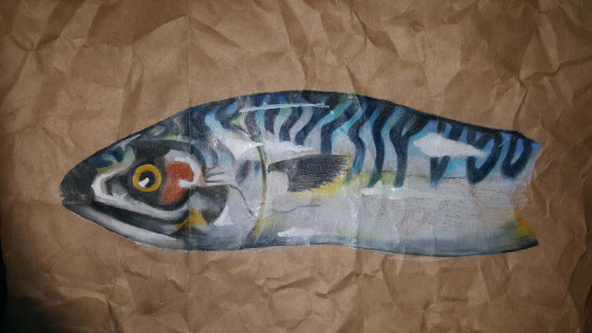
I was planning to do the final piece of three mackerel on brown paper, and decided to draw one mackerel on crumpled paper to see what the effect would be:

mackerel study on brown paper
mackerel study on crumpled brown paper- mixed media

Although this is an adequate drawing, I didn’t feel as though it had the impact that I would like to have and not did it reflect intimacy as a subject on it’s own. So I decided that I would do a trio of mackerel in a similar way.

I decided to do a mock up of the final piece that I wanted to draw. I used a much smaller piece of paper- part of a crumpled, brown paper bag that I had cut up and salvaged the pieces of.

mackerel on brown paper preliminary sketch
mackerel on brown paper preliminary sketch- mixed media

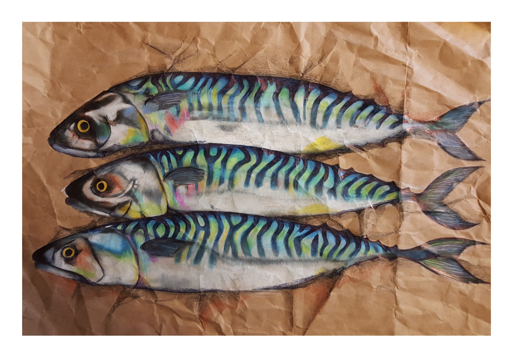
This was exactly what I wanted to achieve. I love the three mackerel together, the way that they work as a composition is simple and striking and I was surprised to see just how much three mackerel could differ in appearance despite being the same species (though I am sure they probably think the same about us!!) I love the effect of the paper being crumpled as a background and think that this is a very pleasing drawing. I love the colours too. I am pleased with the way that I have managed to achieve an iridescence on the bodies of the fish and a sense of them being plump and moist and ‘real’.

Off I set to do the final piece, using the same fish (thankfully frozen by this point so minimally stinking). I had acquired medium-heavy weight brown paper (not quite card, but definitely thicker than most cartridge paper) and planned to use mixed media, drawing pen, biro and highly pigmented colouring pencils. I also decided that I would not crumple the paper despite knowing that this was a really nice effect, It wasn’t practical to crumple A2 heavy weight paper, and because of this, I decided to draw in the crumpled paper background as part of the composition. I had added pencil shading to the existing crumples on the study that I had done anyway, and figured that it wouldn’t be too difficult to draw in the paper that the fish were lying on  myself.

I have to say that I am not altogether happy with the end result of this final piece.

mackerel final piece on brown paper
mackerel final piece on brown paper- mixed media

For several reasons (the main one being pain) I had to draw the whole final piece on a sloping board, rather than having one that was perfectly perpendicular to the ground. For this reason, I think, the mackerel have taken on a somewhat brutish, bulbous and bulging appearance. For want of better words to describe them, they really do look like they have been working out! Truly the bouncers of the marine world…

They also have acquired very human expressions that i am not entirely sure they had as they lay there on that tray on their brown paper. I have nicknamed them (from the top down) “Guilty”, “worried” and “astonished”, which has had me wondering what my frame of mind must have been as I drew this concerned looking trio, unless of course, being caught gutted and sold really does make a fish feel this way? Given that a piece of creative work is always a reflection of the person who creates it, I am fairly certain that the human qualities that their faces contain are  more about me than the fish.

I also don’t think that the crumpled paper background was as successful as a straight drawing as it was as the deliberate, real crumpling that I had decided on in the initial study. Having said that, whilst I was drawing it, I had several incidents of horror as I moved my arm over the drawing and for a fleeting moment thought that I had creased the corners up on the page then realised that it was ‘just part of the drawing’ so I guess that it achieved some kind of positive effect, possibly not the one that I had set out to create, however.

Looking at the drawing as it is, it is not all doom and gloom (unless you are one of the fish…) Again the iridescence that I have managed to achieve is pleasing and the use of colours, I really like. I love how I have managed to include a rainbow of colours in the scales and bodies of the fish, without it appearing garish or over the top. I wanted to do the fish justice in this respect because they are stunning, beautiful creatures, and that iridescence is truly part of their appeal to me, I wanted to capture that and I do think that I have.

I still thing that the composition is what works best for this drawing. I like that it is the whole fish and I like the crumpled paper background, however I think if I was going to do it again I would explore adding in a couple or some of the other marine related objects that I have drawn, or maybe doing a set of drawings as one final piece reflecting several of these objects, including the mackerel but not limited to them.


Detailed Observations of natural objects #2- “The Hornet Chronicles- Studies in Monochrome”

As part of the detailed observations of natural objects, I decided that I wanted to examine dead animals. Of these I found that the ones I was drawn to were mackerel and other sea life, and hornets.

In this blog post I will be writing about The Hornet Chronicles- studies in monochrome.

My aunt found a Hornet on the patio one morning and immediately knew that this was something that would interest me enormously!

I immediately wanted to draw this beautiful, dead creature. I have no desire to be around living hornets, but dead, though a little freaky, I felt that it took on a delicate yet somewhat sinister beauty. I must admit that handling the creature- even though dead- was somewhat scary! I had an irrational fear that it would somehow spring to life and get me on the finger or worse, face! but obviously it didn’t….

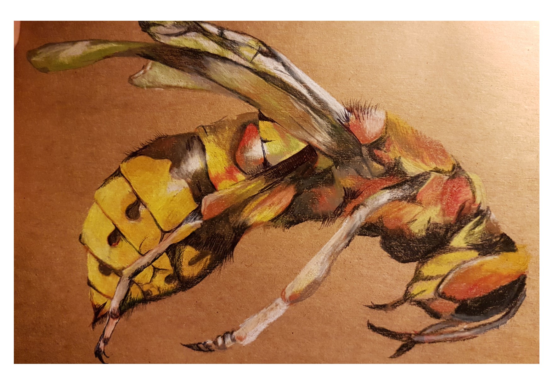
My initial study of it was in regular hornet colours. which is here:

Yellow Hornet
Yellow hornet, Colouring pencils on brown paper

I was really pleased with this although it was very tricky to draw, they seem huge when they are flying round my head threatening to kill me, but when I came to draw him, all of a sudden the detail seemed minute and intricate. I purchased a magnifying glass. This helped.

This drawing really, really piqued my interest. There was something morbid, curious and beautiful about this creature. They are so scary when they are alive, they are ruthless and horrifying. Dead though, it was amazing to see that the whole creature is covered in hairs, tiny little fine hairs, and the markings are terrifyingly beautiful.

Moving on from this I started to draw the hornet in blues. I drew him first just in solitude as a hornet on a page:

playing with colour, blue hornet
blue hornet: Monochrome studies

I mixed the media that I used with pencil, colouring pencil and biro and think that this is a very successful study, I am really happy with it. Again, I really enjoyed drawing this. I am realising that my loves for drawing are largely organic items, animals, faces, the human form, living and dead creatures, wood, leaves, life.

I decided to draw the hornet in a matchbox to give it some context and intimacy, given the title of the module. This is here:

blue hornet in a matchbox

I drew the hornet literally just nestled in the corner of the box. I just wanted to ground it rather than have it suspended in space. As it happens I was not as happy with this depiction of the hornet, it just wasn’t as successful as the first blue hornet.

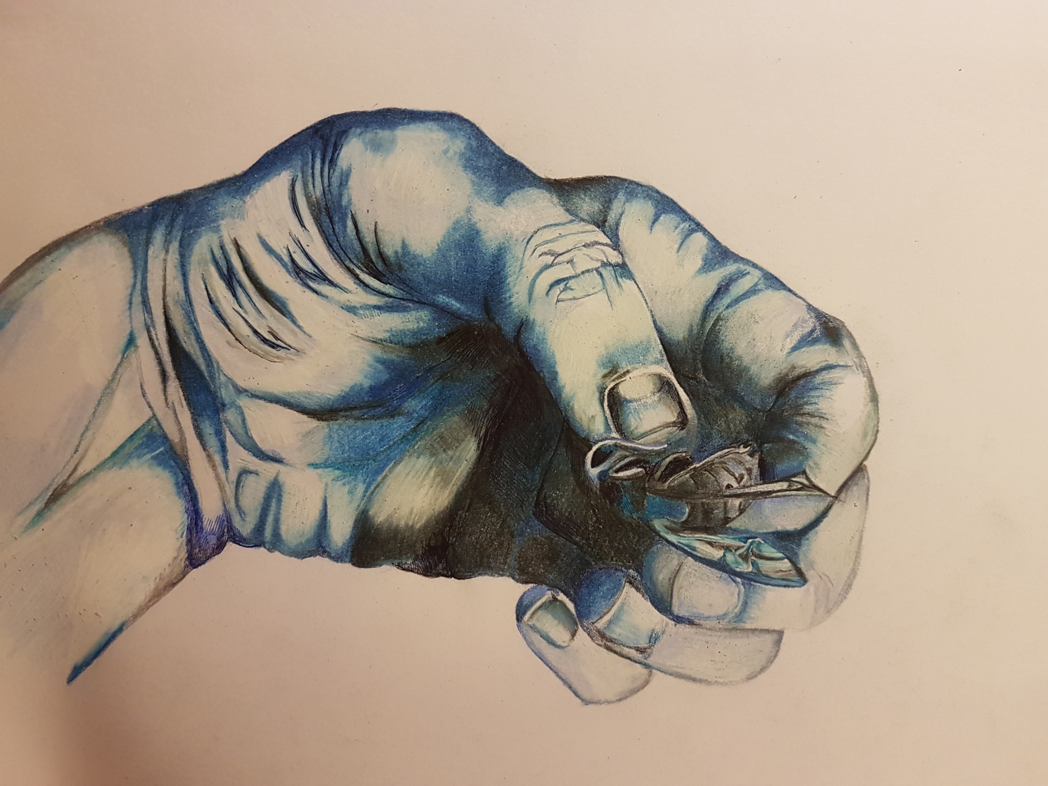
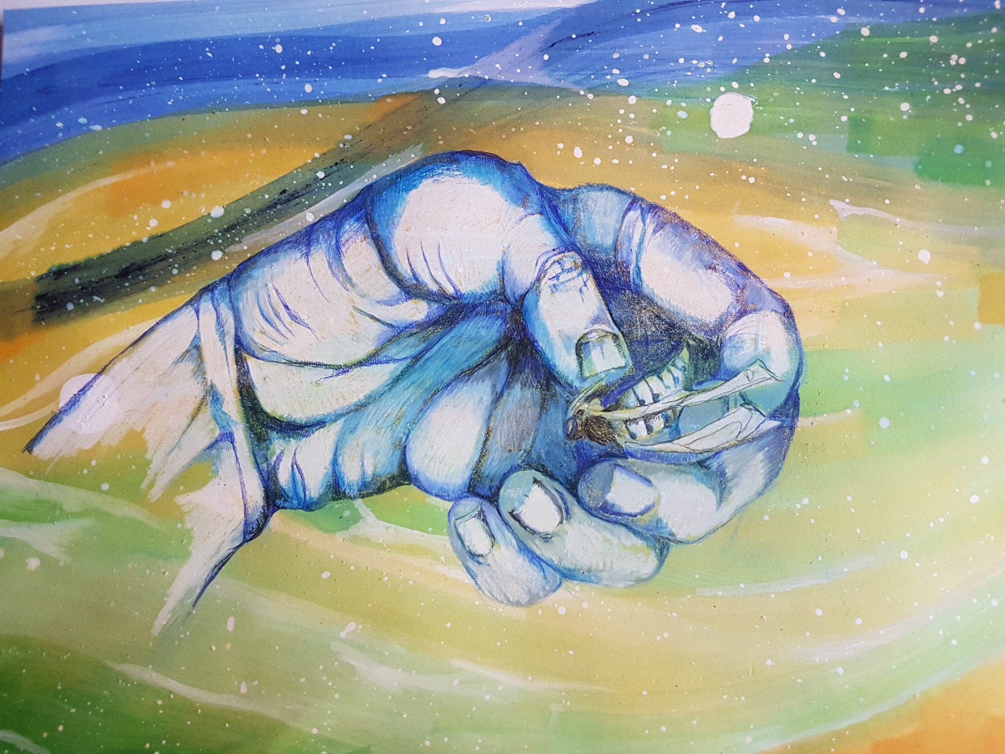
I decided to explore the idea of having another object or subject in the drawing and as I had struggled so much with holding the dead hornet, I decided to draw myself holding it. Holding the hornet, though it was dead, was actually really scary. Like I said, I was somehow afraid that it would spring to life and sting me, even though this was irrational. I wanted, therefore, to portray me holding the hornet in the most uncomfortable way possible. There was a real push pull to the way that I was having to hold the creature. I needed to have it close enough to be able to see the detail on the hand and the hornet, but my instinct was to hold it as far away form me as possible. So I had to contort my hand in a very weird and uncomfortable way to make both of these things possible.

This actually works really well as it happens, I think, because it allows the whole picture to LOOK as uncomfortable as it felt. The push pull I think comes from the pulling the hornet close to me, then pushing it further away in the same movement. The picture really shows this weird relationship.

hand holding hornet study
hand holding hornet study in blues

I was really happy with the way that this turned out. It is really effective. I think that the detail and the tone on the hand is really well portrayed.

Having now established that I wanted to put both my hand and the hornet together, I needed to place it in some kind of background.

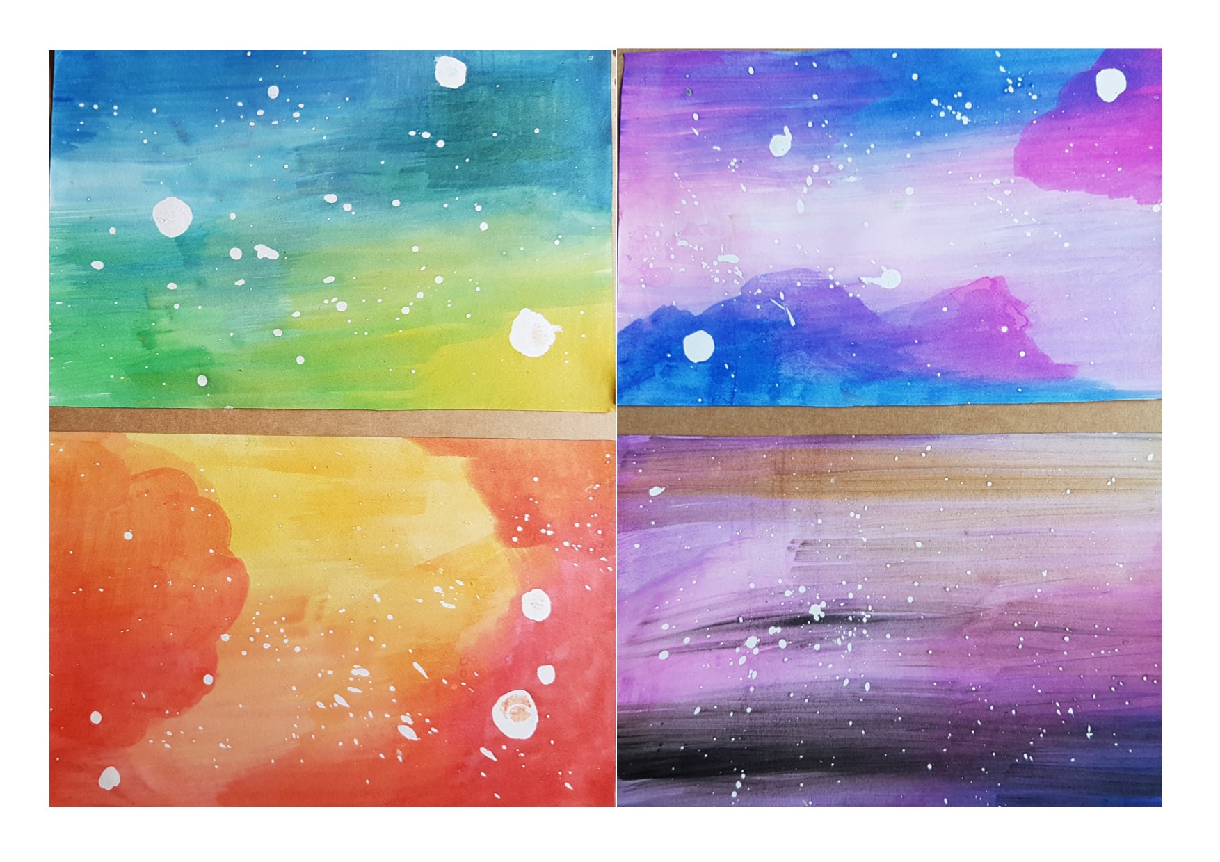
I wanted to have a wash or some kind of ethereal looking background that would contrast with the jarring image of the contorted hand and the dead beast, somehow making the conflict even more obvious, the background I wanted to be serene and calm, whilst the blue hand is stiff and contorted and the beast, though dead was once dangerous. I set about trying out different colour combinations for backgrounds using an ink wash. To add to the ethereal nature of the ink wash I splattered tiny dots of masking fluid onto the paper before putting the wash on it, so that it looked almost other worldly.

potential backgrounds for hand hornet

Out of these colour combinations I decided that the ones that worked best were the yellow/blue/green combination. I felt that the red and yellow was too much like a warning which wasn’t offering enough of a conflict. The purple and blue and black were too dark and brooding and the pinks and blues looked too pretty.  The green and yellow and blue seems very serene and that would really conflict with the contorted hand and scary hornet. I wanted it to be a drawing of conflict and each part of the drawing to make all the other parts increasingly less likely and comfortable.

So I went for the green, blue and yellow.

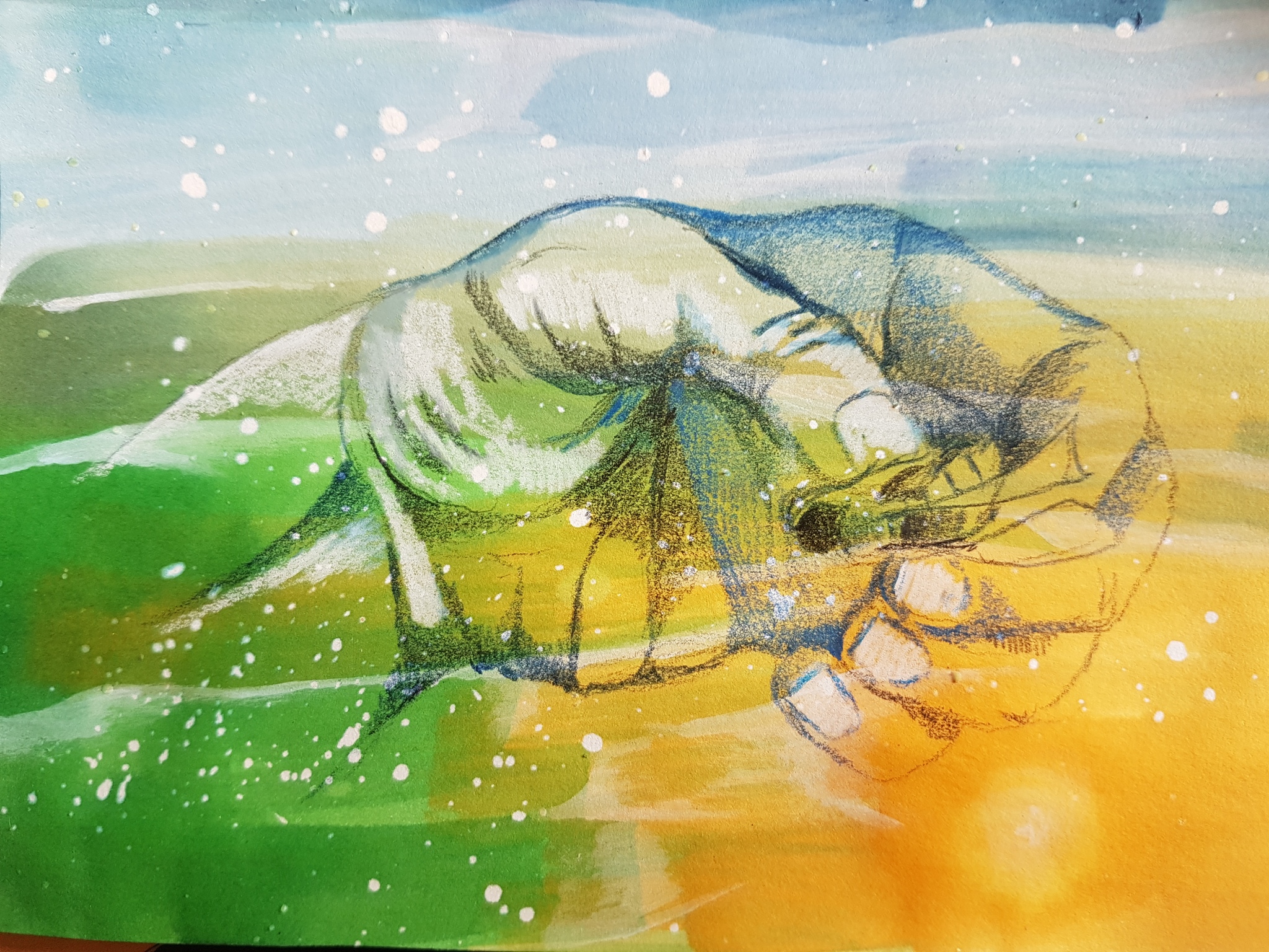
I did a small piece of paper with a wash and the masking fluid. Once the ink wash was dry, I peeled off the making fluid and then drew the hornet over the top of the wash. This was the mock up of what I hoped would be an effective piece.

hand hornet mock up on background

Next I wanted to do the drawing of the hornet on the background in more detail. I was happy with the way that that the mock up came out and felt confident that it would work on a bigger scale and  started out confidently.

One thing I did decide to change was instead of using the masking fluid, I found that when I was trying to peel it off, it was lifting off layers of paper as well as just the dry fluid. Instead I decided to flick tiny spots of white ink which was not as effective but worked out ok.

As it happened, it wasn’t as successful as I had hoped. I found it really difficult to achieve the same kind of wash as I had in the mock up, it came out rather a lot darker than I wanted and though the hand and hornet were obviously more clear and the colours more pigmented, as I had intended, making them more striking and stand out better, the overall effect was not as pleasing.

hand hornet idea for final piece maybe
hand hornet idea for final piece maybe?

I think that the idea is good and I think that it would benefit from further development and thought. I would really like to use the hornet as I LOVED drawing it, it would be a shame to leave it behind completely and I am hoping that there will be an opportunity to ise it again. But I am not entirely happy with the finished article and think that it is definitely still a work in progress.

Exercise 1: Still life using Line: Line Drawings

for this part of the course we were asked to draw a still life composition using just monochrome to imply texture and tone without excessive shading.

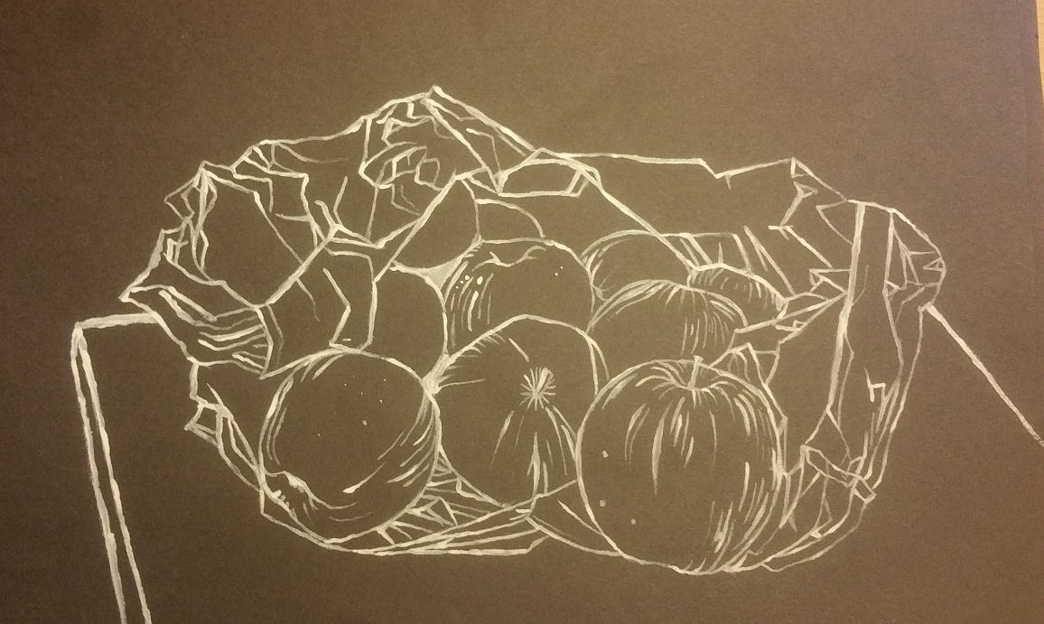
To start with I decided to draw a bag of apples.

line drawing apples in carrier bag
line drawing apples in carrier bag, white ink on black paper

I decided to draw a bag of apples on a small table. I used white ink on black paper. Even though this is a pretty good representation of what I was looking at, I am not really that enamoured with the outcome. It could be a cabbage or a pile of rags, there is nothing that determinable about it that makes it shout apples! So I decided to add in the bunch of bananas again to give it some context which then made the apples make sense.

white pencil on black paper line drawing fruit and bag

I drew it again on black paper with a white pencil crayon. It was difficult to avoid blending and shading as this is something that I do a lot of when I am drawing.

I decided to try doing this same image, either as a whole or small sections of it using different colours and different materials.

I was finding  it more challenging to do this exercise than I thought I would. I have enjoyed it though.

line drawing fruit in carrier bag
line drawing fruit in carrier bag with white ink on black paper

I did the same colours and the same composition but using white ink again and using a stiff paint brush.

I think that this worked better than the white pencil drawing of the same style and type.

I like the flow of the ink and the way that it sits in some lines much more thickly and with greater saturation and in others more thinly and more delicately. I have not drawn much with ink in the past but I really liked using it.

I decided to try doing something a bit more different later on with various pens and also a couple of drawings that were more abstract and then a picture with different subject matter.

The next couple were felt tip pens in different colours on differently coloured papers. I also had a go at pointillism.

I added a paper bag and moved the composition around slightly and drew on white paper with a fountain pen with purple ink:

purple fountain pen on white paper, fruit and paper bag, preliminary sketch for playing with colour final piece

This one I did as a preliminary sketch for the final piece for the playing with colours part of the module.

mackerel heads pointillism

I decided to draw a few different monochrome pictures with different subject matter. This one is of three mackerel heads.

Although I really do like the effect of pointillism it is very time consuming and a bit tedious. I have to remind myself whilst I am doing it that the outcome will be very pleasing and striking so that I don’t get fed up and give up. This is a small drawing (A bit bigger than A5) stuck in my sketch book and it took around an hour or so to draw! All those tiny dots instead of shading takes absolutely ages!

Having said that is IS very striking and effective and a good way to use monochrome to achieve a totally different effect.

monochrome sheeps skull black and white pencil on black paper

This one, above, was a change of subject again, black and white pencil on black paper of a sheep’s skull.

monochrome skull still life, black and white pencil on black paper

Above is a still life composition of sheep’s skull and various other shells, bottles and paint brushes which I drew using the black and white pencils on black paper. I really liked this one. I like the composition and think it looks very effective. I didn’t pursue this one any further. I wish that I had all the time in the world to pursue loads of the things in this module, there is so much scope for developing nearly everything that I have done!

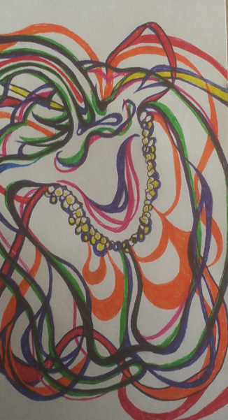
abstract pepper
abstract pepper

This one on the right is an abstract line drawing of a capsicum pepper.

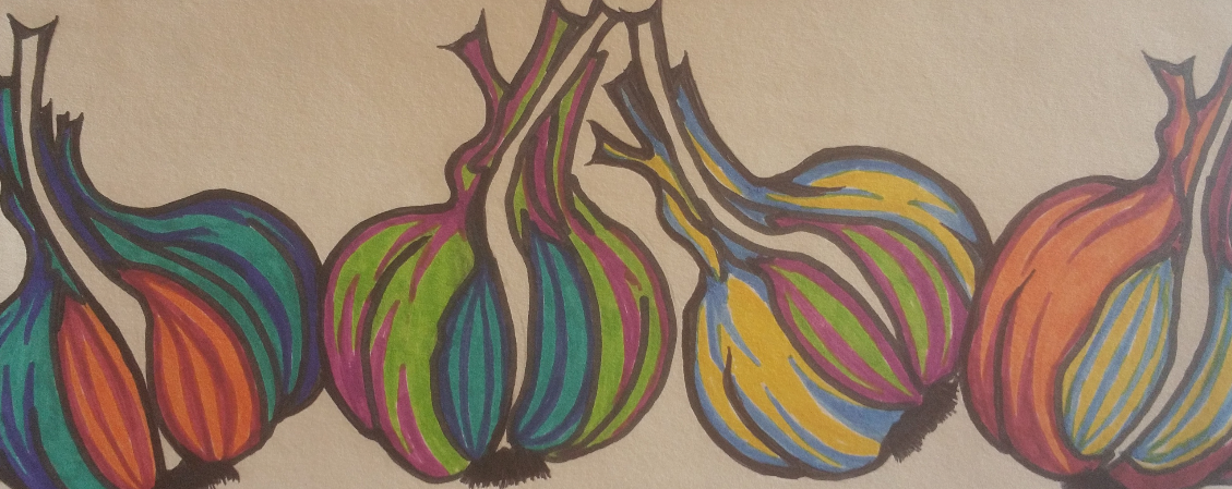
I decided to use lots of colours for this one just as an experiment. It was just a bit of fun, but it was so effective and fun that I decided to stick it in my sketch book after all! I also did a row of a few colourful garlic bulbs in a similar style.

I used loads of different ink pens, biros, felt tips, gel pens and fine liners and a fountain pen for the pepper and a mixture of coloured felt tip pens for the garlic.

Although I deviated from the initial brief for these ones, I think that they are really effective and they were great fun to draw too!

abstract garlic
abstract garlic

Again this was a most enjoyable part of the course and something that I really could take further. It will be really difficult to decide which parts to develop when I am finally ready to prepare to get things wrapped up and ready for assessment. Although it has taken me a long time to get things sorted out, this has been a hugely important and exciting journey for me, where I have come up against a lot of my own demons, barriers and walls but also been enormously inspired and excited by what I have done so far!

More About Negative Space & Research Point

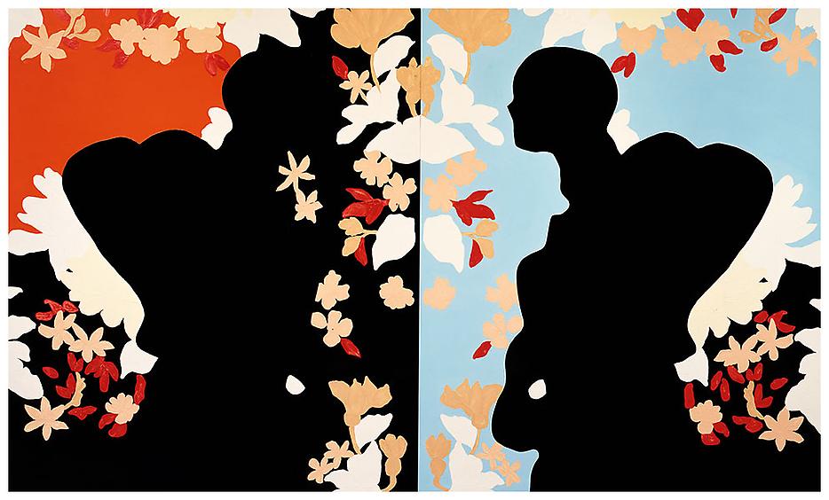
Leading on from the artists that I chose to look at earlier regarding their use of negative space, the course literature suggested that I look at the work of Gary Hume.

These are the images that I have chosen to look at:

Gary Hume 1994_love_loves_unlovable_
Gary Hume ‘Love Loves Unlovable’ 1994

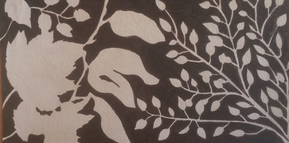
the image that I chose first, ‘Love Loves Unlovable’ I thought was relevant to the work I have been doing as it involves the use of large areas of black and the use of foliage. I really like the way that the colours pop out so much in contrast to the large areas of black.

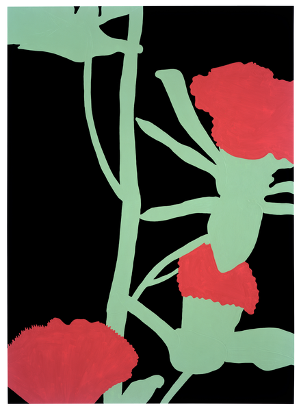
Gary Hume 'pinks' 2000
Gary Hume ‘Pinks’ 2000

The second Image that I chose was ‘Pinks’ which again I decided to look at because of the use of organic matter.

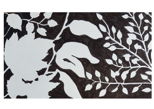
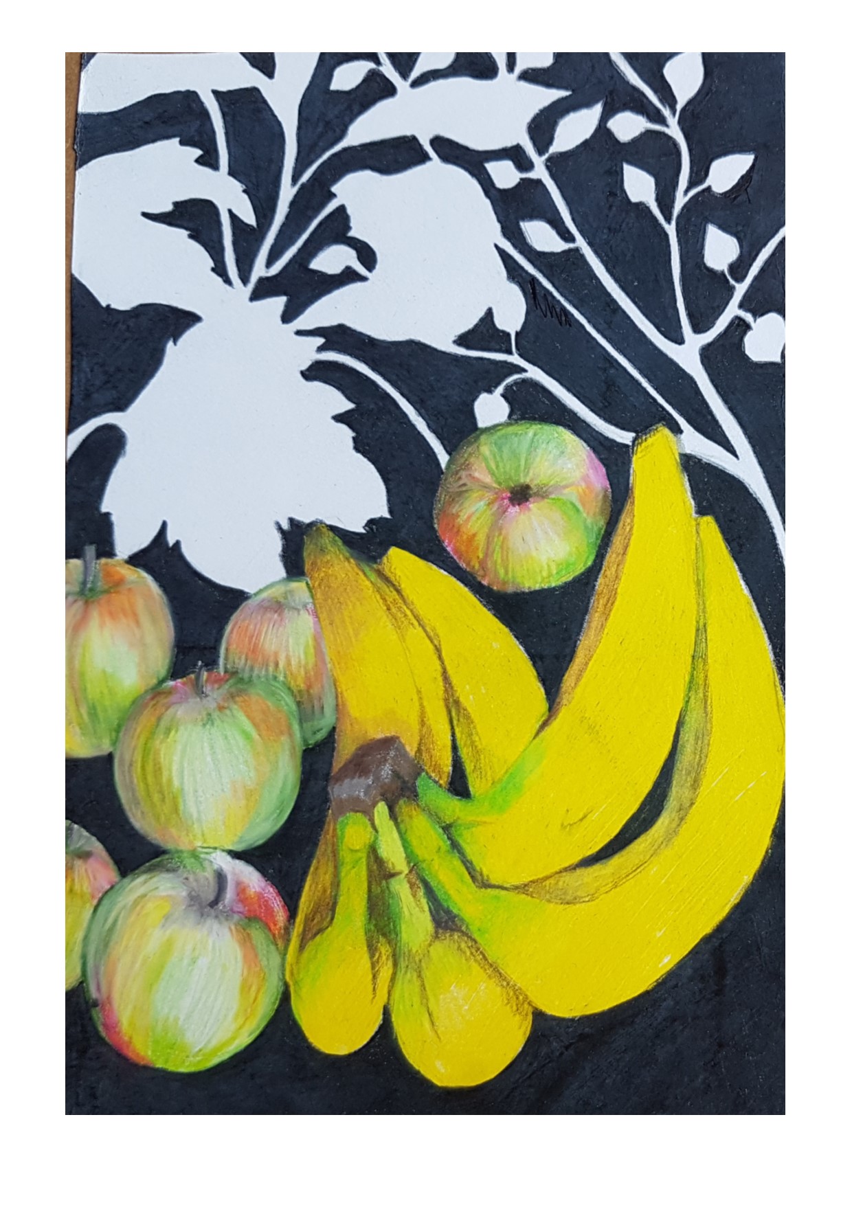
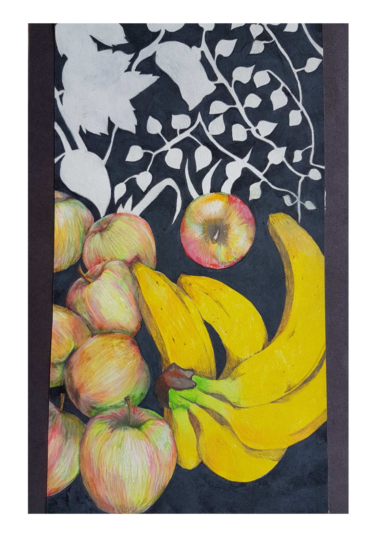
I have been working on my own pieces using apples and bananas and foliage against a dramatic black background, using the foliage in relief rather than adding detail, much like the work of Gary Hume,  I have done a number of sketches and have a rough idea of what direction I would like the drawings to take.

FIrst off I have done a number of sketches of the fruit in detail using various different media. These are in my sketchbook and I have included some here.

I decided to carry on and work with the apples and bananas and foliage and had a lot of thoughts about the composition of the drawing. I want the eye to be drawn in to the middle of the drawing and have explored the best way to do this in my sketchbook.

negative space
practicing the foliage for the background

I first practised the foliage in the background once I had decided on the composition of the final drawing. I wanted to have a range of different sizes of leaves but also not to complicate the foliage aspect of the drawing too much as I want to have the focus of the final piece to be the fruit and the foreground and for the foliage to enhance that aspect not drown it out.

I decided to keep the colour completely flat and blocked so that the detail of the fruit and the colour really stands out. Much like the work of Gary Hume. I decided to do a mock up of the final piece in rough so that I could see what the outcome might look like.

negative space mock up for final piece idea
mock up for a final piece idea.


I have decided after much deliberation that I want the size and shape of the drawing to be tall and narrow rather than a typical ratio. I think that this will be more interesting and quirky, almost as if it is a view through a door that is not properly open…

After all the sketches and preparation for the final piece this was what I ended up with. I am not entirely happy with it, as I think it would be better much bigger, additionally I think it would work well in paint rather than pencil. I did draw some of the preliminary sketches using oil pastels and soft pastels and mixed media as well as exploring other vegetables and fruits but this was what I decided on and I think it is something that would benefit from working on the idea more and exploring more ways of presenting it.

negative space final piece idea
intended final piece for this part of the module, however I think I Would like to work on this idea further.

I do really like the composition of the piece and loved drawing apples and bananas and have decided to concentrate on these as a subject for further parts of this module, though I have explored lots of other subjects too.

I love how warm the colours are on the fruit, and think that it works really well. having said that it definitely needs work.

Playing with Colour and Still Life

If at first you don’t succeed….

FOr this part of the module we were asked to design a still life composition and to play around with colour to achieve texture, tone and depth, using colours that were not what we would expect to use, rather than ‘just’ drawing in the regular colour scheme.

I was really looking forward to this part of the module and was developing something of a real respect for the humble apple and banana. I had also become aware of the importance and significance of texture in drawings and therefore decided to stick with my theme of apples, bananas and carrier bags.

I have done extensive drawings in my sketchbook of these things using various different materials and achieving varying levels of success.

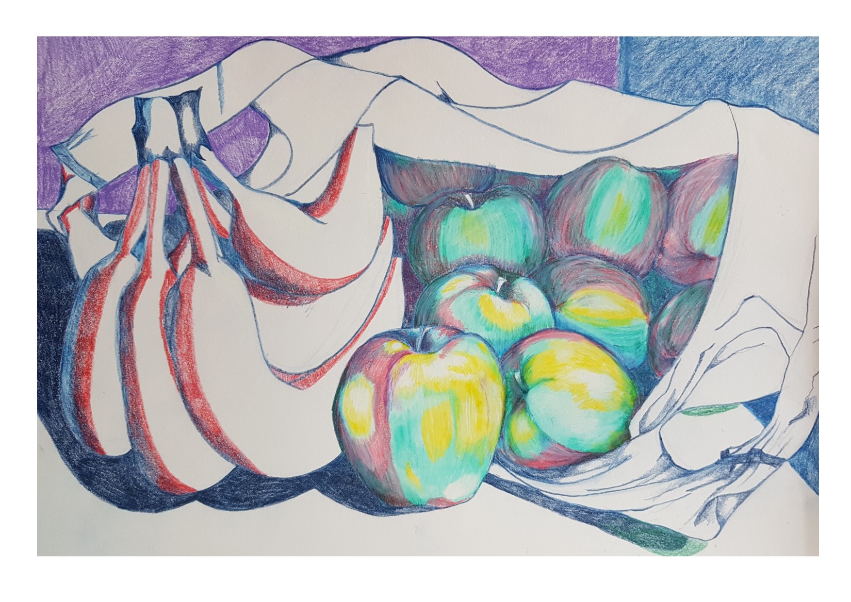
I decided to go all out and use bright and garish colours to depict these subjects and dove right in with my first attempt.

playing with colour #1
playing with colour attempt #1

I was getting along nicely with this one and thoroughly enjoying it, then massively overworked the carrier bag in the middle of the drawing. I was disappointed because until then it was working rather well. I was having fun playing with alternative colours and thought that it was going to plan, but got a bit obsessed with the carrier bag handle and over did it!

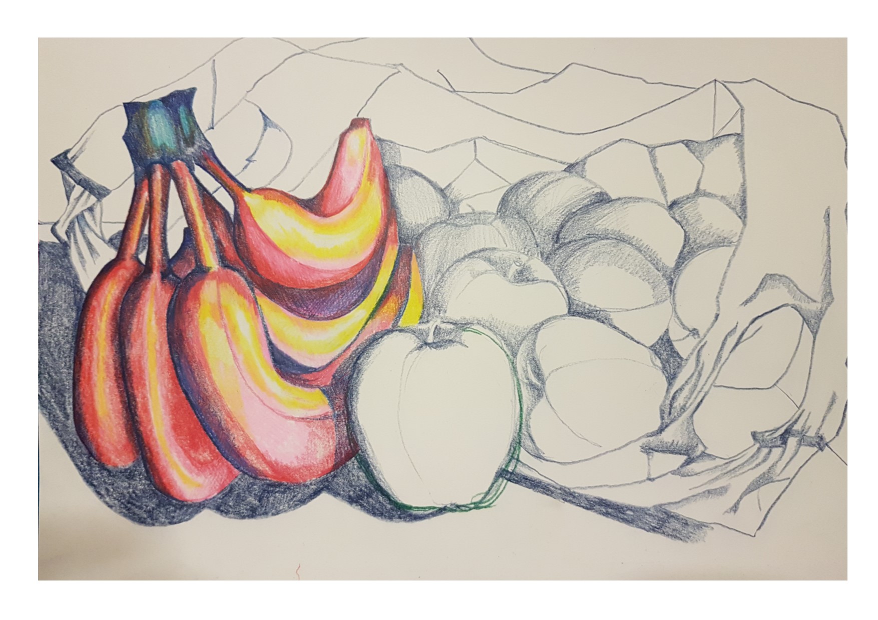
playing with colour #2
playing with colour attempt #2

So I started again…. same subject but honestly, lost all interest in it because I think that the colours went from being quirky and fun and a bit different to just looking rank and offensive …. time to try again…..

playing with colour #3
playing with colour attempt #3

number three started, I was a bit happier with the colours but then realised that as I had shifted my position without realising it whilst drawing the initial sketch for the shapes, I had inadvertently and unknowingly caused the apples at the back of the carrier bag to appear as if they were floating and not sat on the table top properly. Completely unsatisfied with that outcome, I decided to stop again and start a new one…..

Also reflecting back over this exercise, I had not done a very good job up until this point in terms of making the apples look shiny and round, the way that i have drawn them, the very shiny, round parts of the apples look like they are actually flat and shiny.

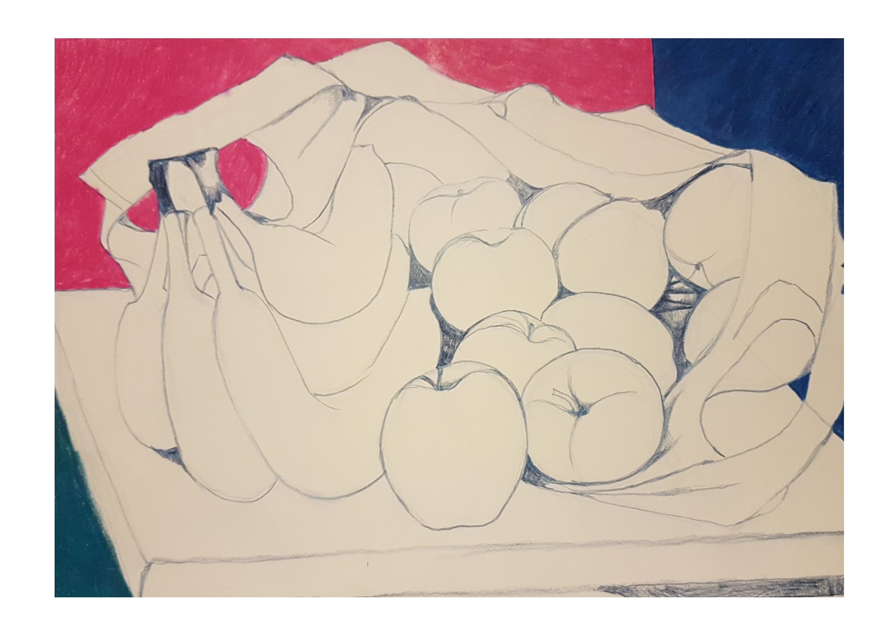
playing with colour #4
playing with colour attempt #4

drawing the outlines again, I managed to sort out the floating apple issue and get that part of the drawing right, but then managed to pick colours for the bananas which were in danger of triggering a migraine. I am all for creating challenging pieces but added to the frustration at having started the same drawing 4 times was the fact that the colours that I had chosen were making me feel nauseated…. I decided to sling it to one side and start again…..

playing with colour #5
playing with colour attempt #5

Studying the still life composition carefully for the 5th time, I managed to draw what I thought was an accurate depiction of what was in front of me, I accidentally ended up with a floating apple. Not deterred, I persevered and finished the outline then plucked possibly the most disgusting colour out of the 200 or so colours that I have to choose from and coloured in the wall behind the fruit all in that colour.

By now I was tearing my hair out somewhat as this previously pleasurable and enjoyable task was now becoming a migraine-inducing, nausea promoting pain in the backside!

I decided at this point to take a hiatus from the carrier bag of fruit and leave it well alone for a couple of weeks and get on with something else.

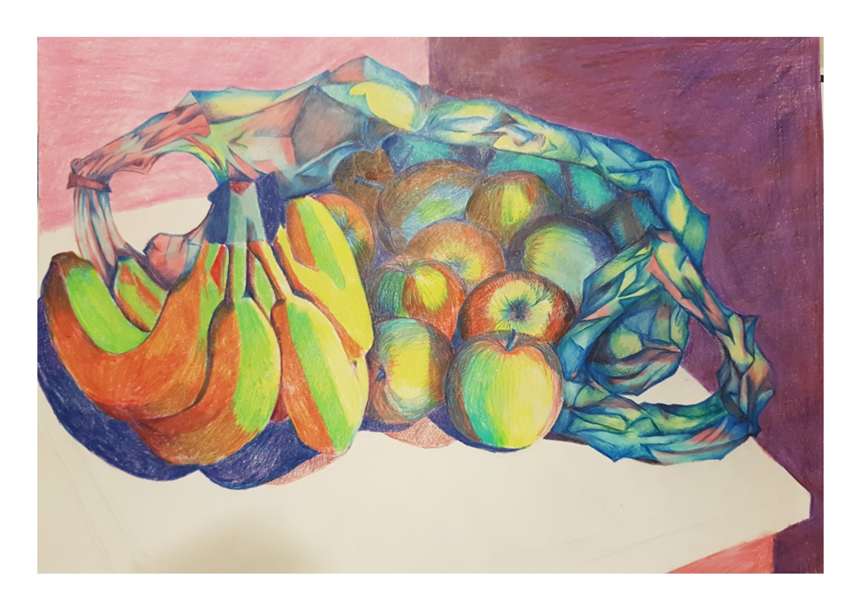
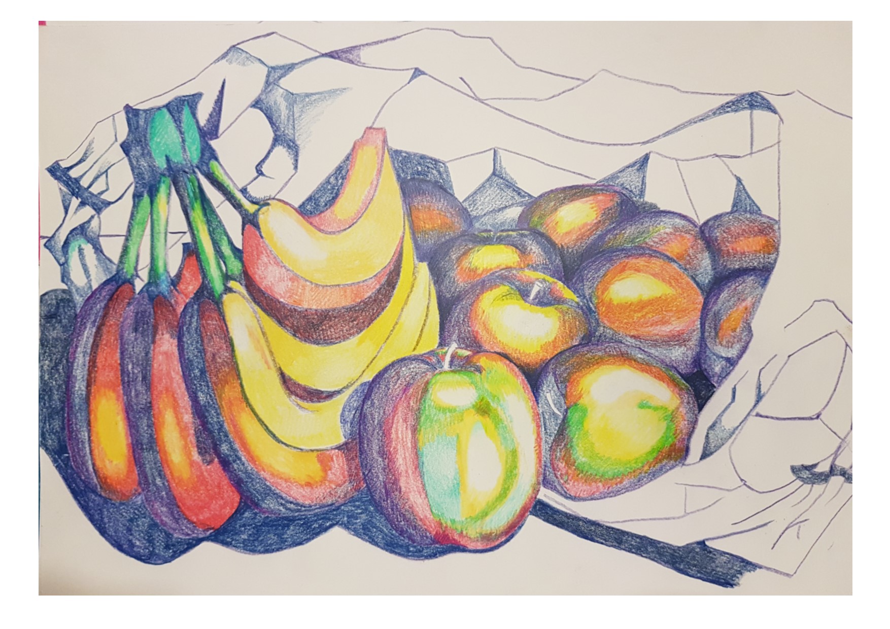
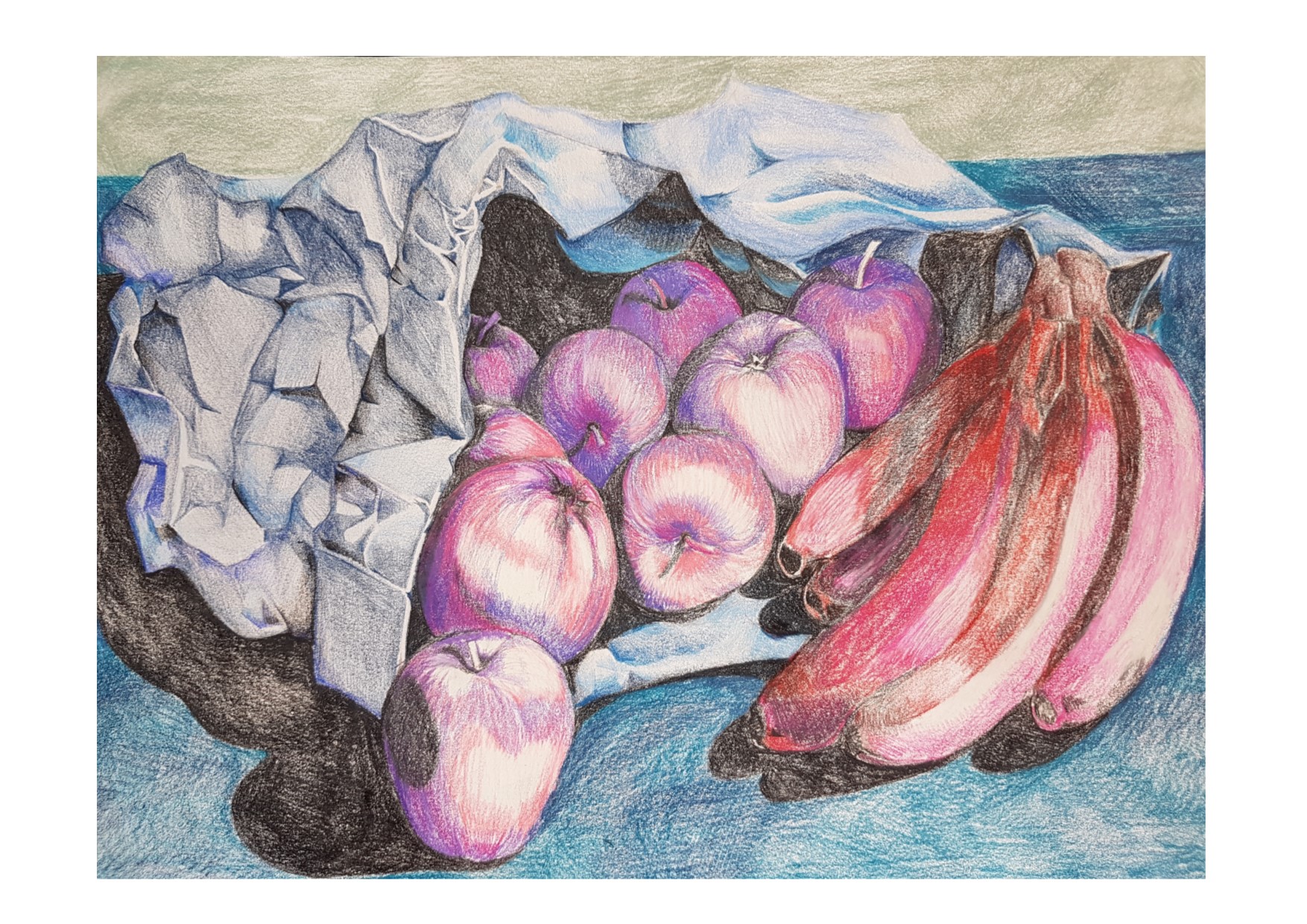
WHen I came back to it some time later I decided to do things a bit differently. I swapped the plastic bag for a paper one and put a bunch of bananas (obviously not the same ones) on the opposite side of the composition instead.

This actually was way more pleasing on the eye!

The I set about taking into consideration everything that I had learned from my first five attempts at drawing this picture and set to.

This time…. IT WORKED!!!

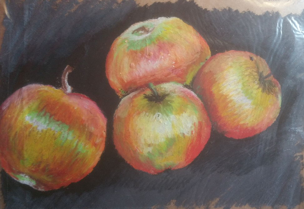
playing with colour final piece

I think that this works really well. I much, MUCH prefer the colours that I have chosen to use. The only part of the drawing that I am not happy with is the dark shadow on the left side of the apple at the front of the drawing looks like a hole and not like a shadow…

I like the use of light and dark and how I have managed to achieve some quite striking differences in tone with out using obviously contrasting shades of black and white. I am having something of a love affair with brown paper, I LOVE drawing on it and think it gives a really great effect.

Over all this was a really interesting if a little frustrating exercise at times. I think that I have met the required outcomes and I am happy with the result.

Interiors & Research Point Including Final Piece for Assignment 2

Looking at the work of Escher, David Hockney, Anthony Green and Philip Pearlstein and their work on interiors. Also my own slant on this subject. Not my usual choice of subject matter but very enjoyable nonetheless!

for this stage of the module, we were asked to draw different parts of the home in short sketches. I started off drawing in the bathroom and kitchen using pastels and charcoal, just quick sketches and I very quickly realised that I was NOT having any pleasure from doing it in this way. I think it shows in the quality of the work that I produced. Though it fulfilled the criteria for the short sketches it was like pulling teeth and I HATED it!

this is what I produced:

the first sketch is obviously my bathroom and the second one I chose to concentrate on the kitchen sink. It was very apparent to me that I would need to find a way of adapting the task to suit my way of working and to make it an interesting and fun thing for me to do, in order that the quality of the work would be better, I find that when I am drawing something and really not enjoying it, the quality definitely suffers.

I thought for a while about this and realised that the things that I love drawing, people, faces, animals, plants. abstract shapes, all have one thing in common…. none of them have straight lines! this is completely the opposite when drawing things that are manufactured and built to an architects design around the home, there are a multitude of precise angles and straight lines.

On realising this I decided that the way that I would be able to inject something exciting into the work, I would observe the room through my digital camera’s fish eye lens.

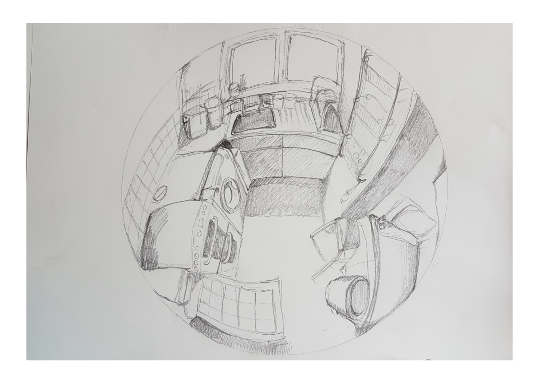
At first I frew a very quick sketch of the kitchen with pencil, whist standing with the

fish eye lens kitchen sketch
quick sketch of the kitchen viewed through a fish eye lens

camera, but realised very fast that this would just not be possible fot eh other drawings. I am disabled and standing or even sitting with lots of equipment and trying to draw simultaneously without anything to lean on, would be impossible. I was viewing the room from an elevated view point so this was proving to be very difficult indeed.

I decided that I would need to take photographs using the fish eye lens and work from those instead, offering me the opportunity to get some really quirky angles and throw myself into the task with much more enjoyment and fun!

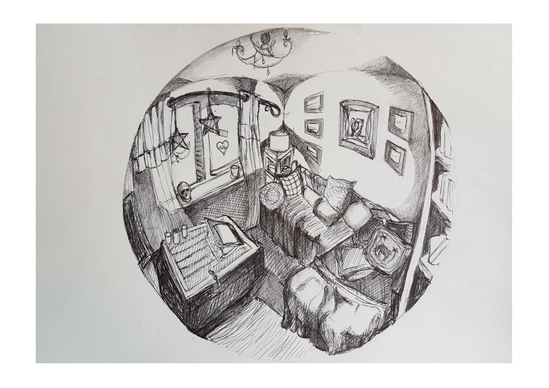
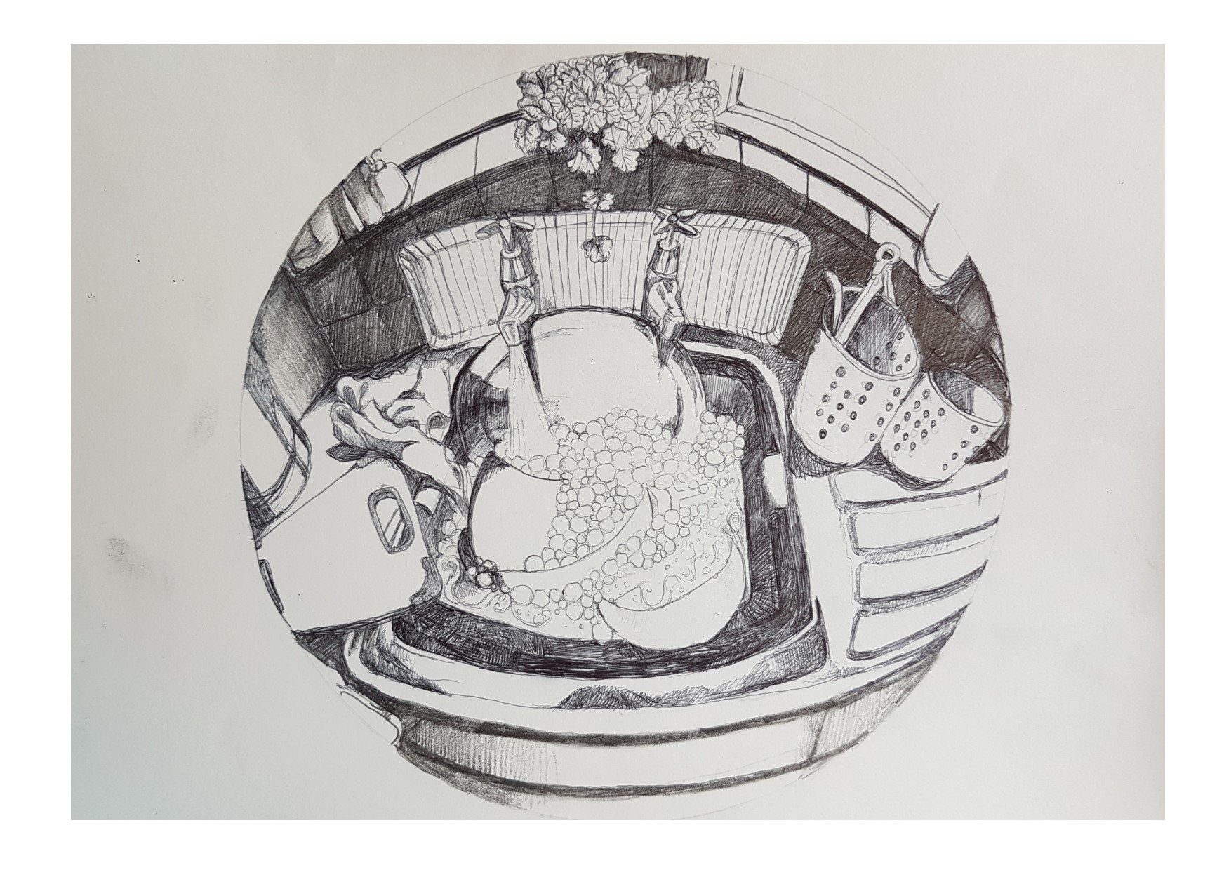
I went on to draw the living room using biro and pencil, I took a photo from high up looking down on the living room from the corner, and then focussed back on the kitchen sink with the tap running.

fish eye lens living room sketch
sketch of the living room through a fish eye lens, using biro and pencil


fish eye lens sink sketch
‘Everything and the kitchen sink!’ Sketch using biro, viewed through a fish eye lens

I was actually really, really enjoying this work now and I am certain that this is reflected in the quality of the work, which is miles away from the initial sketches that I did.

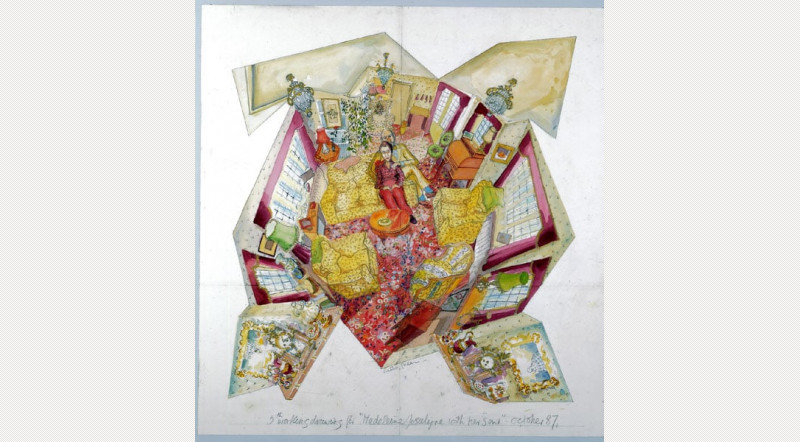
The research point in the course materials presented two drawings. The first is Anthony Green’s “Study for Mrs Madeleine Jocelyn with her son” (1987) and the second is Philip Pearlstein’s “Male Model with Kimono and Female Model with Mirror” (1985) seen here:

Anthony Green 'Study for Mrs Madeleine Jocely with her Son' 1987
Anthony Green’s “Study for Mrs Madeleine Jocelyn with her son” (1987)

Philip Pearlstein 'Male model with kimono, female model with mirror' 1985
# Philip Pearlstein’s “Male Model with Kimono and Female Model with Mirror” (1985)

The first thing that strikes me about these two drawings is that despite the fact that they are very, very different, both of them play with perspective, whether we look at Anthony Green’s study, which is obviously drawn in such a way that it disregards perspective in the typical sense completely, by presenting the whole room in one go , even though it would be impossible to see it in that way with the naked eye, or looking at Philip Pearlstein’s work, where the perspective is actually accurate, the nature of the composition makes it appear that things are somehow not quite right.

I love the ‘push-pull’ feeling that I get when I look at Pearlstein’s work, the legs going in opposite directions and in such a striking diagonal placement, almost draws the eye in a kind of ‘roller coaster’ way, moving the eye around the page drastically and dramatically.

I can also see how the fish eye lens that I have been using reflects the same sort of effect and is a pleasing way of viewing more of the room in one drawing than you would normally see. The addition of the mirror in Pearlstein’s piece offers this same depth, giving us the opportunity to view things from more than just the ‘standard’ perspective.

Looking at these two pieces also reminded me of David Hockney’s work around interiors and the work of Escher who messed about with perspective, perhaps more than I was planning to, but again offering more of the landscape to the viewer than would be there ‘naturally. There was one drawing by escher that I was thinking of in particular.

David Hockney 'small interior' 1988
David Hockney ‘small interior’ 1988

With this one I like the way that it almost has the fish eye lens effect, with none of the lines being particularly straight and the feeling of the drawing is that it curves around a centre point. I also like the colours and the way that the eye is drawn straight to the centre of the picture.

I also like the fact that it has loads of detail and content but is somehow really naive and simplistic at the same time! I also liked another of his pictures which I chose to add here too.

This one is along the same lines, the curve of

Tyler Dining Room 1984 by David Hockney
Tyler Dining Room 1984 David Hockney

the drawing pulls the eye into the centre of the picture in the same way as the first one, perhaps even more so. It also has the same quality as the drawings by Pearlstein and Green, in that it offers more of the room to the viewer than you would normally find in a picture of a room, the edges of the room are pulled in to include more detail and space and again, despite the content and detail being very rich, it has that same naive quality.

The drawing that I had in my mind by Escher is the following:

Escher 'hand holding reflective space' 1935
Escher ‘hand holding reflective space’ 1935

I love how this drawing includes both the room and the artist himself. I actually had wanted to find a large reflective ball to draw in the same way, but had to compromise with the fish eye lens instead because I was unable to find one. Again, this drawing, though actually done with less space, and with a smaller area to fill, still offers much much more to the viewer of the room and the space it is depicted in than if it was just a reflection in a flat mirror. I love how we know that those shelves are straight and parallel, but in the drawing they are not. The curves I find really pleasing and exciting to look at and I feel that I have managed to bring something of the same effect to my own drawing.

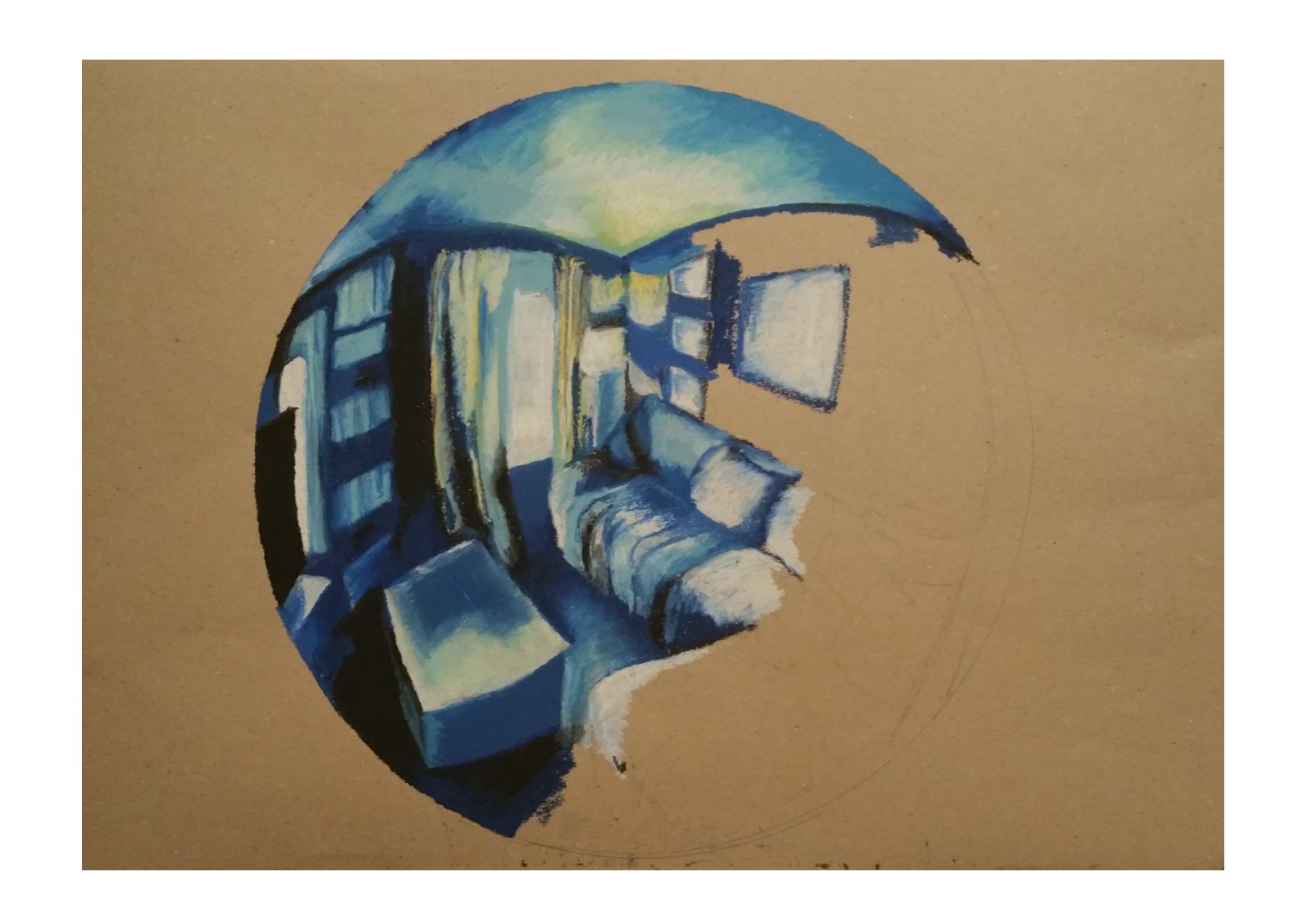
I initially decided to draw my fish eye lens final piece in oil pastels, and After drawing around a huge bodhran drum to get the size and shape that I needed to draw the lens aperture, I plunged in using a blue colour scheme, after playing with alternative colours in a previous exercise in the module. However this was a huge failure. fish eye lens final piece #1 oil pastel

It looks clumsy and clunky and messy and I was really unhappy with the result. I did endeavour to stick it out and finish the drawing but it became clear after some hour or so of drawing that I was on a hiding to nowhere in terms of making a decent looking picture and I decided to discard that effort (I have included it in my folder though) and move onto a medium that I felt would offer me the opportunity to add detail, but still retain that naive quality that has been a feature of the works that I have seen that I particularly enjoyed looking at.

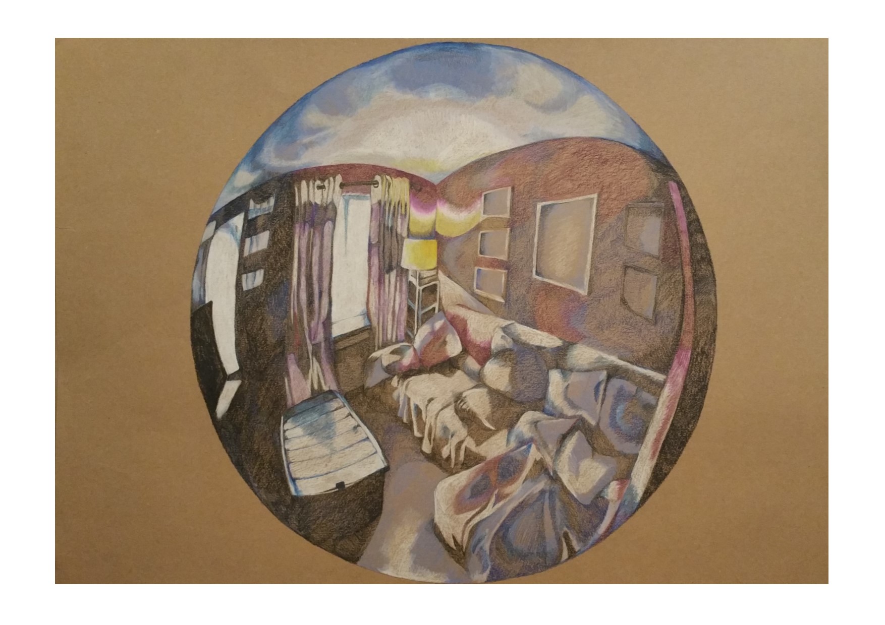
I actually did not expect to enjoy drawing this last piece as much as I did. I had fleeting memories of the initial room sketches that I had done in soft pastel and charcoal and shuddered at the thought of trying to make something staid and architectural like a room enjoyable and pleasing to look at in picture form. It really wouldn’t be my usual choice of subject and definitely something that I would not have thought would be a fun way of spending an afternoon! To my absolute amazement, I LOVED drawing the whole picture and was a little bit sad when I had finished as I would have liked to have spent more time doing others. I think it would be a really good thing to have a set of three or four of these fish eye lens drawings, in different colour schemes and either different rooms or different perspectives of the same room.

fish eye lens final piece #2 pencil living room
Fish Eye Lens Final Piece- Living room

I chose to use blues and purples on the whole but added in the warm yellow of the standard lamp which I think draws the eye even more to the centre of the picture. I also used the warm tones of the yellow in the light cast on the wall and the sofa in parts. I think that I have managed to capture the light and dark of this interior really successfully, the light that is prevailing is the stark bright outdoor light coming through the windows which has cast some really nice shadows and added a lot of contrast and silhouette in places which is very pleasing to look at and could appear gloomy, but I think presents itself as rather striking.  I’m also really pleased that I have managed to make the fabric of the curtains have a somewhat translucent effect, with the bright external light behind them. I love the curved lines and the way that the walls draw you into the room, and again, like the work that I have admired so far, the way that the perspective that I have used allows so much more of the room to fit into the picture than if I had just drawn a flat, regular perspective drawing.

Overall I am really satisfied that this is a successful drawing and meets the criteria and outcomes that are expected of me, and I very much enjoyed making this.

“One Long Day…”

Coming Home

It’s been a long while since I wrote anything on here. A good three or so months since my last actual blog post, but I have been writing bits here and there to put on here, none of it’s seems very relevant any more, I have just felt so disjointed and all up in the air, and all of a sudden I feel as though my brain has  let me start being creative again. Hurrah!

Wow.

I’ll start at the end first- logic y’see!

So this morning (Monday 20th March 2017) I posted what felt like an embarrassing SOS on the drawing 1 forum basically explaining that I have been in a terrible place mentally and physically for the last few months. Just leading up to the last few months I was extraordinarily productive and churned out loads of work, something that I will certainly been on the lookout for in future as it was a pretty big indicator that I was experiencing a manic episode. I am diagnosed with bipolar type 1 which if you want to know more about can be discovered abundantly on google with no real effort…. (here is a link to loads of articles on google about it –Bipolar Articles– see, you really didn’t need to put in any effort at all!)

I was amazed at the lovely responses that I received after just a few hours of posting that SOS, I had, it seems, no reason to be embarrassed and every reason to believe that the people who I am sharing the journey of this course with are basically lovely, supportive, and generous folk who are a lot like me…. I had a big grin on my face to replace that glum, solemn grimace that I had been wearing earlier in the day.

As any fellow BP1-er will know, those euphoric highs are pretty much always followed by a crippling low. This was form in that regard.  In addition to that there is also the small matter if the dissociative disorderly stuff, chronic anxiety and various other mental health stuff- and then just to add another layer of fun and games, I hurt my back, which made my physical problems a great deal worse… I have the added benefit of fibromyalgia and chronic fatigue… deep, deep, resounding joy!

There I have been since the tail end of that wonderful productive period (I will also be writing a blog post with drawings that I made during that time later, I need to get this off my chest first!) dipping and dipping further and further, until frankly I just didn’t feel able to get back up. The first thing that goes, every time this happens, is the ability to be creative. That’s not to say that the feelings are only there when I am manic, that is not the case, I pretty much feel creative all the time. When I am manic and euphoric that creativity is massively increased, but it never fully goes away, the feelings don’t anyway, the ability to use them, to have those feelings manifest works of art- this is what diminishes. Along with the creative purpose that reduces, I also find that the state of me and my flat are also hugely affected. Often, I end up living in and living as a total mess!

The reason I decided to name this post ‘One Long Day’ is because it feels exactly like that to me. Each day doesn’t seem to end with any kind of satisfying, restful conclusion, boundaried by undisturbed sleep, rather it just drags on and on with unrelenting sadness, emptiness and ultimately despair…

I lived in that one long day for months. Now it is time to start another…

After I posted that plea for support I knew that I had to take action and do something about the situation. Not just sit there and hope that it will go away or somehow magically change into something more positive. This has just been a snag. There may be others, there may not, but it is likely that there will be.

I took out my folder which had somehow acquired the same emotional qualities as a giant five headed monster with big teeth and the attitude of what would happen if Katie Hopkins and a rabid T-Rex were to somehow create an especially angry two-year-old.

With sweaty palms and a raging headache I decided that I couldn’t do it by myself, so I called a friend for the emotional support necessary to open it.

Friend on board, I falteringly opened the folder at the required page and realised that rather than being a hugely pissed off toddler, I was faced with no more than a slightly vexed puppy. Maybe one who had just found out that its tail was attached to its body and endlessly chasing it wasn’t going to achieve anything. Pretty much that. Or maybe the puppy was actually me?

SO the rest of the story is pretty non-descript in terms of narrative, basically I read the stuff I needed to, got some paper, pens, pencils, gel pens, a biro and a drawing board and sat down and sketched several pages worth of drawings, felt really happy about it and now I am writing this. I’ll include photos of the drawings in my next post…
Thanks for sticking with me and helping me to trust the process. It isn’t always easy, painless or fun but the process always wins out in the end.

Project 1 Continues… Detailed Observation of Natural Objects
More Sketches For Drawing 1 Part 2- Intimacy, Exercise 1. Further Studies and Experimental Drawings.

I started to share in my previous post some of the detailed observations of natural objects that I have chosen to work with. This has been a riot of mess, colour, fun and ideas. Manly I have chosen to work with seafood, fruit and vegetables and this will continue through the next project -I have already made a start to this, and there is a lot of continuation from one project to the next as I read forwards to the next on and find that  I have been doing some of it anyway! I like to keep the next project as a surprise. I don’t read forwards at the beginning because I want to be able to approach each topic with my own ideas and not just be led by what is in the folder so that I can see how things develop organically for me. It is interesting how much of what I have been doing already then shows itself in the next project!

I have been doing lots of sketches of natural objects paying attention to the object individually and as a group if there is more than one- as you can see form my perevious post, looking at background as well as subject (something which I have now discovered comes up in project 2!)

I used different materials, papers, drawing implements and styles.

smartselectimage_2016-11-16-10-17-36

I re-drew the apples from the first part of my sketches using oil pastels to see if there was any improvement on the soft pastels. I actually think that this works really well.

smartselectimage_2016-11-16-10-17-23

I included this doodle in my sketchbook after reading about ‘Memento Mori’ and being inspired somewhat by the subject matter that these artists paint and draw. I decided to keep it in my sketchbook as it was interesting. What amused me greatly though was that when I photographed it and looked at it as a whole picture and not just the individual aspects of it, I realised that the silhouette in the middle bottom of the doodle looks remarkable like a female bottom wearing slinky knickers. This was quite by accident, though I wonder what my unconscious mind was trying to tell me!!?

smartselectimage_2016-11-16-10-17-00

This is a bit of a study on just the negative space aspect of the drawings that I was doing initially after researching artists who use negative space in still life. I used a piece of plain cartridge paper and a black felt tip pen for speed. I wanted to have an experiment with negative space in more fine detail as I think it would work better with the style of drawing that I prefer.

smartselectimage_2016-11-16-10-16-49

These were some really simple doodles on the back of the cabbage study that I included in my first blog post of this part of the course. I used different colours of felt tip pen and a white pencil just to get some idea of colour choices.

smartselectimage_2016-11-16-10-16-31

This is a group of garlic based on the study that I did of the garlic. I used garish colours of felt tip pen just to try something new. I actually really like this drawing even though it is nothing like I have ever drawn before and is not anything like the kind of thing I would normally have in my house, I would actually really love to have this on my kitchen wall, it’s great fun and quirky and quite a joyous little sketch!

smartselectimage_2016-11-16-10-16-17

Another experiment that I did with the drawing of the pepper that I drew (example in the previous post) I decided to experiment with lines to imply the shape and form of the pepper. I actually really like this one too. It is fun and colourful and I like the way that it gives a sense of looseness but in actual fact is really carefully drawn. I used fine liners an biro and just layered up lines and colours to make this effect.

smartselectimage_2016-11-16-10-15-13

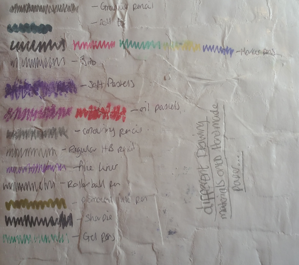
This is a sample sheet of some paper that I made. I used pieces of crumples greaseproof paper which I painted a square of white acrylic pain. I had planned to just do that and draw directly onto it but the paint made the greaseproof paper really flimsy and thin and it would have been impossible to make any kind of marks on it that were pressed harder than a very delicate touch. I decided to persevere with the idea of making this paper and tore up a piece of plain cartridge paper into small pieces and layered them up onto the greaseproof paper with the acrylic paint then finished it with a thick layer of white acrylic paint to make the drawing surface. This made a really robust drawing surface once it had dried, albeit a little bit shiny. I experiemented with  a dozen or so different drawing implements (from top to bottom):

  • Graphite Pencil
  • Broad black felt tip pen
  • Colourful artists ink pens
  • Biro
  • Soft pastel (I had to put a layer of stick tape over this to stop it smudging as I couldn’t use fixative)
  • Oil Pastel (again added sellotape)
  • Colouring Pencil
  • Regular HB pencil
  • Ink Fine Liner
  • Rollerball Pen
  • Gold Permanent Ink Paint Pen
  • Sharpie
  • Gel Pen

The most successful of these with this drawing surface were the HB pencil, the biro, the colourful artists ink pens, the fine liner and the roller ball pen.

With this in mind I did a few sketches on the handmade paper:

smartselectimage_2016-11-16-10-14-51

This was the first, a whole mackerel which is not that successful. I was really getting to grips with the surface ass I was drawing on it. It was really lumpy and shiny and hard to use but I thought if used in the right way could produce some interesting results.

smartselectimage_2016-11-16-10-15-48

Mackerel head based on the larger drawing of the mackerel that I did in soft pastels (further down) I think that this is much more successful. I used biro and artists ink pens, smudging and blending the colours for different effects. I used the white background to pick out shiny parts of the fish… And finally:

smartselectimage_2016-11-16-10-14-34

A brown crab. I think that this one works really well! Again I used biro and ink pens. It looks like watercolours and I think works really well. This drawing is based on the sketch that I did of a crab that I bought from the fish market. I really like this one and think that it is the most successful of the three that I did.

smartselectimage_2016-11-16-10-15-37

This is a detailed sketch of one of the whole mackerel that I did then cut out and mounted onto a crumpled piece of greaseproof paper which I mounted onto a piece of heavy brown paper. This was not without difficulty as the greaseproof paper did exactly what it was designed to do and wouldn’t stick! In the end I had to use gorilla glue which kind of leaked from behind the sketch and left some weird discoloured patches. I need to look at different types of glue rather than just relying on pritt stick!

smartselectimage_2016-11-15-09-34-17

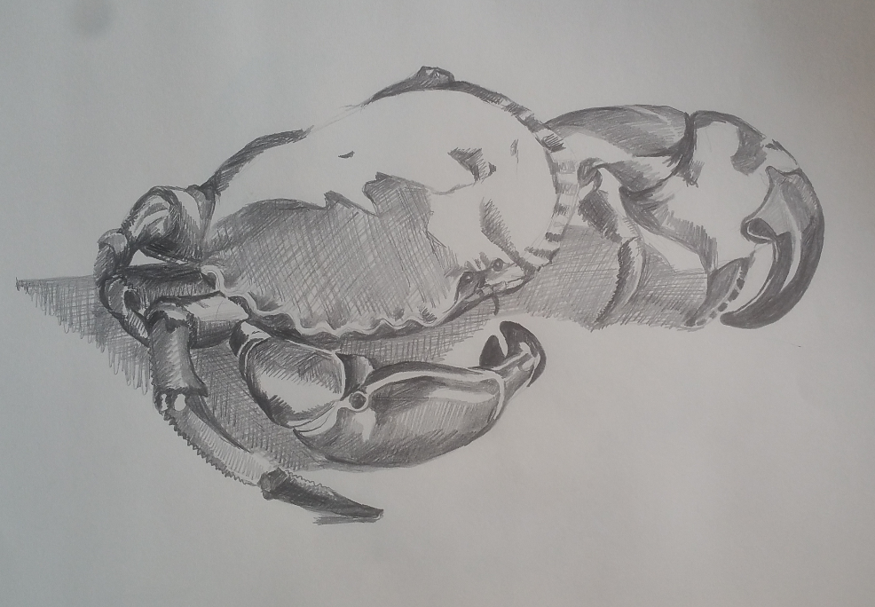
This is an A3 sketch of a brown crab bought from the market. I don’t normally have an issue with dead animals, I love skulls and such like, but this felt rather macabre drawing something that actually still looks alive once it is posed.  I did this by just drawing in the dark patches and the shadows using cross hatching.

smartselectimage_2016-11-15-09-34-35

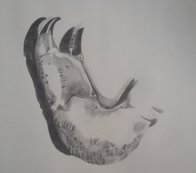
I decided to do a more detailed drawing of just the crab’s leg which I had to pull off. I think this is rather successful though it looks better in the photo than it does in the original drawing- as is the same with the whole crab sketch. I included more detail of the tezture and tone in the crab’s shell.

smartselectimage_2016-11-15-09-34-49

And finally…. This is an A2 sketch/drawing of the mackerel head done in soft pastel. Though I had sworn off soft pastels I decided to give them another go on a much bigger piece of paper. Gosh, I love this drawing! It is beautiful to look at, really love the detail, which I have struggled to achieve before. What I did differently was to draw it and blending the colours then putting a bucket load of fixative on it to stop it from smudging but also to give the drawing a rough texture again. I have always found that after a while the grain of the paper becomes saturated with the soft pastel and it becomes impossible to get detail onto the paper. From experience I know that fixative makes the surface rough again in the right quantities and I was able to draw onto the fixative with a small amount of biro and then another layer of soft pastel and then more fixative. I think the colours look sublime and I am really pleased with it. My partner really loves this one. It is big and bold and colourful and rich.

"Pencil-Case"

Journalling and Journeying through Pictures and Words

My ADHD PhD

Muddling through life and a PhD with ADHD

Daniel's Learning Blog For Drawing 1

A blog about my journey through a degree with OCA

CREATING SPACE

Thinking, drawing, painting & learning

Michelle's blog

When I was younger I used to spy, today I still spy but instead I put it to paper leaving traces around me..

Has anyone seen my guild?

Just another WordPress.com site

Roger Rowley

Learning Log for OCA Drawing 1

Alison MacPherson: Drawing Skills 1

My Learning Log - Drawing 1

The Belle Jar

"Let me live, love and say it well in good sentences." - Sylvia Plath